PAINT COLORS & WALLPAPER THROUGHOUT OUR HOME + TONS OF TIPS!
I get questions about our home’s paint colors and wallpaper on a daily basis and I’m so happy to finally have it all here for you. You’ll find all of the paint colors throughout our home that we’re currently using, as well all of our previous paint colors – and there are quite a few.
I’m also sharing loads of decorating and design tips throughout this post – we’ve learned a lot from our mistakes over the years, through the many trials and errors we’ve gone through, painting our different homes. I hope you find this a useful and resourceful guide, that can help you make some design, decorating and paint decisions in your home!
Originally published June 2019, updated April 2025.
Affiliate links are provided throughout this post – see my full disclosure policy here. As an Amazon Associate I earn from qualifying purchases.
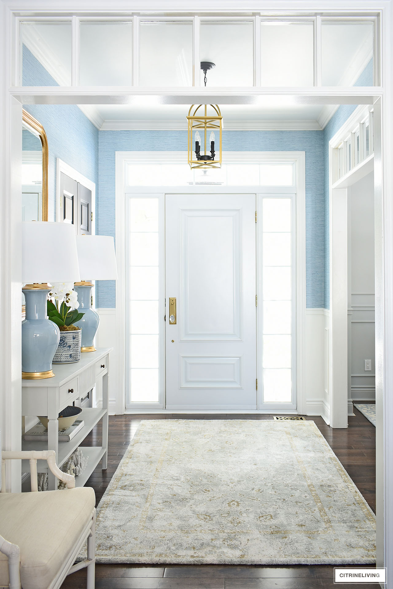
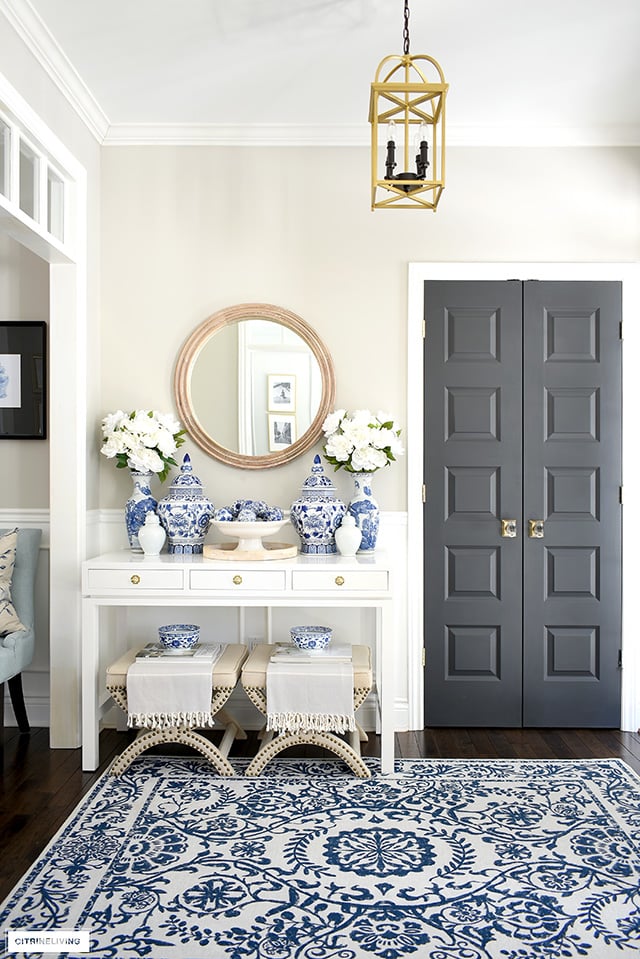
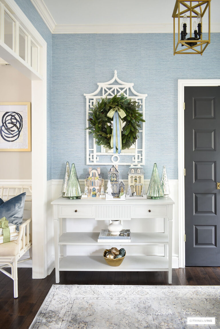
FAUX BLUE GRASSCLOTH IN THE ENTRYWAY
I think one of the most common questions I get is what is that blue on the walls? It’s an inexpensive faux grasscloth and it helped to completely transform our entryway when we installed it a few years ago.
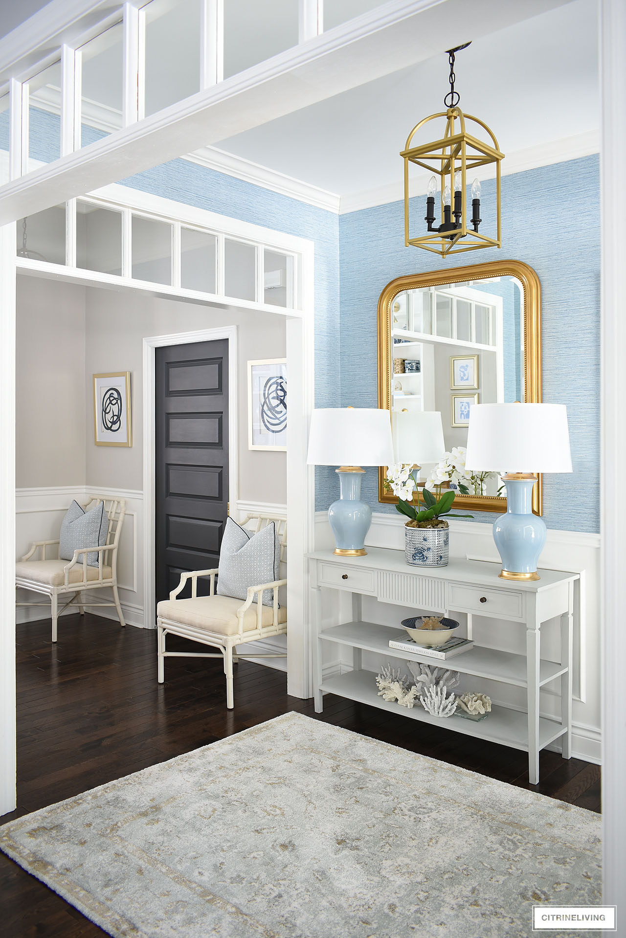
It’s a gorgeous pop of color and compliments all of the other paint colors in our home as well. It brings an elegant, coastal feel to our home – a style I find myself leaning into more and more.
So much, that I wrote an entire post about it – Elegant Coastal Decorating – I think you’ll enjoy reading it.
SHOP OUR ENTRYWAY
Wallpaper | Rug | Mirror | Lamps | Console table | Planter | Ceiling light fixture (we painted ours gold)
ENTRYWAY – BENJAMIN MOORE COLLINGWOOD OC-28
This is what our entryway used to look like, before we added our current faux grasscloth wallpaper, above. It was the same color as our living room – Benjamin Moore Collingwood OC-28 – a warm grey, or ‘greige’ (a cross between grey and beige) painted in an eggshell finish.
Lighting is everything and it can affect colors and how they read, quite drastically.
The same color can look very different in each room, depending on the natural light on that particular day and time of year.
In the winter months, we get the most incredible bright, crisp light in our home (shown in the shot above), since the leaves are gone and we’re surrounded by snow. As much as I don’t love winter at all, it’s my favorite time of year in terms of lighting!
In the summer, everything can take on a slightly greenish hue and in the fall, more yellow, since we have so many trees surrounding our home. This space often would reflect that throughout the seasons.
Our home does not have a very big footprint, it’s just shy of 1700 square feet, but the 9 foot and 11 foot ceilings, wide doorways with transoms, and open concept floorpan, all help to make it feel larger and more spacious.
DESIGN TIP
Always test your paint colors by painting large swatches or buying them. It rarely turns out the same as on the small swatch from the store and lighting is a key factor. Look at it at different times of the day, on different walls. You’d be very surprised at the different colors you’ll get. We’ve made that mistake too many times, forcing us to repaint – more time and more money.
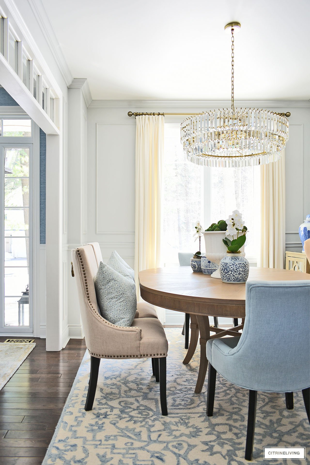
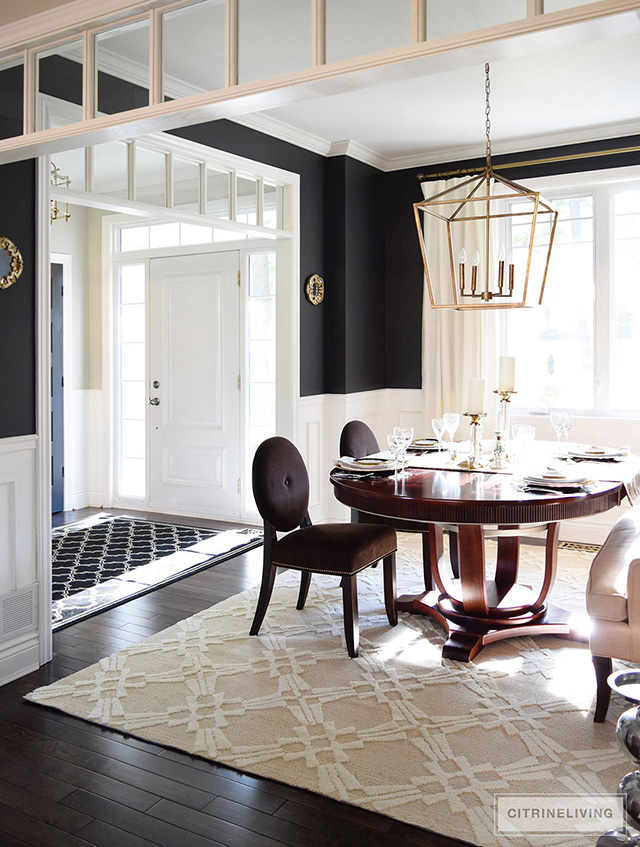
DINING ROOM – BENJAMIN MOORE STONINGTON GRAY HC-170
I love this cool color, which is Benjamin Moore Stonington Gray HC-170 – it’s so different from the Collingwood (a warm grey) we have in our other rooms, but it’s such a gorgeous compliment!
I love the cool versus warm mix and this color is stunning against the blue faux grasscloth in our entryway. This room is also painted in an eggshell finish.
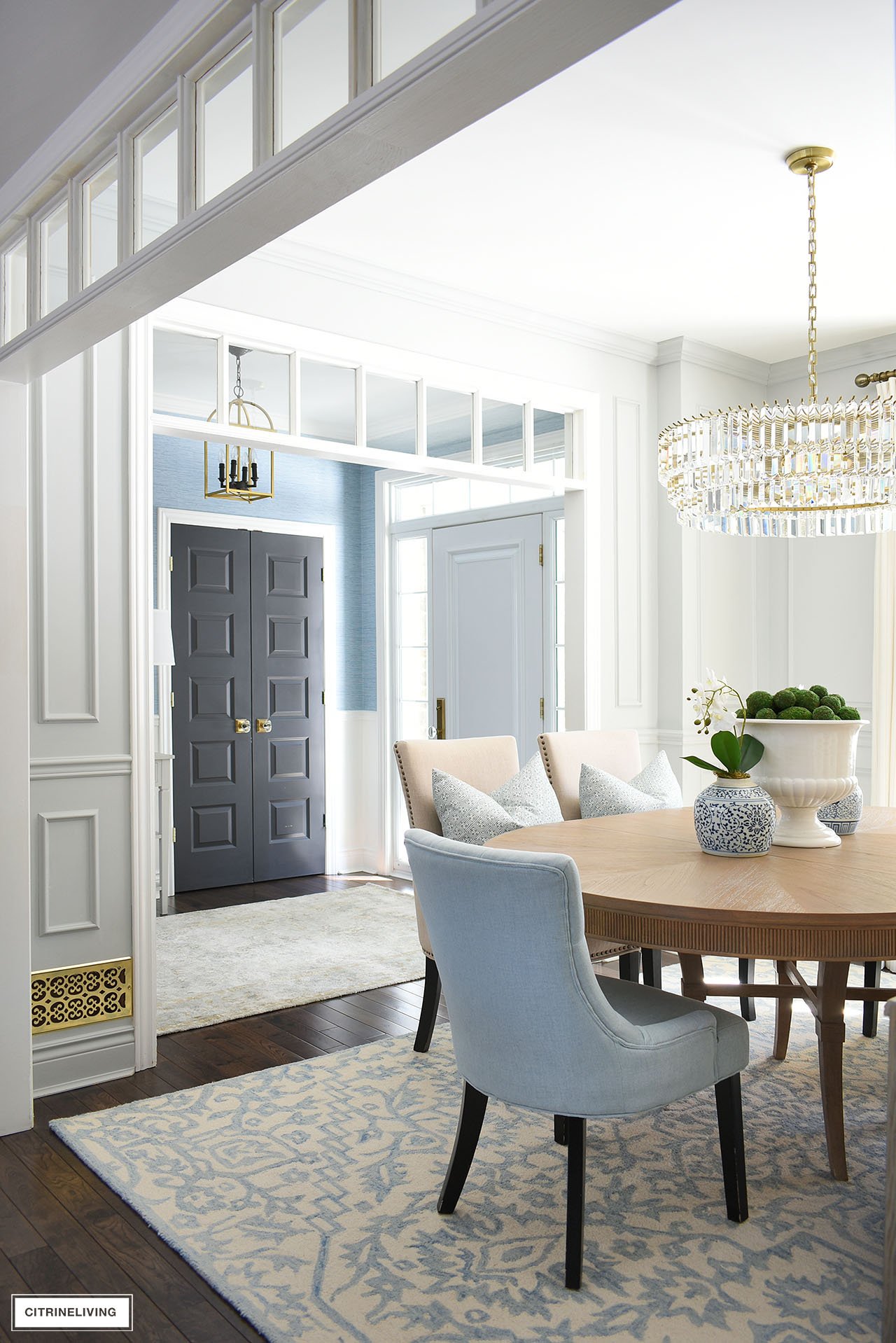
Our dining room was given a makeover a few years ago – you can read more about our dining room reveal to learn more about it.
Keep scrolling further down to see our previous black walls in this space. I love the elegance of this color, it’s soft and beautiful, and really elevates this space to another level.
SHOP OUR DINING ROOM
Blue chairs | Beige Chairs | Table | Chandelier | Rug | Wall sconces | Drapes | Drapery hardware | Gold frames | Settee
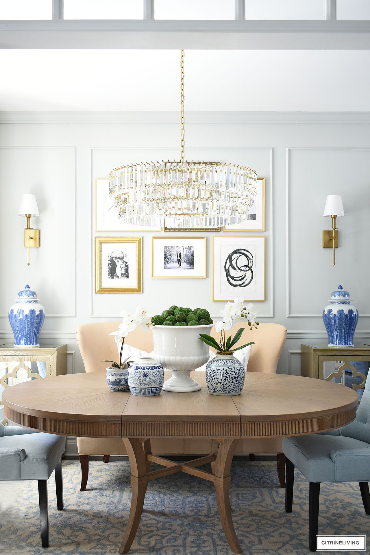
We added the upper moldings and they make a huge difference as well. Consider adding moldings for visual interest, added sophistication and traditional detailing in your home.
DESIGN TIP
If you want your room to feel a little more rich, elegant and traditional, consider painting from the crown molding to the baseboard all the same color – it’s an old-world, European look, but so modern at the same time. I love the chic factor it brings to this space. A small detail, with very big impact! Consider painting the ceiling the same color as well.
PREVIOUS DINING ROOM COLOR – BEHR CRACKED PEPPER PP-U18-1
I loved these beautiful black walls for so many years, and many of you who are regular readers may remember my dilemma about changing them!
I couldn’t decide what to do for so long, butI finally went for it and created the vision that I had brewing in my head.
Even though black walls are all the rage right now, I don’t miss them, but I sure did love them! Also painted in an eggshell finish, this room was so cozy, enveloping and welcoming.
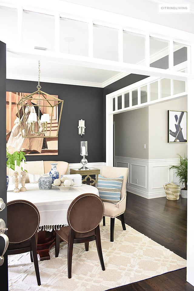
We loved it for the 8 plus years we had it in here. The tone of this black is warm, and it can sometimes read as a very dark charcoal in our home.
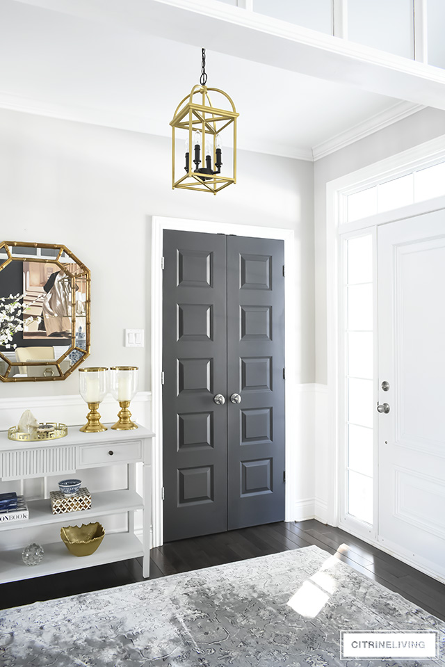
HALLWAY – BEHR ULTRA PURE WHITE + INTERIOR DOORS, BEHR CRACKED PEPPER
Our hallway was recently transformed with moldings, lighting and our bright crisp white that we have on all of our trim throughout our home. Take the full tour of our Hallway Makeover to see what it looked like before.
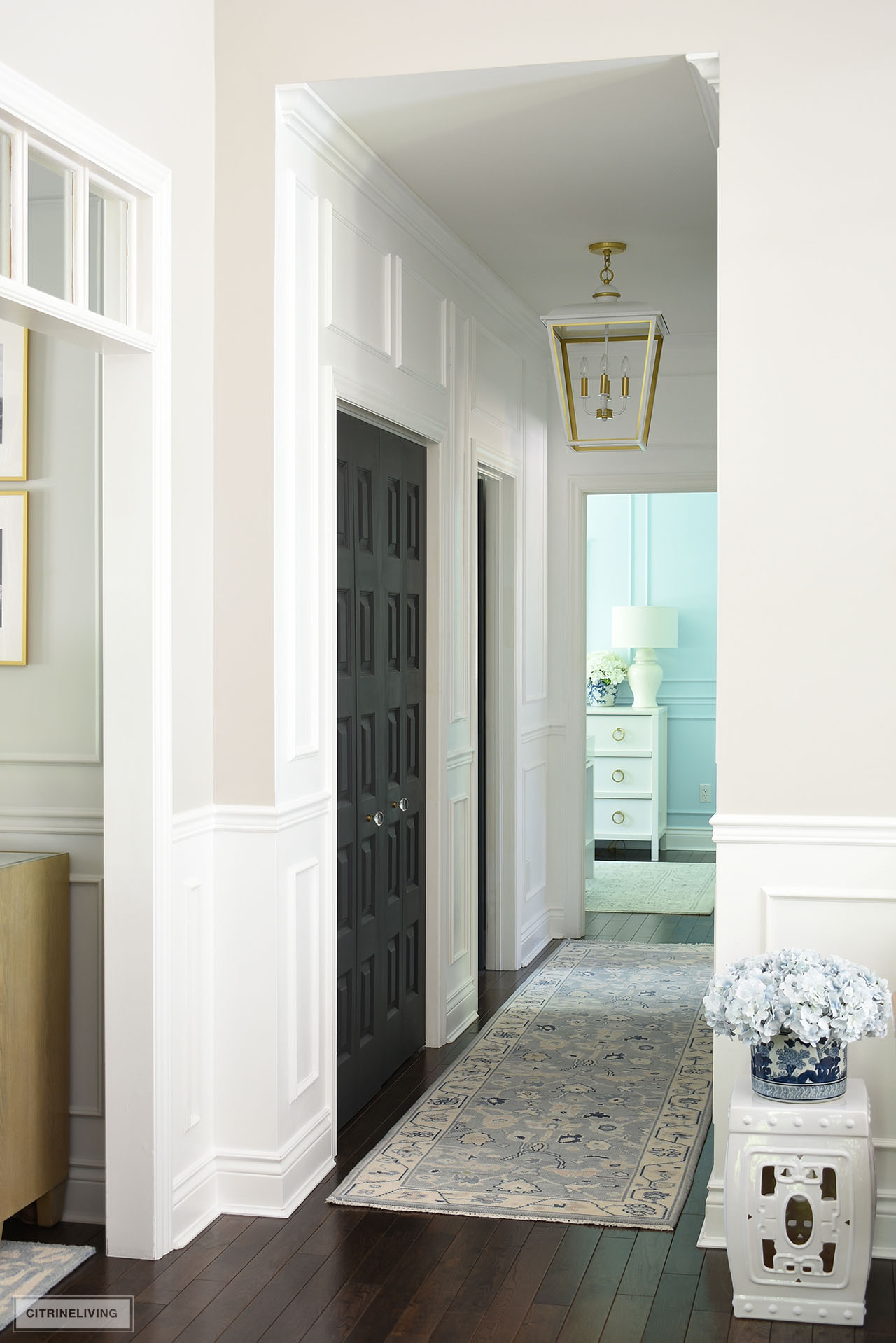
It used to be Collingwood down this hallway as well and I never loved it. It always felt very dark since there is no natural light in here.
Now, it’s so much brighter and feels much larger, especially with the added moldings and large light fixture. The finish is the same semi-gloss we have on all of our trim throughout our home.
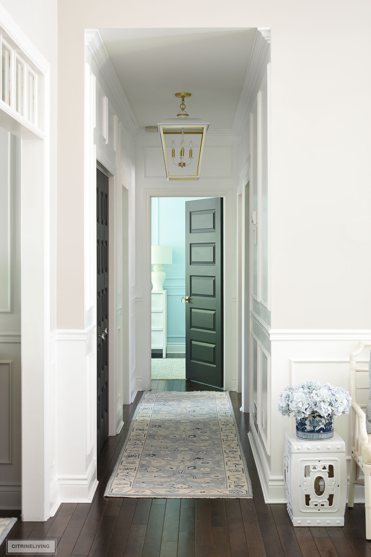
When we built our house, we used the leftover paint from the dining room to paint all of our interior doors in Behr Cracked Pepper, also in an eggshell finish, which I don’t recommend. It shows wear and tear and can be harder to clean.
DESIGN TIP
Paint your interior doors at minimum in a semi-gloss finish. It’s much easier to maintain and so much easier to clean, plus the sheen is beautiful! If you’re really bold and want a luxe, high-end look, have your interior doors sprayed a glossy lacquer finish. Some day I’ll do that in our dream home!
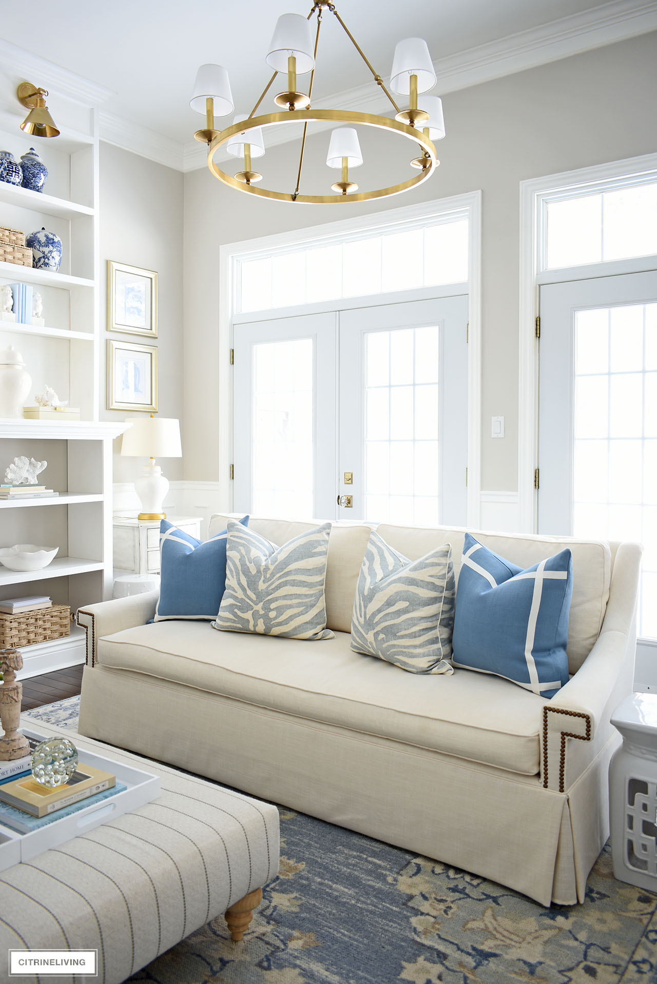
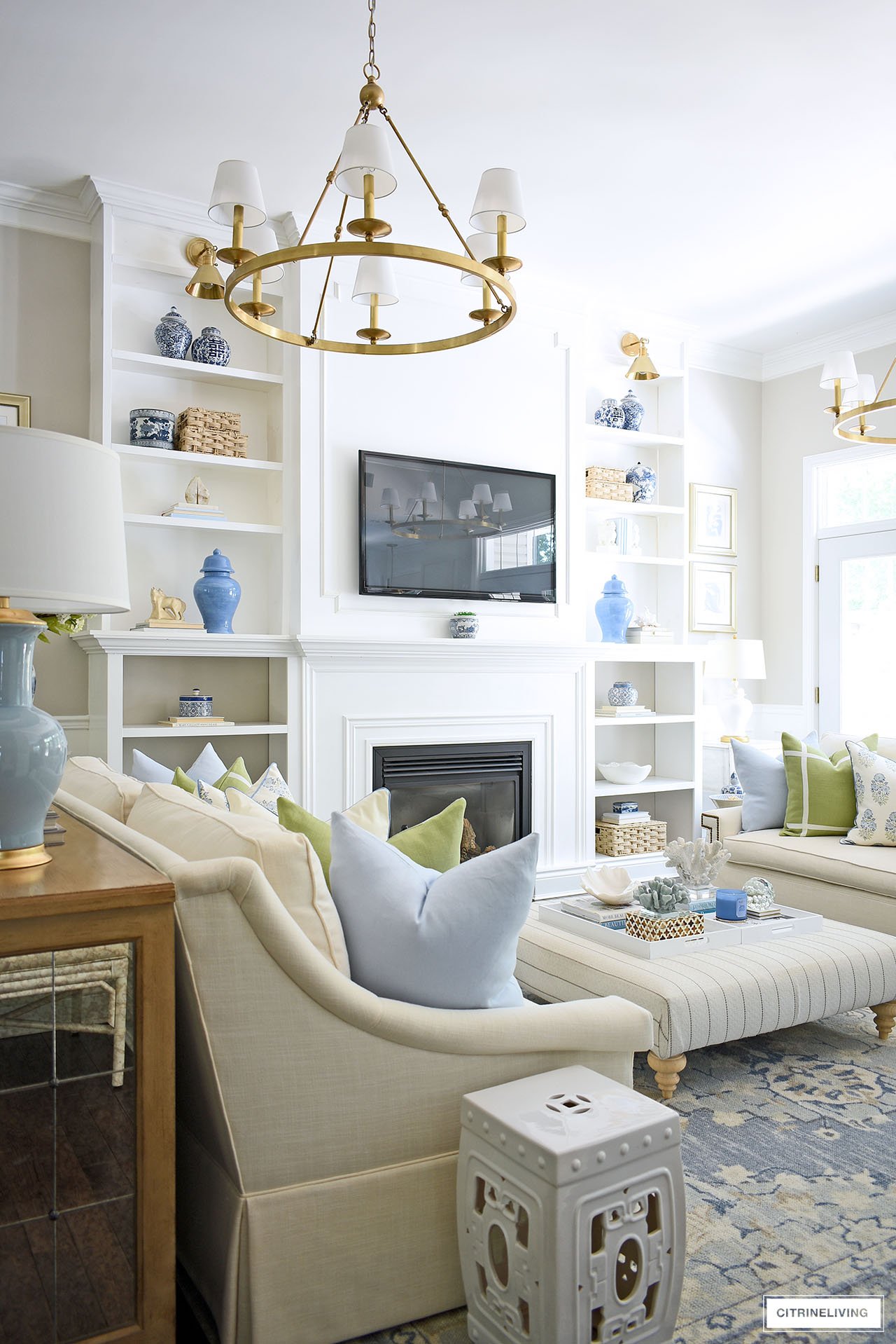
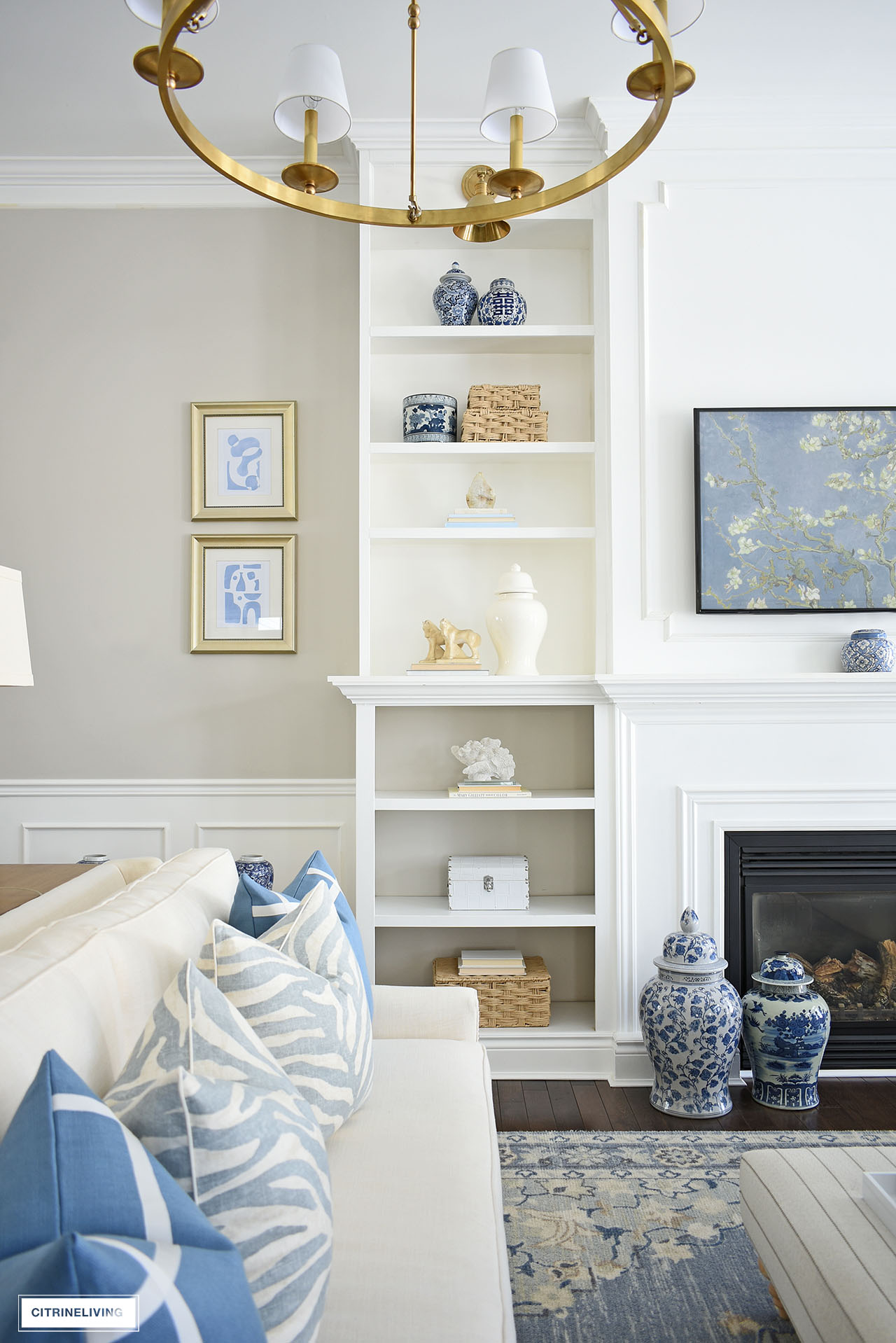
LIVING ROOM – BENJAMIN MOORE COLLINGWOOD OC-28
Our living room and the transition space to the other rooms is painted Benjamin Moore Collingwood OC-28, in an eggshell finish.
You can see how the lighting can change the look of the color in different parts of the room – as is the case for any color, naturally.
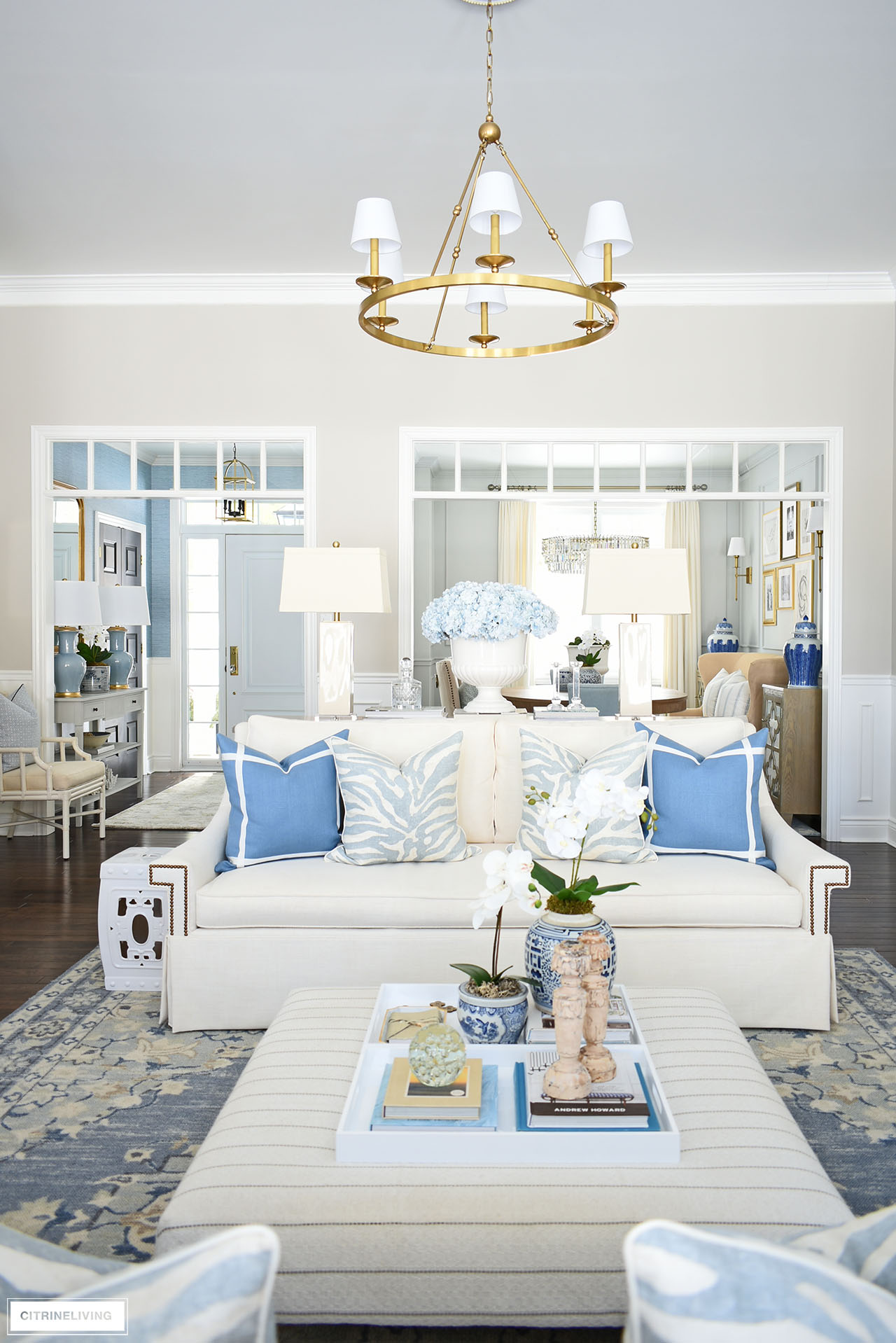
This color can look soft and light in certain spaces and more dark in others. It can even have a pinkish tone to it depending on the light, so I can’t stress enough – always test your colors!
SHOP OUR LIVING ROOM
Sofas | Chandeliers | Wall sconces | Rug | Garden stool | Ottoman | Matisse prints | Bookshelf wallpaper
DESIGN TIP
Buy the brand you test your colors in! We had BM Collingwood OC-28 matched in another brand that was on sale, after we’d tested the Benjamin Moore paint – HUGE MISTAKE! In an effort to save money, and without testing the new brand’s color mix, we suddenly had peach walls. We found ourselves back at the store, buying five new gallons of Benjamin Moore paint, and had to repaint everything.
TRIM + MOLDINGS THROUGHOUT – BEHR ULTRA PURE WHITE, SEMI-GLOSS
When choosing white for millwork and trim, I often love to use a crisp, clean, bright white. It gives such a beautiful contrast to the wall color and makes everything feel so light and airy. That’s why I also chose it for our hallway.
Our ceilings are all the same color in a flat finish, while all the trim throughout our home is a semi-gloss finish.
I love color for trim and even ceilings too – but for our own home, which is a smaller footprint and open concept, I opted to keep things simple for a clean, crisp look.
DESIGN TIP
I personally prefer to use at least a semigloss finish for trim, moldings and doors. Trim and moldings collects a lot of dust and it’s so much easier to keep them clean when the paint finish wipes easily.
LIVING ROOM WALLPAPER (BOOKSHELVES)

What a statement this stunning peel and stick wallpaper made in our living room! I’d been wanting to add this for quite some time and we’re so thrilled with the result. It brings these shelves to life and everything just pops off the gorgeous blue. A very inexpensive update that elevates our home!

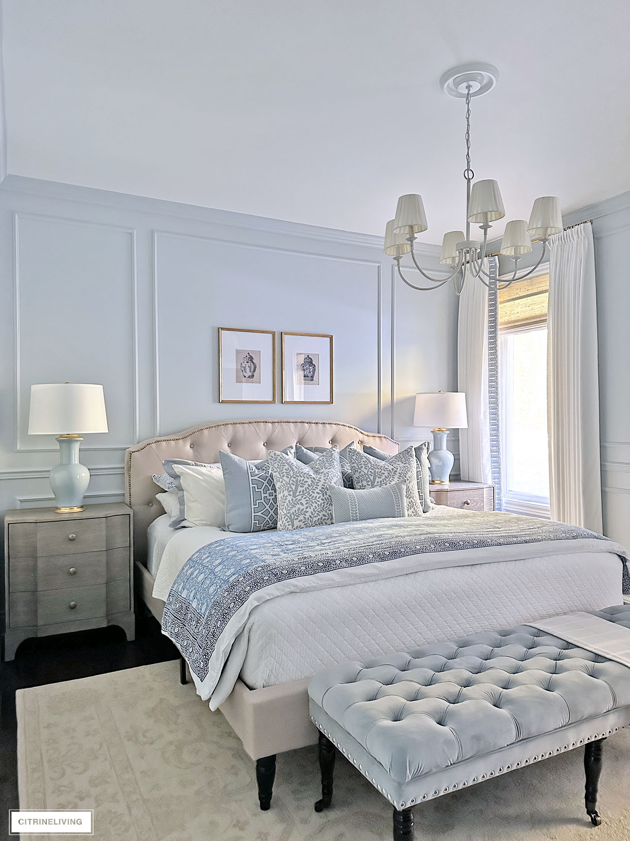
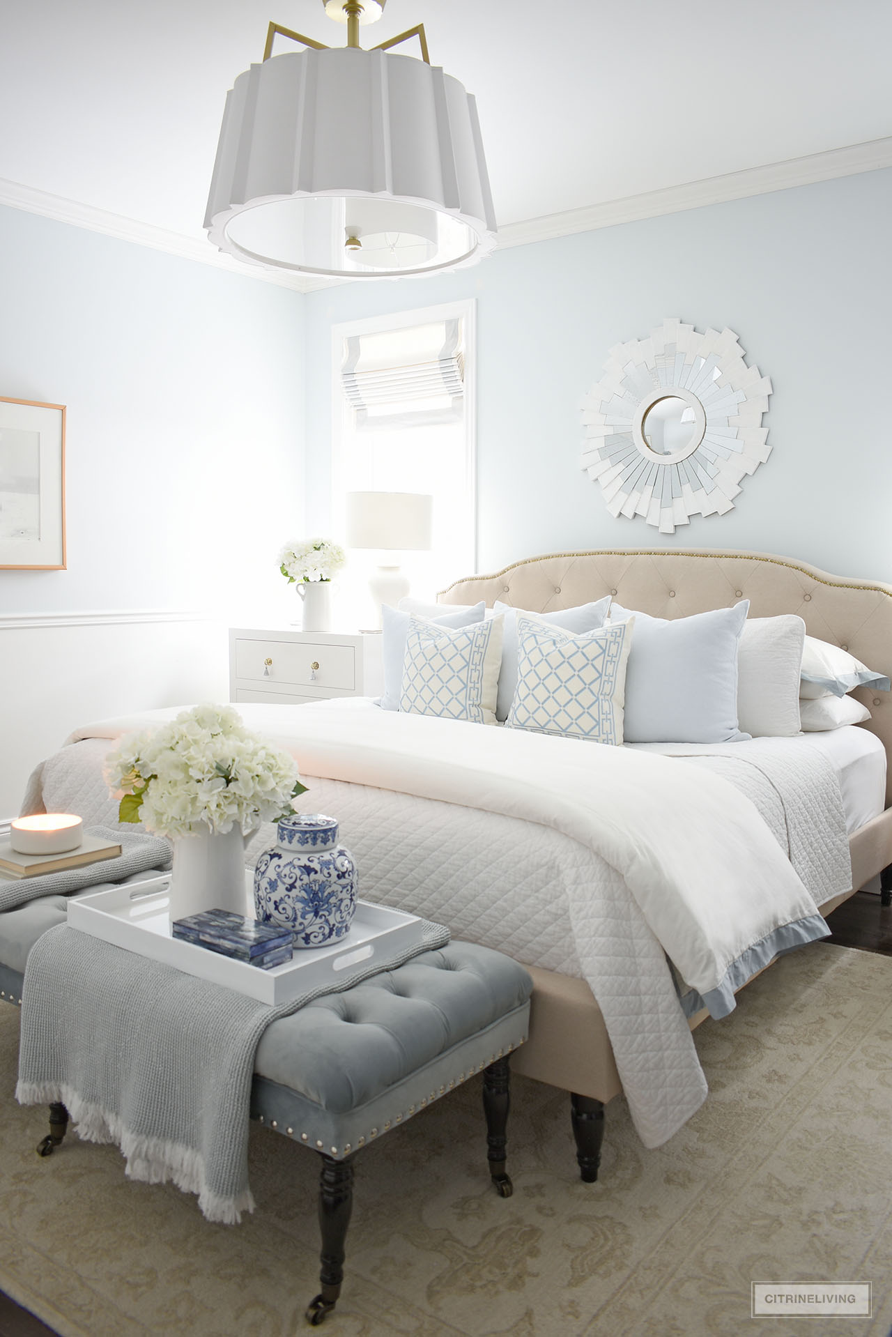
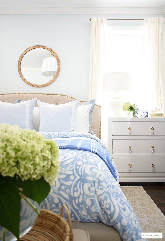
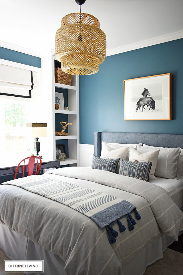
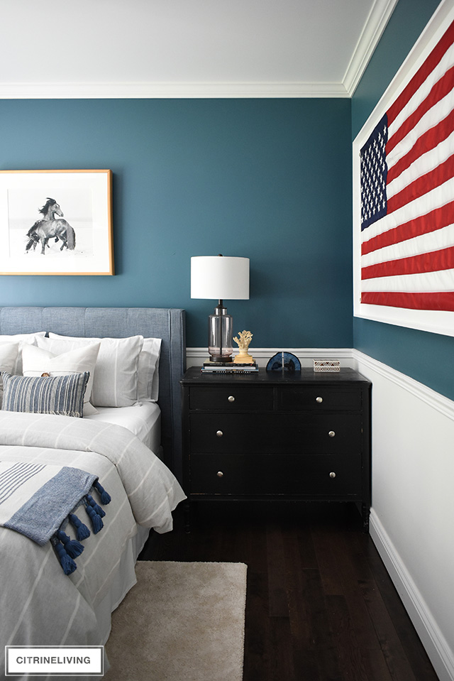
CURRENT MASTER BEDROOM COLOR – BENJAMIN MOORE BLUE LACE 1625
We recently updated our master bedroom and I think it’s my favorite makeover to date! It has seen a few transformations throughout the fifteen years we’ve lived here and this latest, European-inspired space is so elegant and chic!
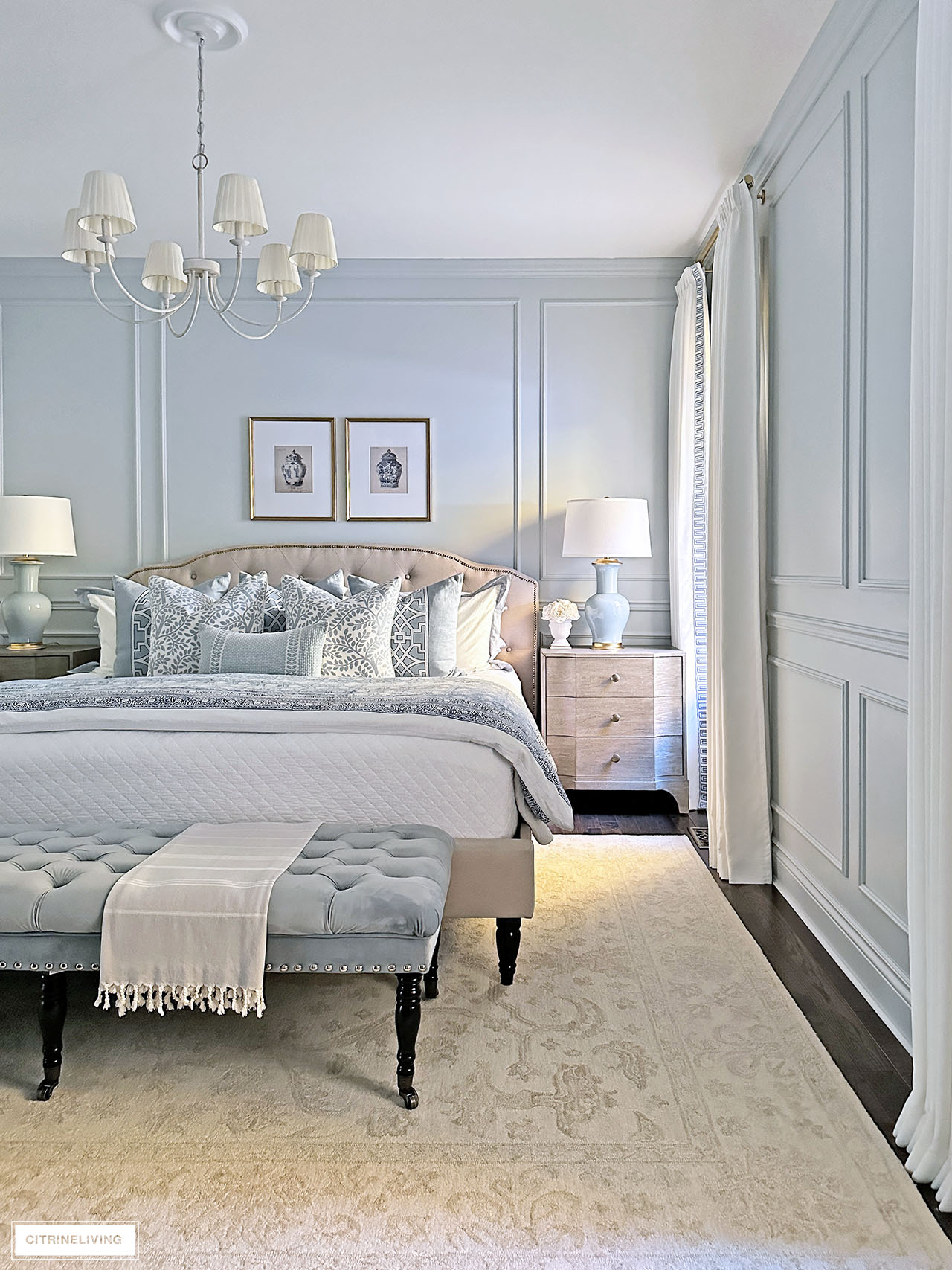
We switched the location of our bed back to where we first had it to maximize the small footprint, added wall moldings for a traditional look and feel, we added new lighting, chic and affordable custom drapes and elegant new nightstands.
You can tour our makeover reveal to read more and get all the details of our bedroom and this gorgeous, serene wall color that is truly the perfect blend of blue and grey.
PREVIOUS MASTER BEDROOM COLOR – RALPH LAUREN, WASHBOARD
This color is discontinued unfortunately but it sure was beautiful. When we first built our home, my vision for this room was moody grey on grey on grey, and we loved it! It was such a relaxing space and the color was so enveloping, luxe and rich.
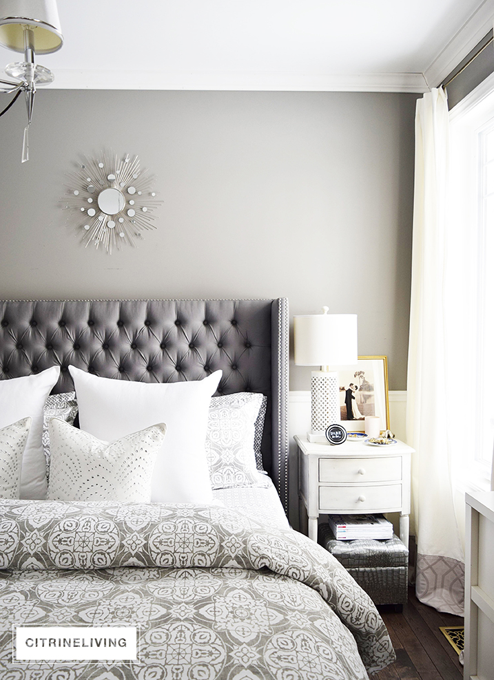
It felt like a cozy cocoon in here, with a rich, curated look, and it was such a treat to sleep and relax in. See more of how our bedroom used to look before we transformed it.
It was perfect for us at the time. That said, because there’s no direct sunlight in here and the windows are north-facing, it felt very dark, very often.
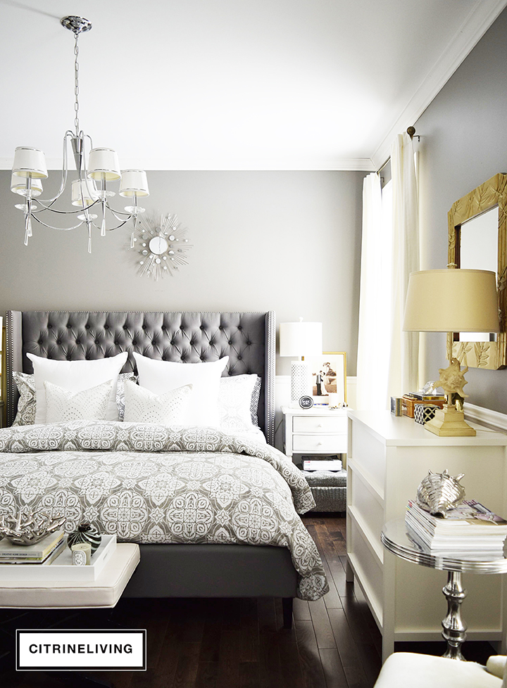
I had fallen in love with the idea of having rich, moody colors, to create a room that was cocoon-like, but I learned after a while that we needed more brightness in this space that had very little light.
PREVIOUS BEDROOM COLOR – BENJAMIN MOORE ORIGINS ICICLE WHITE
That need for more light is what inspired this cool, bright wall color.
Unfortunately, the make and color also doesn’t exist anymore – it was called Icicle White, by Benjamin Moore Origins, exclusively for Canadian Tire, here in Canada.
It’s a very light grey-blue with the most refreshing, crisp feel to it – it certainly provided that coastal, airy retreat I was after.
Remember what I said earlier about testing your colors? This color swatch card read as a very pale grey, and on the walls in our space, it’s very pale blue.
My girlfriend painted her bedroom the same color, and there’s no blue to be found at all.
I’m going to sound like a broken record here and I can’t stress it enough – test your paints, because the lighting has everything to do with how it actually looks. Fortunately for us, we love how it turned out.
DESIGN TIP
If your space gets very little natural light or direct sunlight, consider keeping the walls light in color. While we loved our dark moody bedroom before, it just felt too dark for us. The energy in this space was completely transformed from cocoon-like to an airy retreat just with paint.
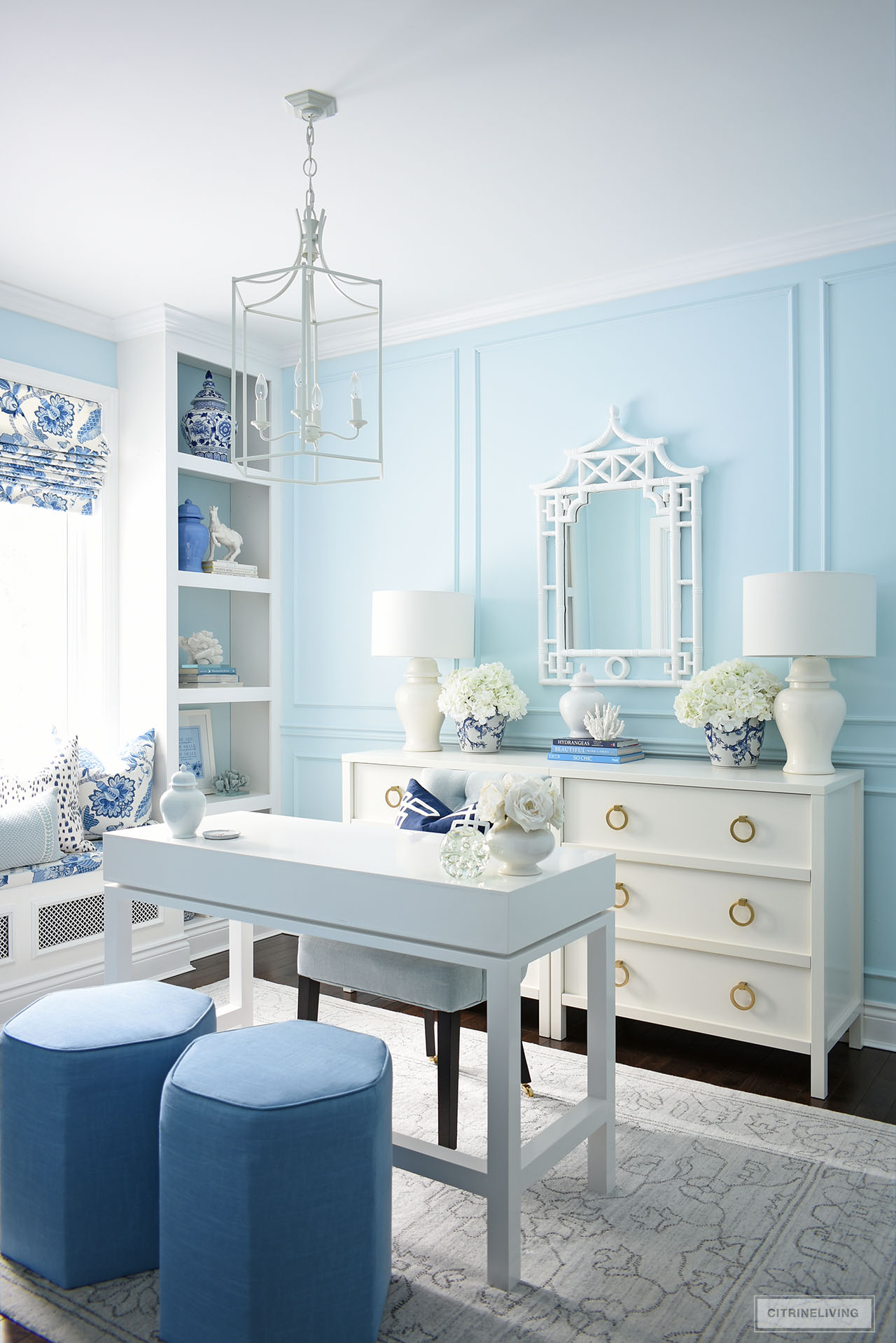
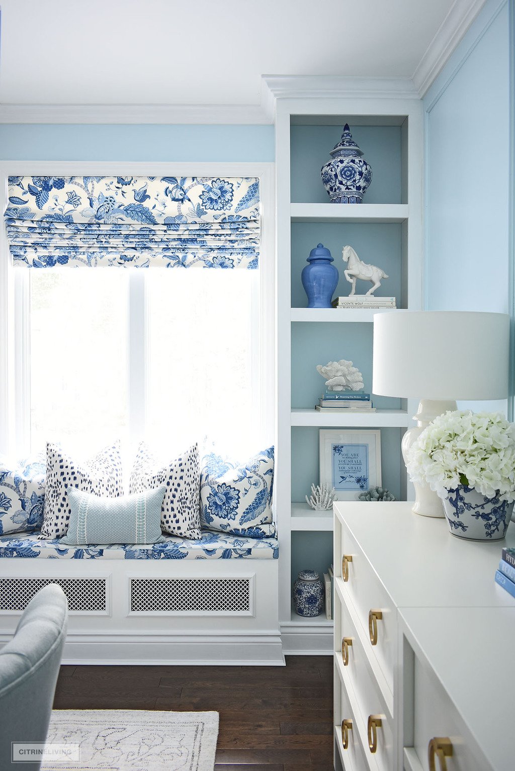
HOME OFFICE – BENJAMIN MOORE HARBOR FOG 2062-70
This room used to be our son’s bedroom and when we moved his room to the basement, I decided to turn this into my own, dedicated office space. If you’ve never seen my full home office reveal, you’ll want to!
Painted in Benjamin Moore Harbor Fog 2062-70 in an eggshell finish, this gorgeous light blue is crisp, bright and sophisticated.
SHOP MY OFFICE
Pagoda mirror | White desk (similar) | Brass hardware | Pendant light | Rug | Office chair | Les Touches spotted pillow, navy | Blue and white floral pillows |
We installed wall moldings for added elegance and a traditional feel, as we did in our hallway and dining room, but chose to keep the crown moldings, baseboards, casings and bookshelves Behr Ultra Pure White.
We built a gorgeous window seat that I love so much, also painted the same white.
I used to work at our kitchen island for many years before having this special room to call my very own, which was inspired by my beautiful Mama in Heaven.
DESIGN TIP
Looking for a way to create a sophisticated, chic office space? Choose a monochromatic color palette to elevate your design. Repeat the same fabric in different areas for a rich, layered, luxe look.
OUR SON’S PREVIOUS BEDROOM – RALPH LAUREN BLUE LAGOON VM 127
Can you believe this bedroom is my office space now? It’s so amazing what color can do to transform a space.
I used to love this bedroom so much – it was a great space for our son for many years. This gorgeous, moody color was truly so beautiful.
Feel free to take the tour of how we transformed this room from a young boy’s bedroom to a grownup, modern teen coastal bedroom.
OUR DAUGHTER’S PREVIOUS WALL COLOR – SICO, KILT GREEN 6127-74
Oh, how I loved this color palette so much and the Palm Beach vibe we had going on in this space! This was what this room looked like when we first built our home, it was so cute and chic!
It’s gone through many transformations since.
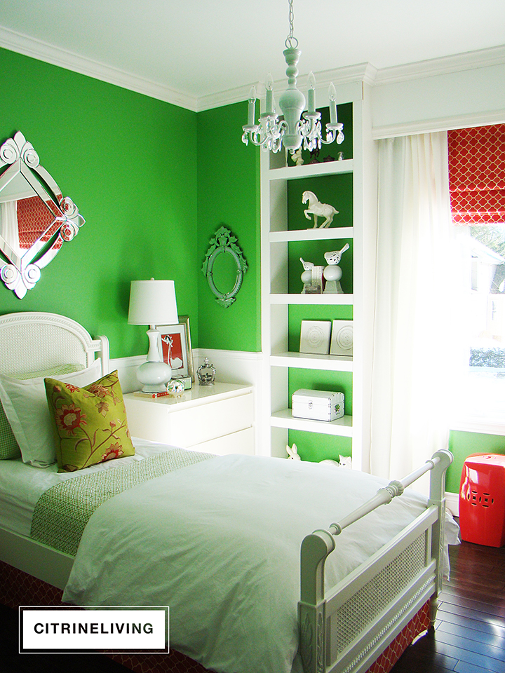
My beautiful Mama and I were always redecorating my bedroom growing up, and it was so fun to share the same special projects with my own daughter through the years.
This vibrant, saturated green was one of my favorites, keep scrolling for the other colors we’ve used in here.
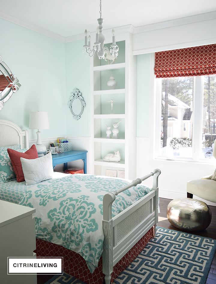
OUR DAUGHTER’S PREVIOUS WALL COLOR – BENJAMIN MOORE REFRESHING TEAL 2039-70
We went from energizing, saturated walls, to a bright, crisp pale teal that my daughter and I fell in love with at the time.
This bedroom gets the most sunlight in our home, since the front of our house in south-facing, and this room gets all of the glorious light.
You can see this full reveal, which also shows more of this space’s transformation, and before photos.
OUR DAUGHTER’S PREVIOUS WALL COLOR – PREMIER INFINITY PALE PEACH
Bedroom transformation number three! We went from cool walls to this softest, blush pink that we adored! So warm and welcoming, sophisticated and chic.
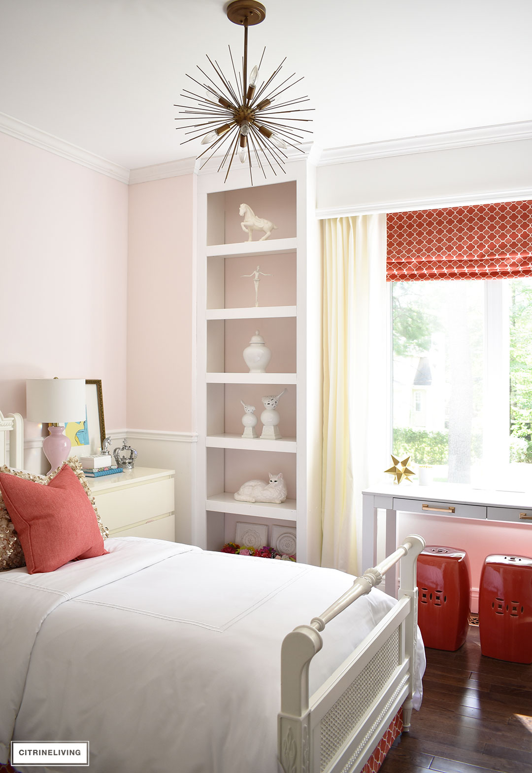
This bedroom design grew up a little bit more this time around with the addition of brass accents. I just loved the coral and red tones with the blush pink, such a stunning color combination.
It’s amazing with each room design, the reds were so gorgeous. Red goes with everything!
OUR DAUGHTER’S LATEST WALL COLOR – BENJAMIN MOORE STONINGTON GRAY HC-170
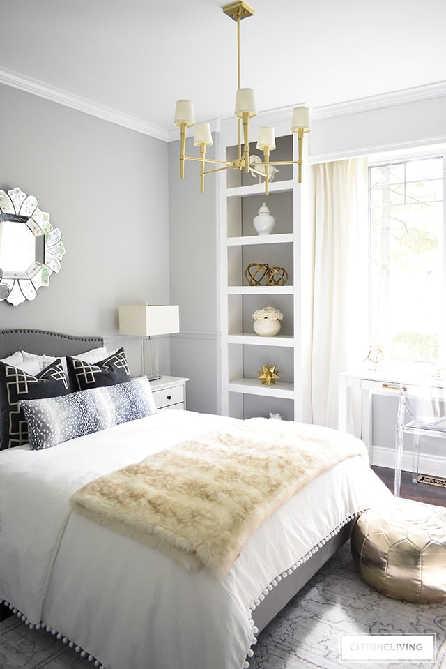
It’s been quite a few years since this last makeover in this bedroom – and now that our daughter is older, it’s taken on her own personal design style.
No more mother/daughter decorating in here…which makes me so sad, but it’s all part of giving your kids their own freedom, right?
DESIGN TIP
Kids rooms are a fantastic way to experiment with color. Especially when they’re younger. It’s a fun process to choose colors with your kids, so they feel involved and an important part of the project, since they’ve helped choose the color they like best for their own personal space.
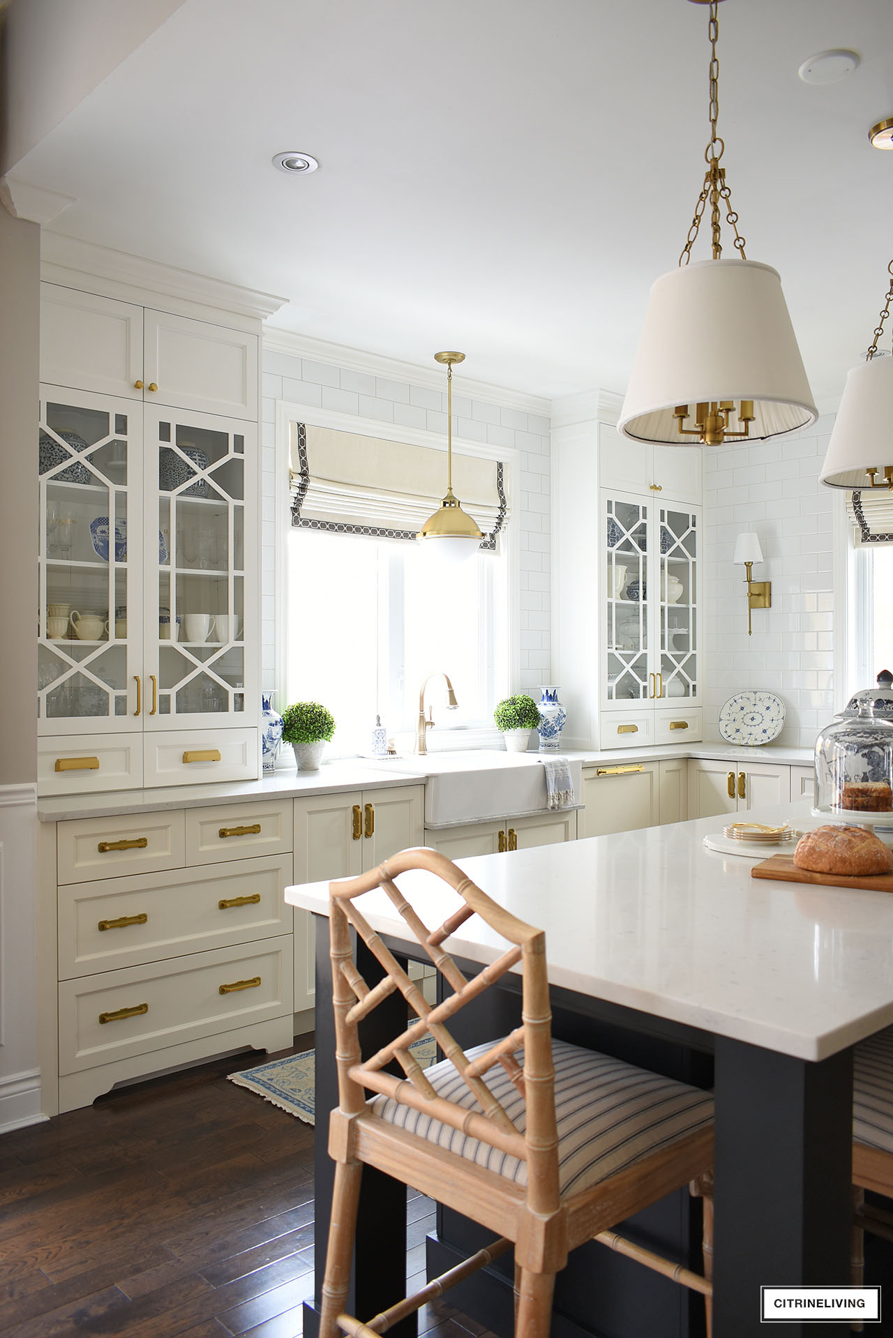
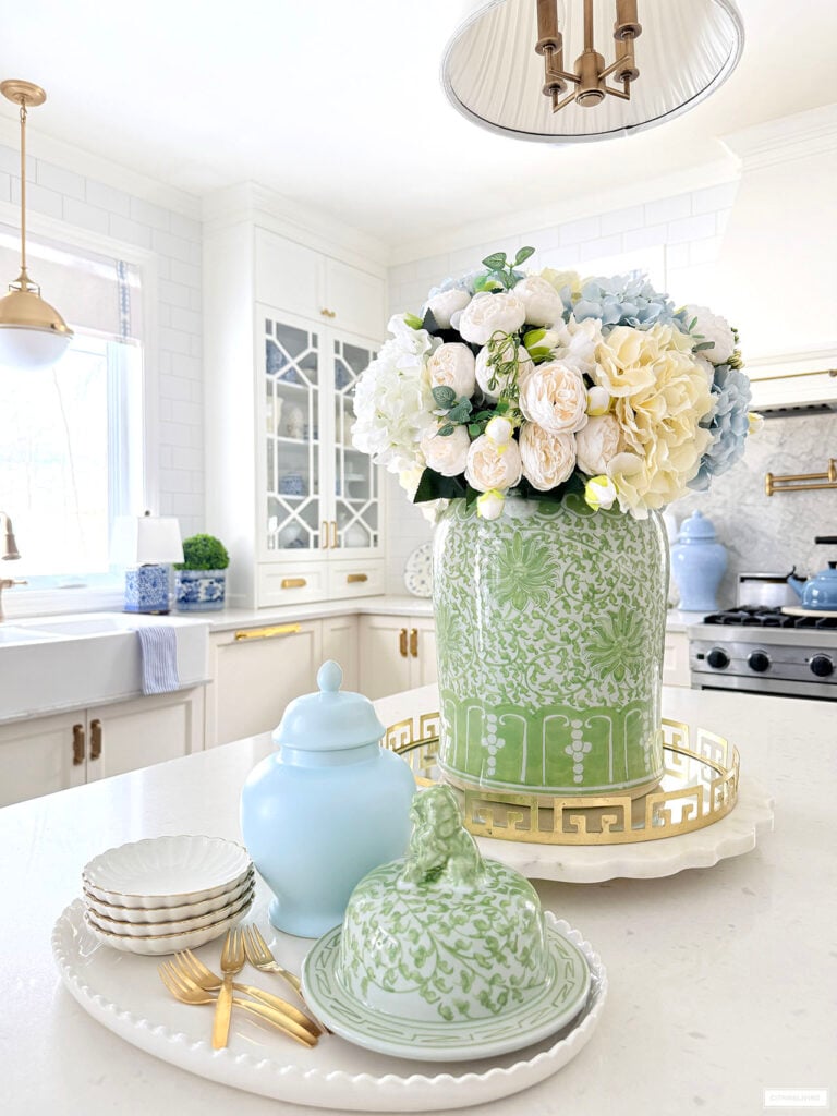
KITCHEN CABINETS + RANGE HOOD – BENJAMIN MOORE SIMPLY WHITE OC-117
We recently completed a gorgeous kitchen update, which we are so in love with. We added new upper cabinets and retrofitted some of the lower cabinets with added storage and a matching dishwasher panel.
We decided to go with a two-tone look in our kitchen (actually three colors, since our island is black) for brightness and visual interest.
SHOP OUR KITCHEN
Faucet | Sink pendant light | Island pendant lights | Wall sconces | Bar stools | Striped fabric | Pot filler | Brass rail
Our upper ivory cabinets and range hood always took on a very yellow tone in our kitchen, because of the light that we get in in here most of the year.
We painted everything above the counters (cabinets and range hood) Benjamin Moore Simply White OC-117 – a gorgeous, creamy, warm white, but still clean and bright.
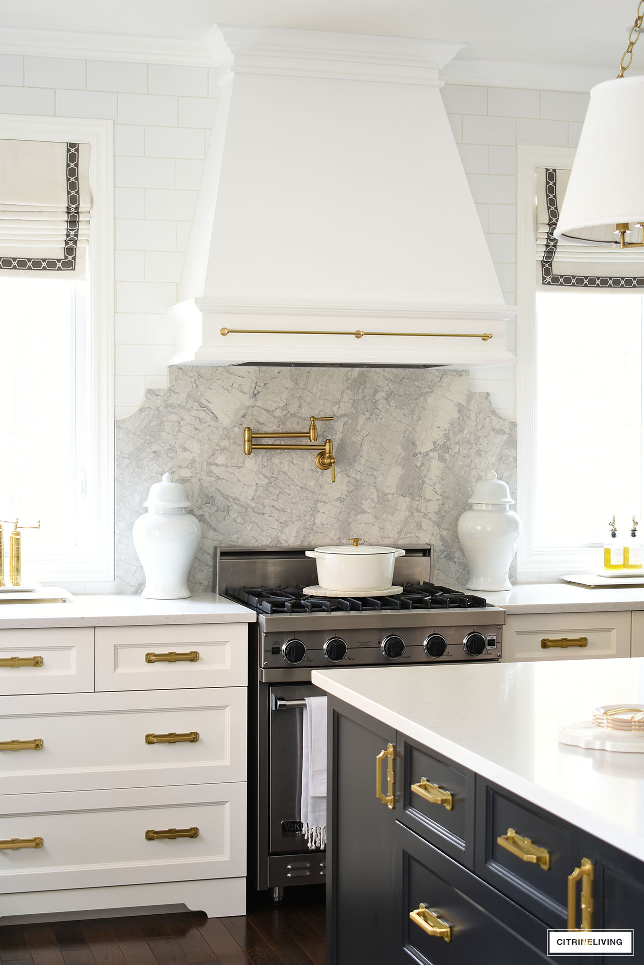
It compliments the custom ivory lowers and black island beautifully, as shown above.
DESIGN TIP
Create visual interest and give your kitchen personality by using two (or three!) different paint colors for the cabinets and island. Don’t be afraid to push the boundaries and make a statement in your home – it will be your very own!
SMALL BATH – FAUX GRASSCLOTH WALLPAPER
This bathroom has also undergone a few changes over the years, but it’s been like this for the most part for the last several years. Feel free to read more about our kids bathroom makeover.
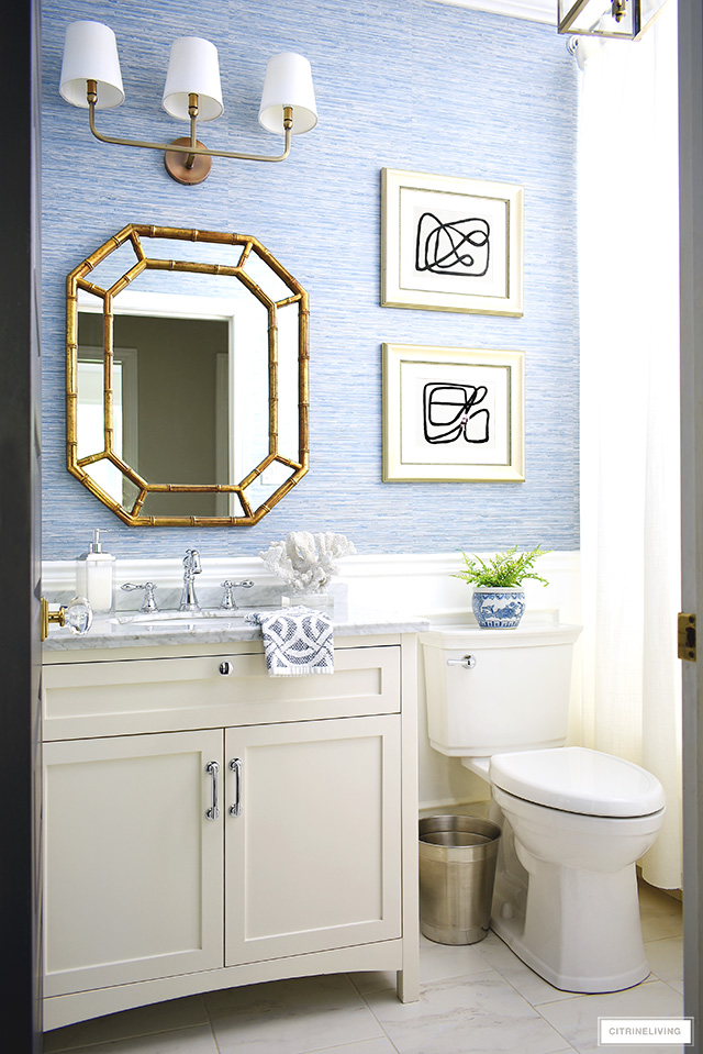
We added a faux grasscloth wallpaper, which was the perfect choice for this bathroom, since it has no window.
That means a lot of moisture! We love coastal-chic vibe it brings to this space too.
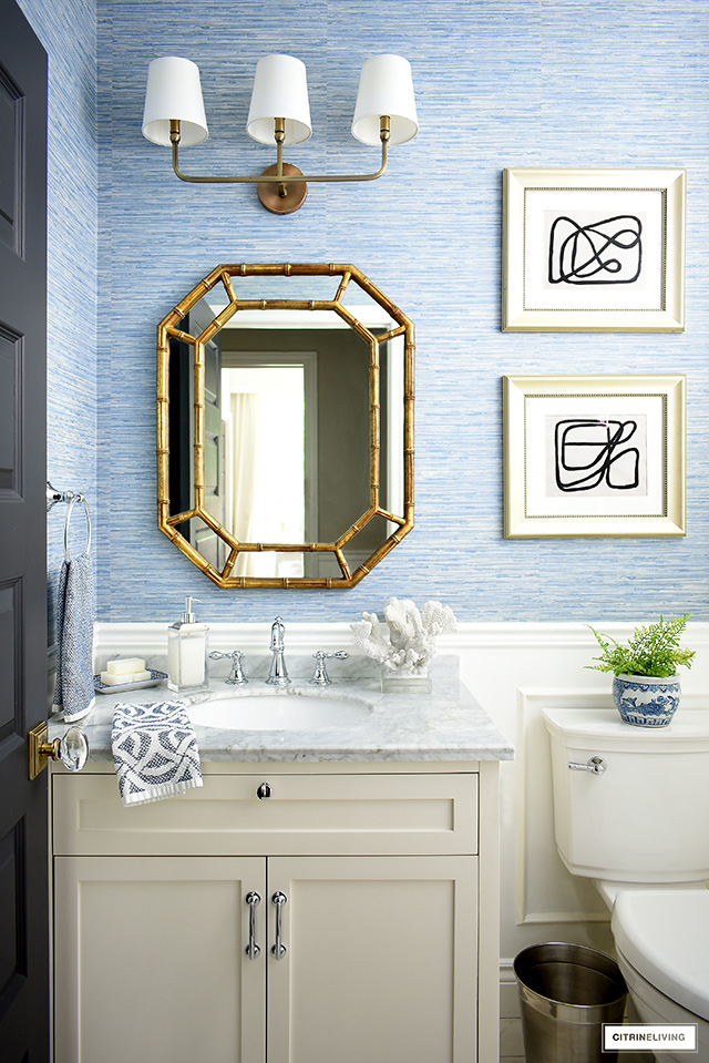
This exact wallpaper is no longer available, but it is almost the same as the faux grasscloth wallpaper in our entryway.
DESIGN TIP
In a small bathroom like this one with no window, a vinyl wallpaper is perfect for standing up to steam, condensation and humidity.
PREVIOUS MASTER BATH – RALPH LAUREN MONTAUK DRIFTWOOD
This is an oldie but goodie! Our master bathroom was painted in Ralph Lauren Montauk Driftwood, a soft, beautiful blue-green-grey color, in a semigloss finish.

It almost had that look of sea glass and it was so pretty for this space. I loved this bathroom’s romantic, vintage feel that we created when we built our home.
The vanity, a repurposed dresser was also painted in the same color, in a glossy finish. We never got around to painting the drawers.
We’ve since given this space a makeover and love it so much more now. Scroll down to see it.
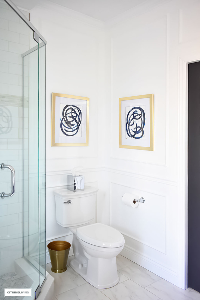
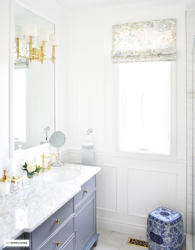
CURRENT MASTER BATH – BEHR ULTRA PURE WHITE, SEMI-GLOSS
As with our hallway makeover, we went all white, again with my go-to Behr Ultra Pure White for our master bathroom makeover, when we tackled this space for the One Room Challenge many years ago.
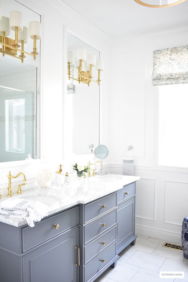
SHOP OUR BATHROOM
Vanity | Faucets | Wall sconces | Knobs | Pulls
We added more wall moldings and painted the space from floor to ceiling, including the crown moldings and baseboards for that rich, elegant, old-world look we love so much.
DESIGN TIP
Use a semi-gloss finish in your bathrooms since there is so much humidity moisture! The glossier, the better, to withstand all of that humidity and condensation.
PREVIOUS LAUNDRY ROOM + MUDROOM – RALPH LAUREN WASHBOARD
The look you see here is from the first mudroom/laundry room a makeover from a few years ago, but the wall color remained the same.
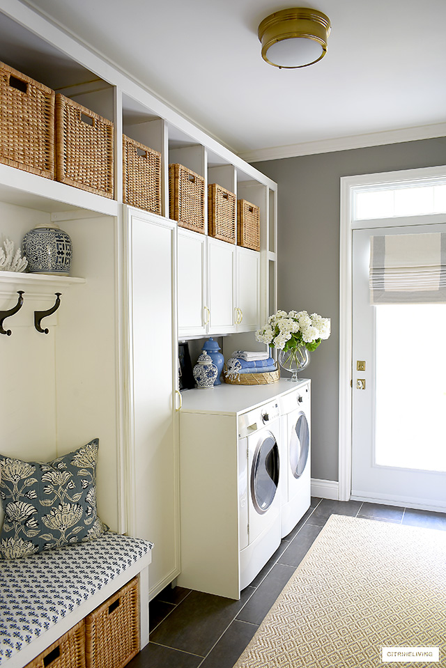
This dark color, Ralph Lauren Washboard, helped keep this very hardworking space in tip top shape since there is always traffic in here.
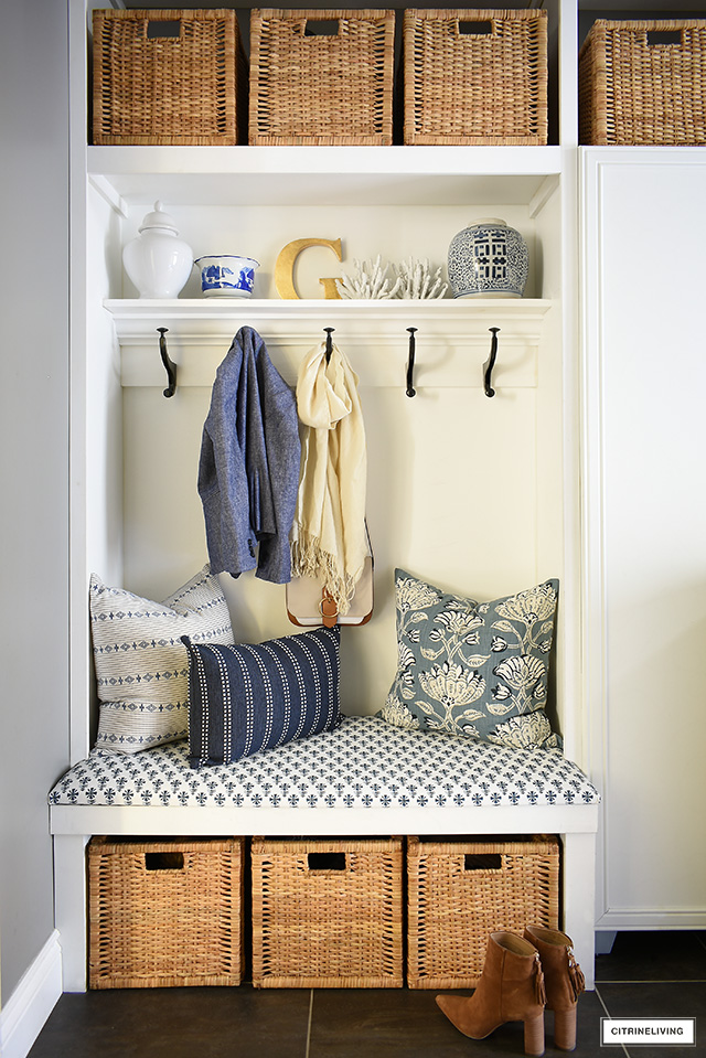
Our builtin bench, shelf above it and the wall in this nook are all painted the same Ultra Pure White by Behr, in a semi-gloss finish.
DESIGN TIP
Keep the look in a utilitarian space like this clean and uncluttered with baskets that are all the same size and color. Visual uniformity brings a sense of order in an otherwise hectic room.
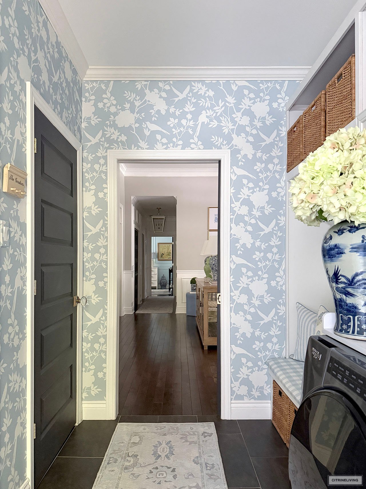
CURRENT LAUNDRY ROOM + MUDROOM – BLUE AND WHITE PEEL AND STICK WALLPAPER
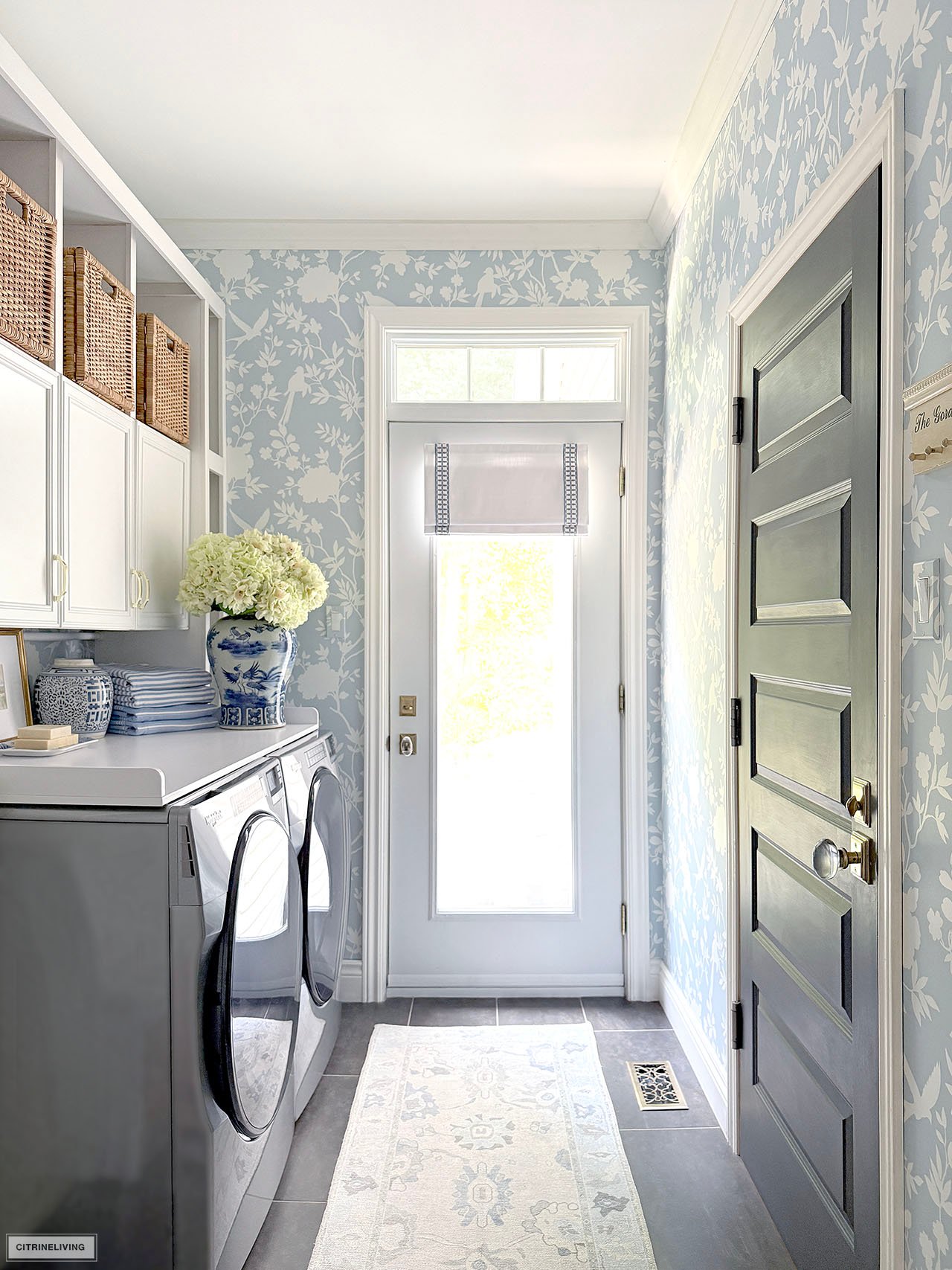
For years I’d wanted to update this room and we finally did it last year! You can visit the full reveal for all the details.
We made a few simple changes that completely transformed our laundry room, making it almost feel twice the size! It’s incredible what color can do.
SHOP OUR LAUNDRY ROOM
Wallpaper | Rug | Roman shade | Large ginger jar | Faux hydrangeas | Small ginger jar | Block print pillow | Striped pillow | Baskets | Hooks | Cabinet pulls | Blue towels | Striped towels | Light | Counter top | Gold frame | Digital print | Tension rod | Blue and white dish | Laundry bar soap | Door handles | Floor vent | Gingham tablecloth (used to cover bench)
I hope you’ve found this guide about our paint colors throughout our home useful and helpful. Use the tips I’ve included, most of them I’ve learned from my own mistakes, and we’ve painted a lot of rooms in our lifetime! Thank you so much for reading, as always, I love to have you here! Happy painting! xo

Hi! Thanks for stopping by and for your question! We bought ours at a local hardware store – you should be able to as well. Home Depot should carry it if you have one near you. This link is an example of what to look for from Home Depot. Hope this helps!
Everything is soo beautiful! I realize this post is from a previous time, yet I’m having a hard time finding trim for picture frame molding. Where did you find yours?
Hello! We didnt paint our vanity, it came this way! Thank you for the kind words! xo
Wondering about the paint colour of your master bath vanity? Thank you for sharing, your home is beautiful.
Hi! Our lowers are ivory but I don’t have an actual color! All of the original cabinets are a polyester material – this is sort of like a laminate. When we had the new bank of drawers and dishwasher door front made, we had the cabinet maker match the color, so it is custom. We painted our uppers Simply White by Benjamin Moore, which we absolutely love. It’s a beautiful warm, creamy white, but still very bright and not yellow. I think that would be a great color for you – but always make sure to test your paint first! I hope this helps! xo
What color are your lower kitchen cabinets? And what would be a good overall cream color to paint the cabinets and wall space in-between?
I’m so happy you’re inspired! Thank you for the very kind words!
Breathtaking. Love EVERYTHING!!! My favorite color is blue also. You have inspired me to redo everything. Thank you for sharing.
Hi Sharon! Thank you so much reading with me and for the very kind words! I’m thrilled you’re inspired and that you’ve found this useful! I’m so happy you’re here. xox
Breathtaking home!! Thank you for including paint colors, so many don’t. The wall color is the backdrop for every room. I’ll be visiting your site again, you have inspired me to return to Blue and white..Thank You…Sharon Wassmer wassmersharon@gmail.com
Hi! We used the leftover eggshell paint that we originally painted our dining room with. I strongly recommend at least a semigloss finish for doors!
What type of paint for cracked pepper on doors?
Hi! Thanks for the question! For walls, eggshell finish is fine, I’ve never had any issues with cleaning. Satin just has a little bit more sheen, so you will be fine with that as well! Good luck! xo
I am considering painting my basement media room Cracked Pepper by Behr. I noticed you mentioned that you did a Eggshell finish, did you notice any cleaning issues? I was leaning Satin but would love to know your thoughts. Thank you
Thank you so much Penny! The color is actually just white! It’s the standard color of the door, I don’t have a color name unfortunately! Thank you for your very kind words!
You are Very talented! WOW! Gorgeous home! Can you tell me the inside front door color, is that Collingwood as well? Thank you!!!!
Hi Carol, sorry for the late reply! This is a custom color from our builder, I don’t have the name! Have you considered going with navy blue perhaps?
Hi, I love the color of your island, is it Cracked Pepper? Thanks so much. Our is black, and we are in the process of remodeling and I find the black is harsh.
Hi Alex! Thanks so much for your kind words! I think Benjamin Moore Van Courtland Blue is a really close match! I hope that helps! xo
Love your taste!! Can you please call out a color for your medium grey bathroom cabinet, anything close to get me started with some swatches. Thanks!
Hi! I have no paint colors for them! The finish is polyester – so it’s like a veneer. I chose Ivory and Black!
Cabinet colors?
Hi Joanna!! I am so happy you found this useful! I have learned so much over the years and I’m so happy to finally share! I think you’ll love having the the mouldings painted, it’s a really elegant look! Thanks so much for reading!! xo
Thank you for sharing your paint colors. I’m getting the painters in to redo my bedrooms, bathrooms and all the doors & trim. I’m thinking of painting the trim the same as the walls as you did to get a nice uniform look. I’ll also be using semi-gloss in the baths. What a timely post!