OUR UPDATED KITCHEN REVEAL IS HERE!
Our kitchen has a new look and we couldn’t love it more! Our kitchen reveal is finally here. As many of you already know, I’ve had this vision in my head for a long time and I can’t believe the transformation. It’s still the same kitchen – just so much better.
The entire process from beginning to end took about six months, as we had a few delays and hiccups and along the way. It was a relatively easy project and we tackled a lot of it ourselves. The only demolition we did was take down our builtin shelving, remove some upper cupboards and the tile insert behind our stove. We repainted our range hood and some upper cabinets, tiled one wall, added some new crown molding, trim and brass rails. We installed a new dishwasher and panel, recovered our bar stools and installed all new hardware, a drip rail and pot filler. A lot of thoughtful details went into our new kitchen update and we are so thrilled with the outcome. Nothing is more satisfying than bringing a vision to life!
I hope you love it as much as we do…please come and see our newly updated kitchen reveal!
Affiliate links are provided throughout this post – see my full disclosure policy here. As an Amazon Associate I earn from qualifying purchases. I’d like to thank Belwith-Keeler for providing all of our gorgeous hardware and BellLavigne Kitchens for the incredibly stunning cabinets.
THE KITCHEN REVEAL: OUR STUNNING NEW CABINETS!
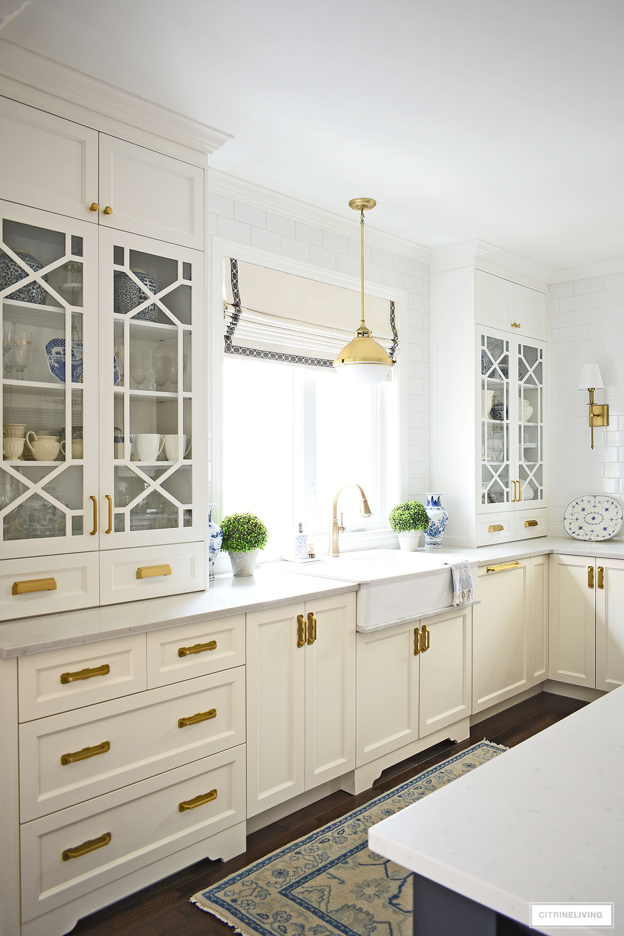
Every time I walk in here, I’m pinching myself. Our kitchen reveal is finally here and I cannot believe it!
We made just a few simple changes – by this I mean we had no major renovations to live through, we just made some rather straightforward upgrades – and they make such a HUGE difference.
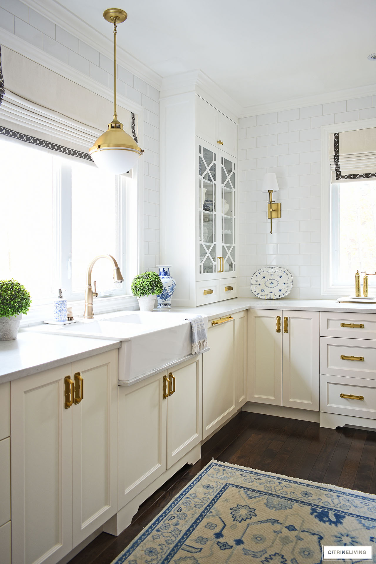
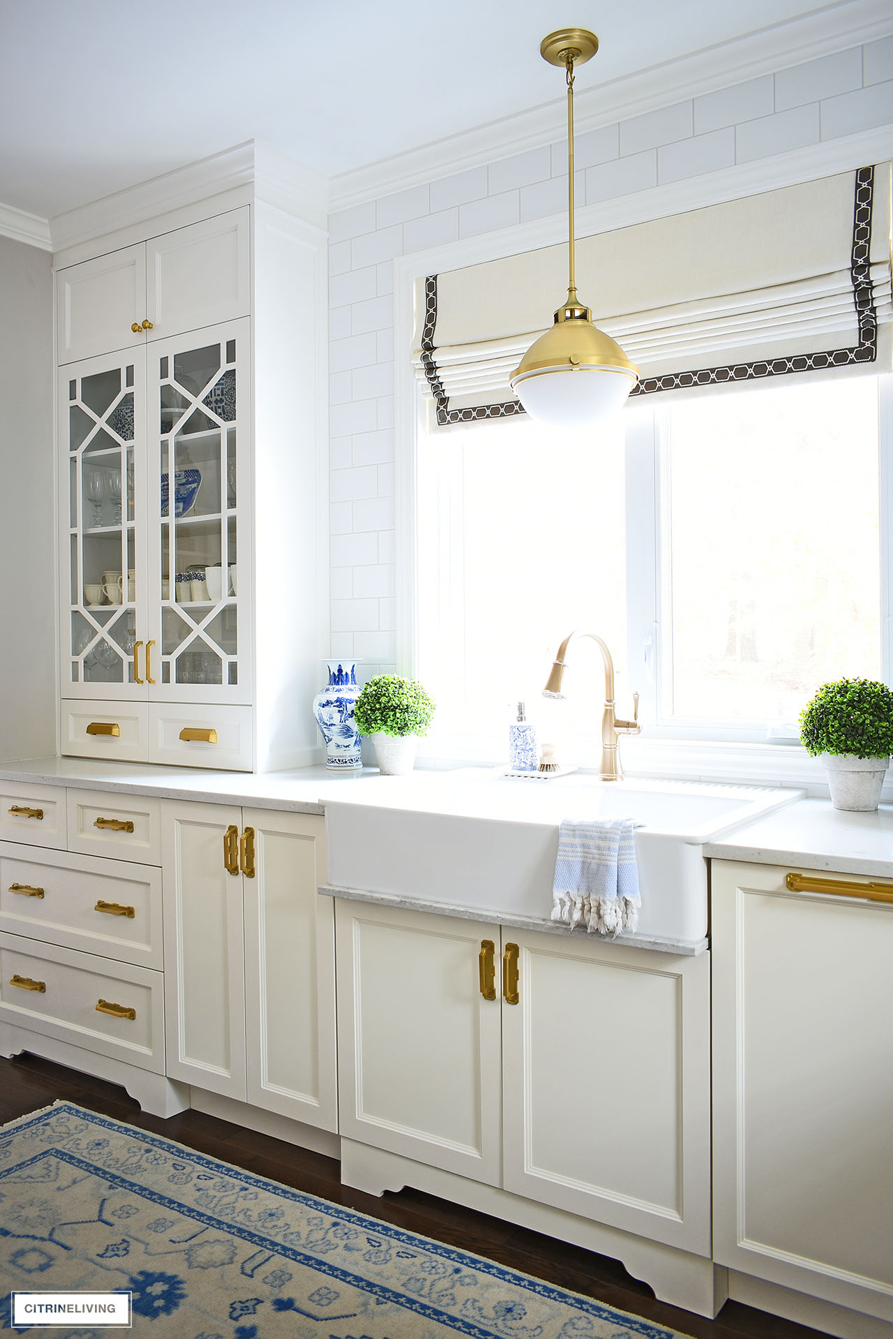
The biggest update you’ll find in our kitchen reveal are these most stunning and elegant custom upper cabinets.
They are SO gorgeous, with a chinoiserie-inspired, trellis design (also called fretwork or lattice).
These new cabinets not only fit right into our kitchen, they feel like they’ve always been here and elevate our space and home to another level.
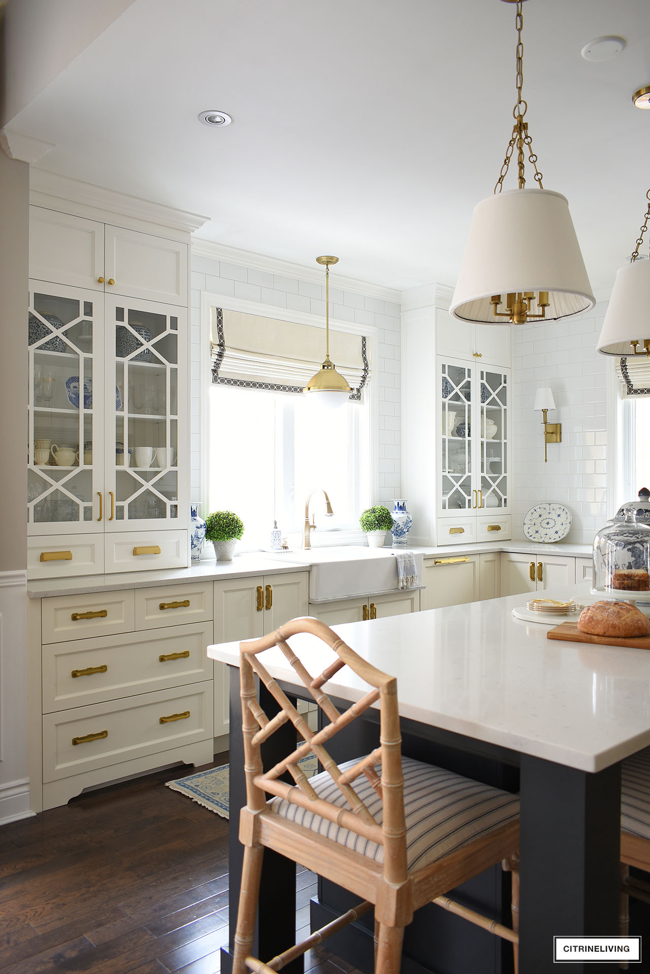
We had a bank of drawers installed on the left, designed to match the rest of our drawers, where we had a small desk that was never utilized.
Everything turned out exactly as I envisioned, and working with BellLavigne Kitchens was amazing. They truly brought my vision to life in the most perfect way with our cabinets, and the workmanship is such high quality.
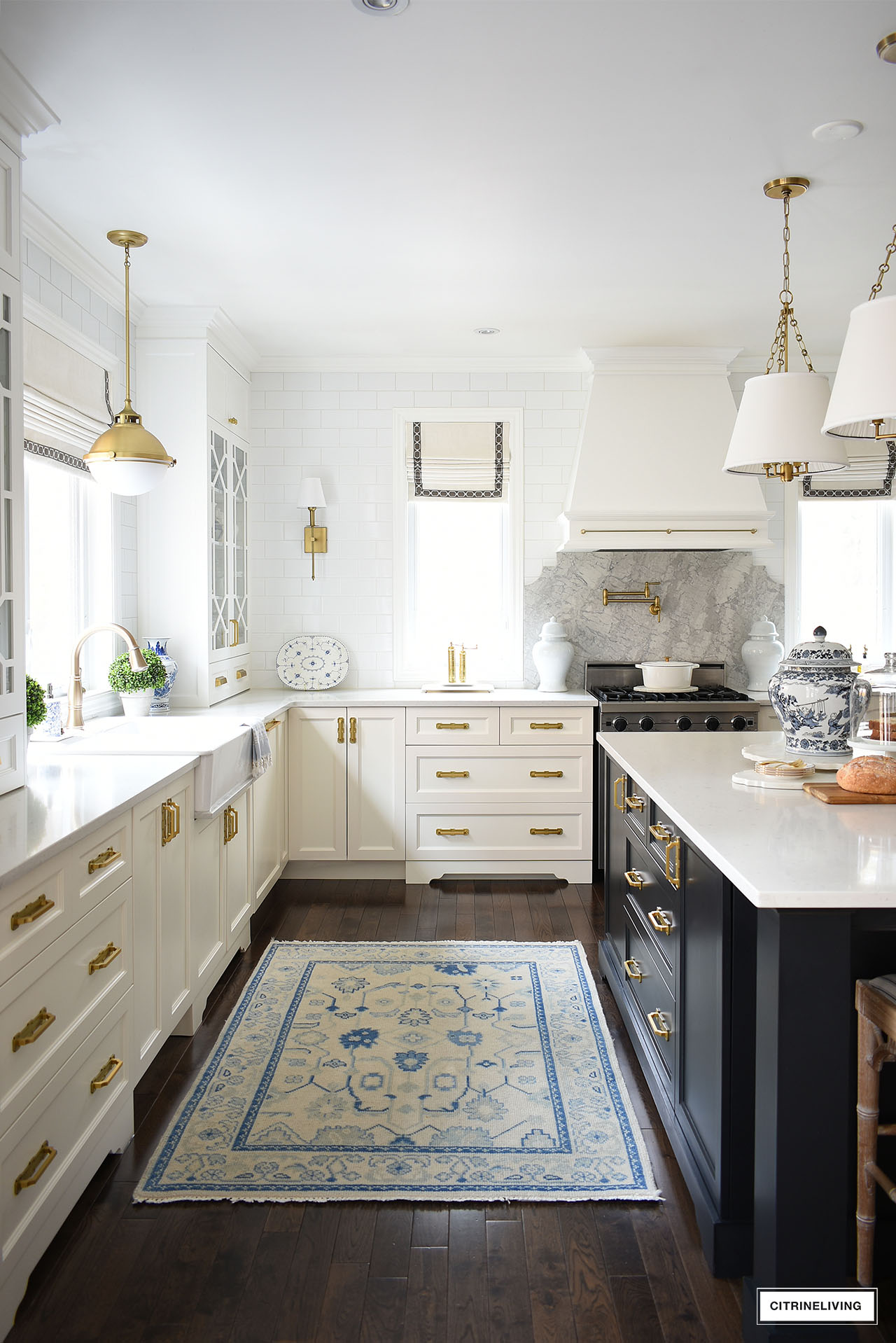
We chose to use BM Simply White OC-117 on our new upper cabinets, and I also painted our hood and upper cabinets around the refrigerator the same color.
We kept the lower cabinets ivory, and had the new dishwasher panel and drawer unit perfectly custom color matched.
Our island is also a custom black color, so we have three cabinet colors in this space.
ALL OF THE UPDATES IN OUR KITCHEN REVEAL
- Custom upper cabinets flanking our sink
- Lower drawers on the left of the sink
- Additional subway tiles around the sink window
- Quartz drip rail under our sink
- Brass hardware
- Paneled dishwasher
- Quartz backsplash
- Brass pot filler
- Painted hood
- Brass rail on our hood (and some on our corner shelves not shown)
- Painted upper cabinets over the fridge
- Recovered bar stools
If you’d like to learn more about our kitchen journey and the details of this whole project, I talk more in detail about my vision for our kitchen in this post and about the process and progress in this post – there’s a lot of information, how-to’s and tips you might find useful.
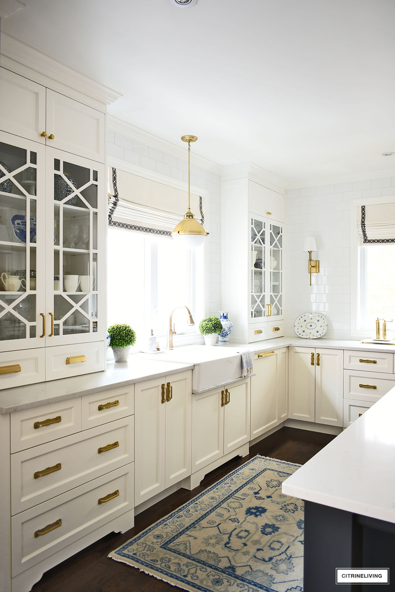
Our new upper cabinets are truly spectacular, and with the added tile wall and dishwasher panel, it feels like a brand new space.
The continuous flow of cabinetry spans this entire wall for a beautifully seamless look.
We love how much lighter and brighter it feels in here.
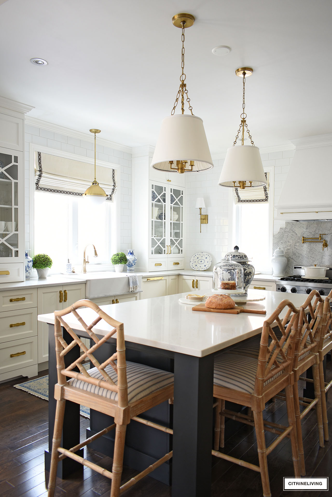
We recovered our bar stools in this gorgeous, classic ticking stripe, which I also shared in my progress blog post. I love the traditional feel it brings to the space.

STRIPED FABRIC
Our latest fabric to recover our kitchen barstools! I love the vintage, classic stripe.
SHOP OUR KITCHEN
Faucet | Sink pendant light | Island pendant lights | Wall sconces | Bar stools | Striped fabric | Kitchen rug | Pot filler | Brass rail | Blue and white vases | Blue and white platter | Brass salt mill | Brass pepper mill | Topiaries | Monogram linen towels
A LOOK AT OUR KITCHEN BEFORE
I snapped these quick phone pics shown below, before our project started – I wanted to show the ‘every day’ in here, not styled, retouched pictures you usually see.
I loved our open shelves, but that was about it. I also felt that our dishwasher needed to be paneled, so we could achieve more brightness over here.
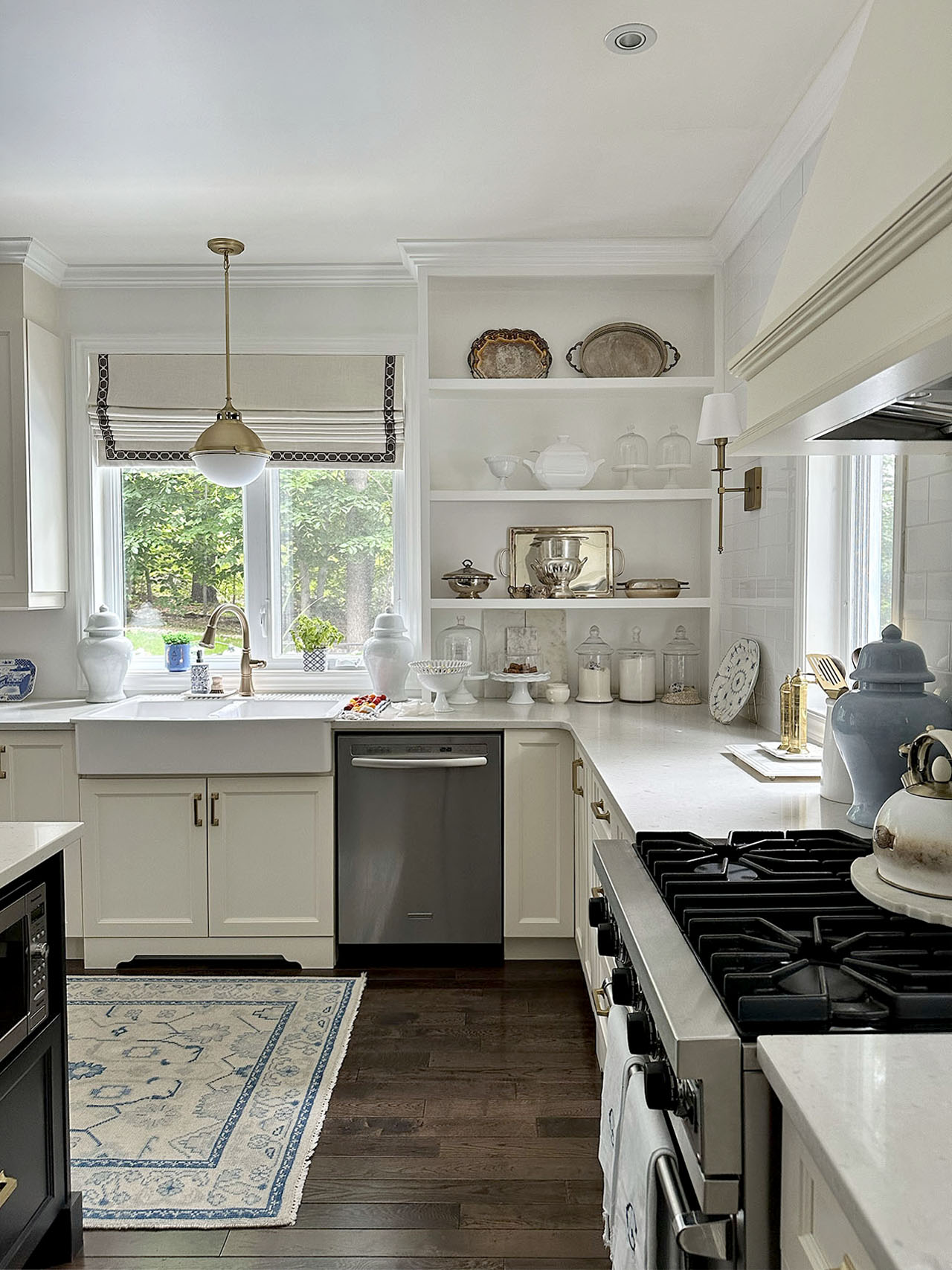
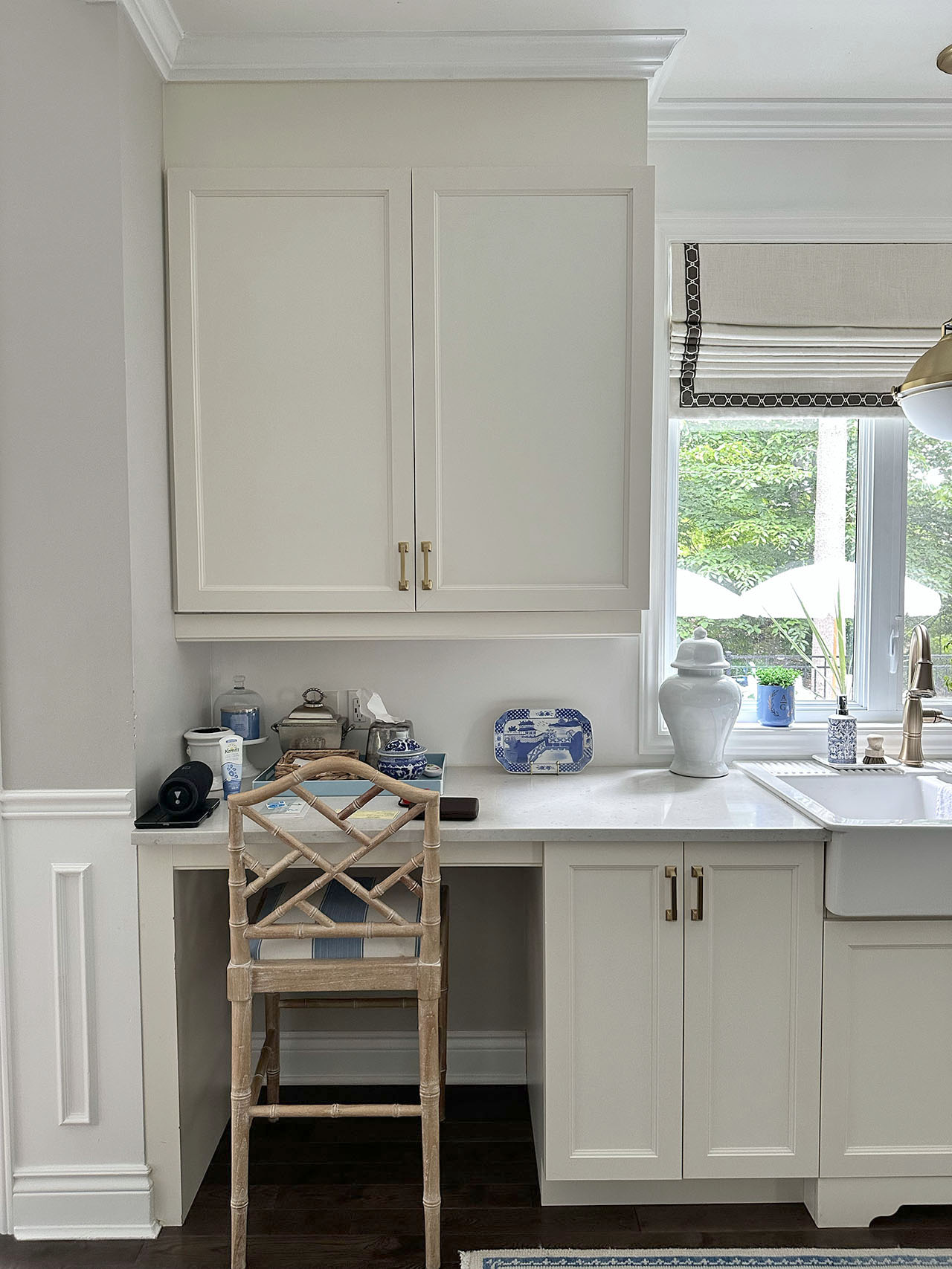
Our desk was cumbersome and dark as well and really did not function much more than collecting stuff. What a difference some thoughtful details make! Just adding drawers for more storage and paneling the dishwasher alone gave us a whole different look.
OUR GORGEOUS BRASS HARDWARE
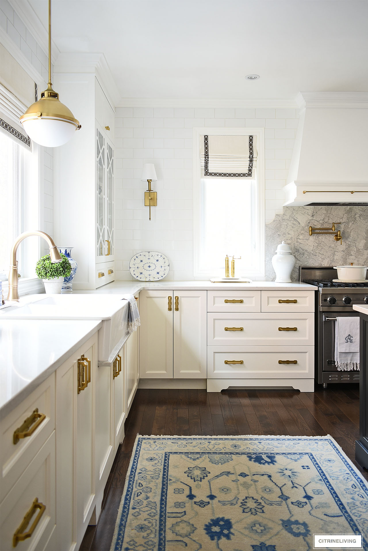
One of my favorite companies to partner with is Belwith-Keeler – I’ve worked with them several times in the past – in this white and grey kitchen (our good friends’ home), our kids bathroom refresh, and our previous kitchen update.
They have a gorgeous selection of hardware, in every style and finish imaginable.
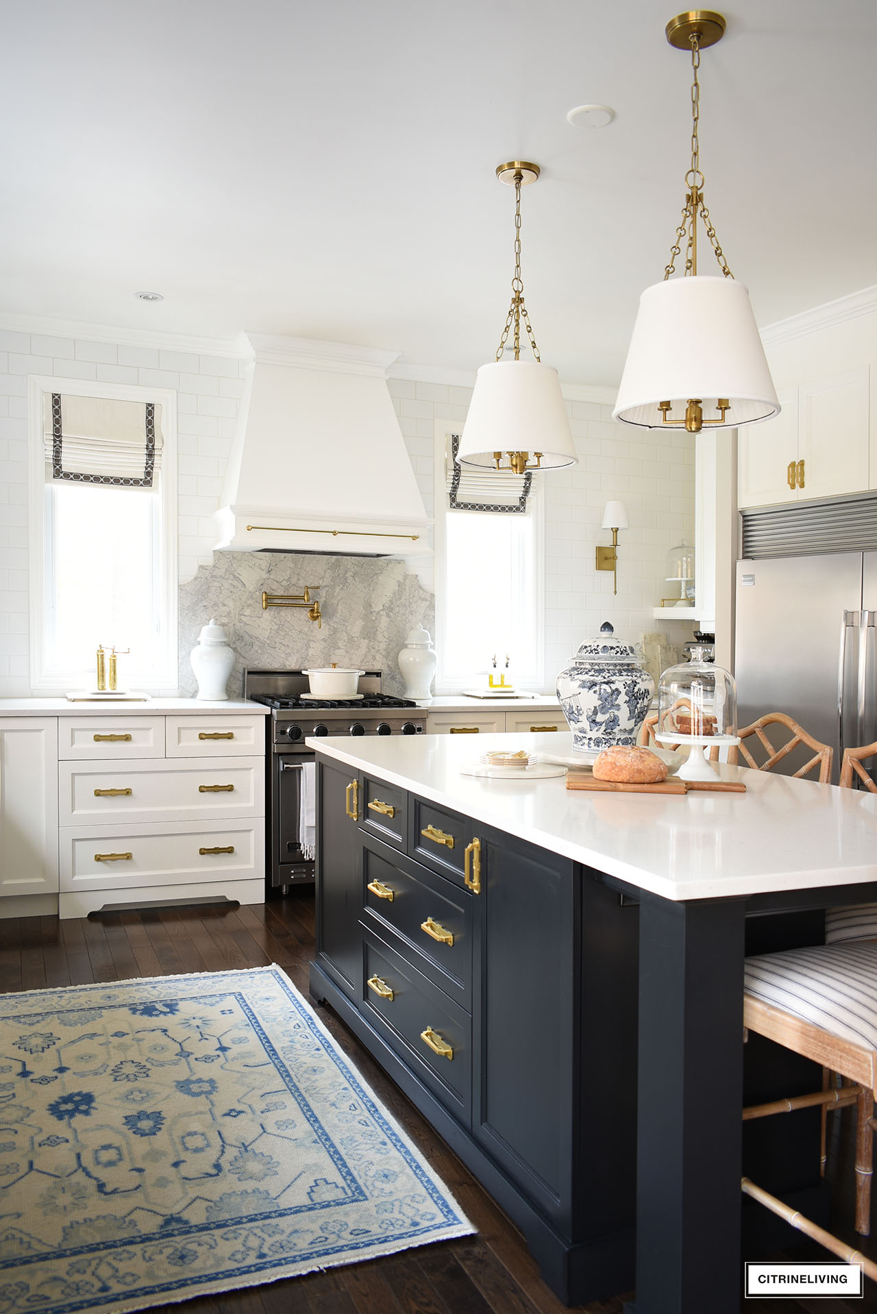
For our hardware, we chose a beautiful mix of styles for a truly original and unique look.
I wanted something that would elevate our kitchen, complement some of the design details in our space and something that would speak to our own design aesthetic.
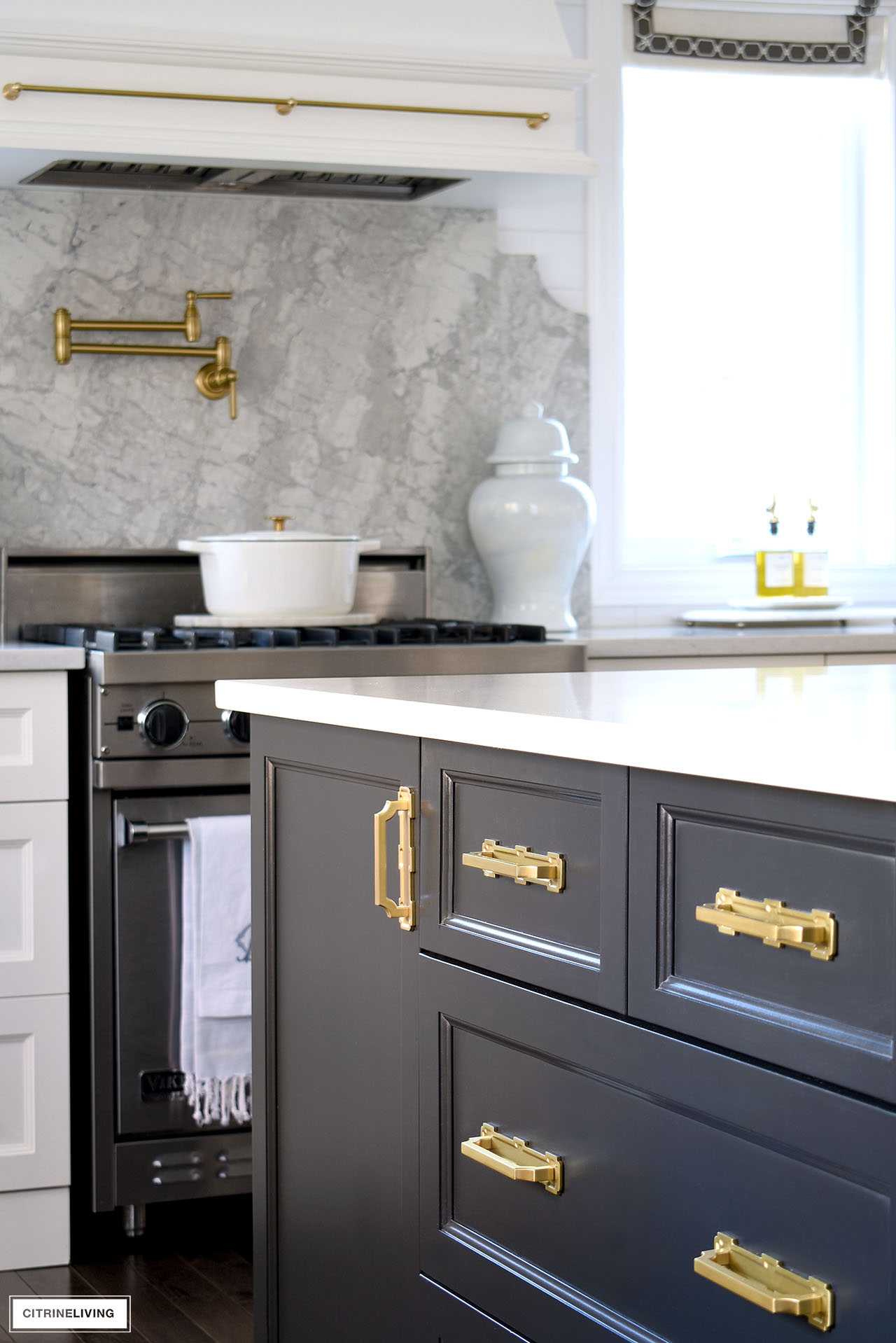
On all of the lower cabinets and drawers, our dishwasher and upper cabinets by the fridge, we chose to combine a mix of two different styles.
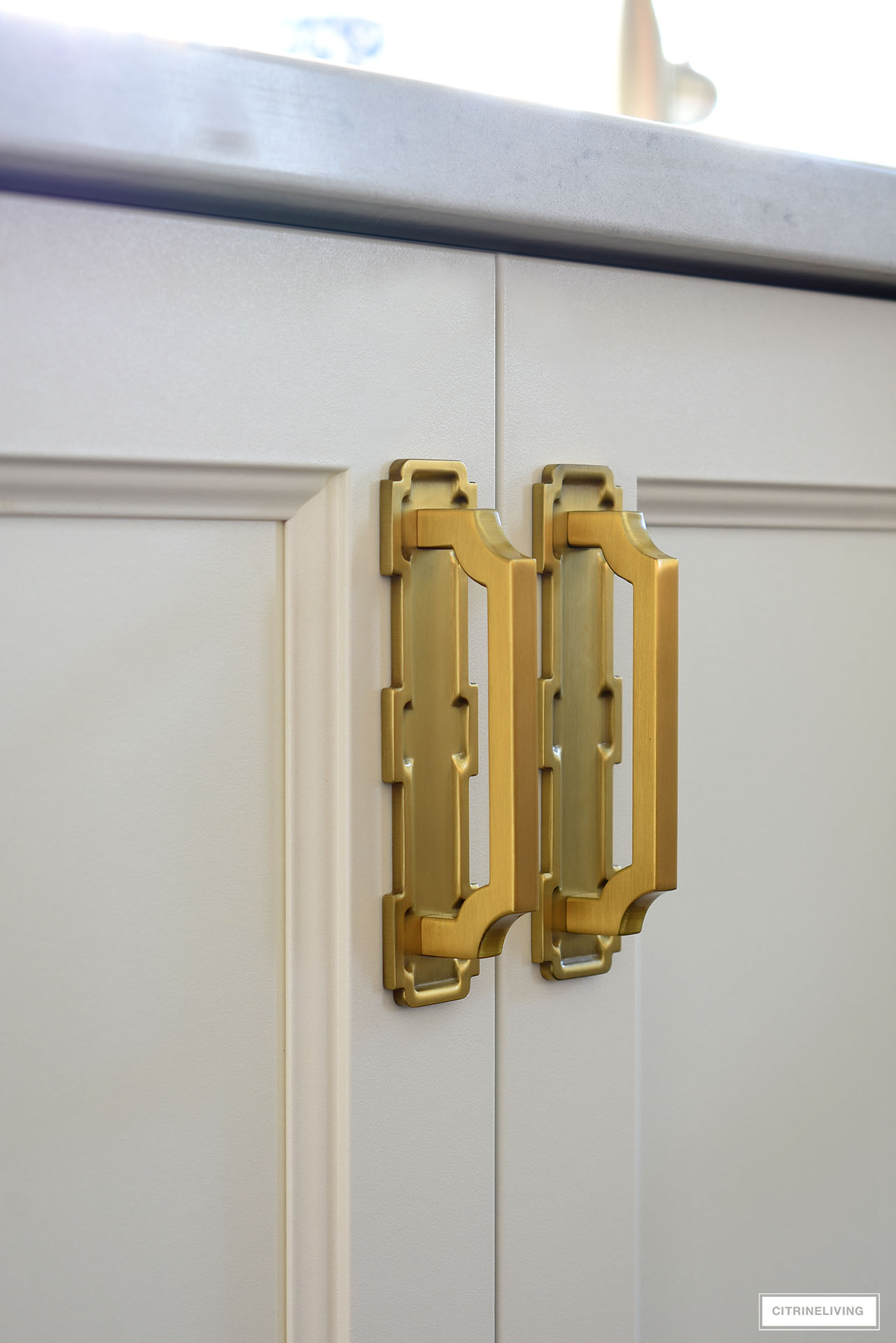
We chose these gorgeous Coventry backplates combined with these elegant Monarch pulls in two sizes – 128mm on all of our drawers and 96mm on all of our existing cabinet doors.
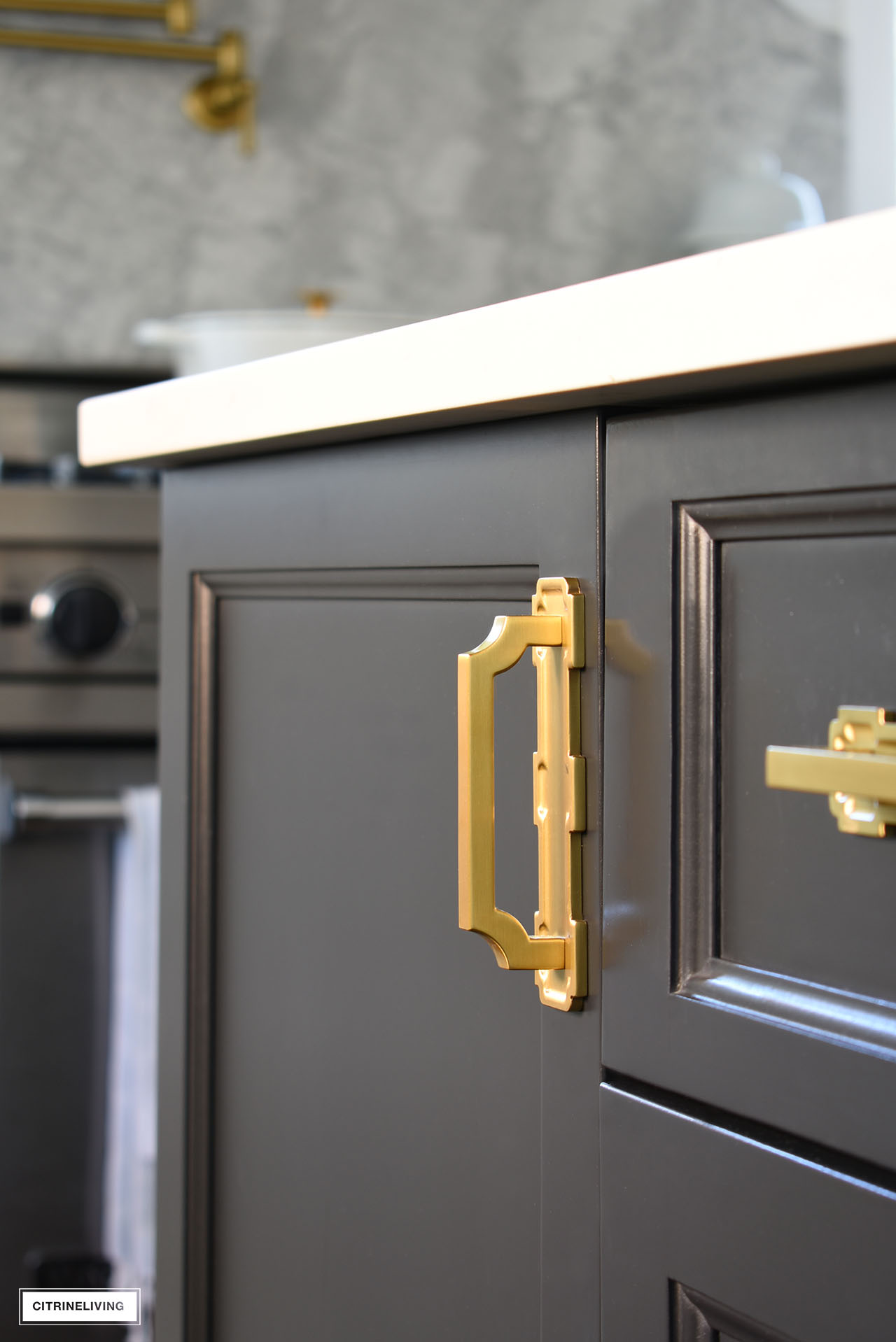
Did you notice how the shape of the pulls echo the shape of our new backsplash? I also find they lean toward a Chinoiserie feel that complements our new trellis cabinet doors. The special details of the backplates also have that same feel.
It’s a truly stunning mix and we couldn’t love this chic look more.
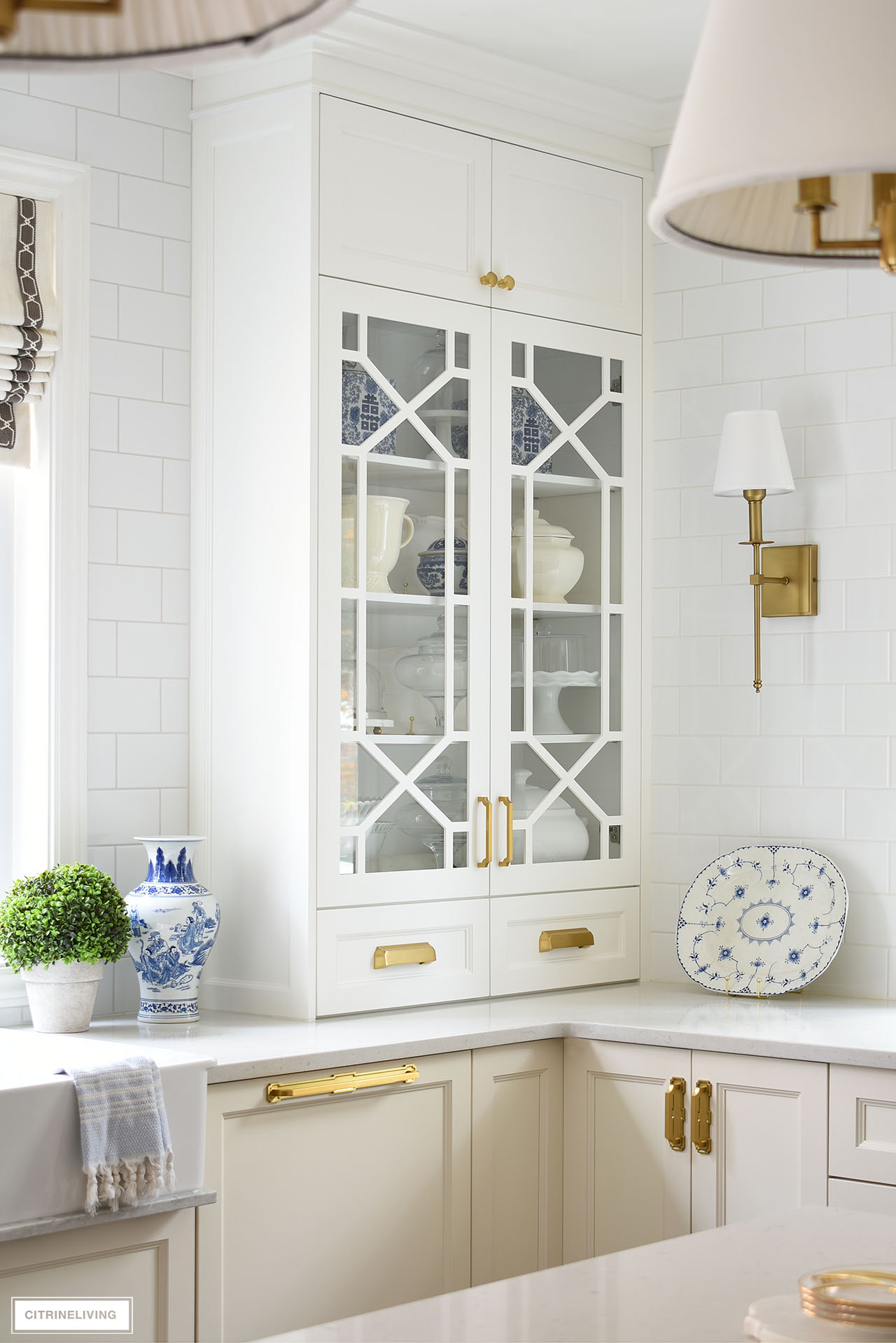
On our new upper cabinets, I wanted to create some visual contrast, since these cabinets are so special. I didn’t want them to have the same hardware as everywhere else.
We used the Monarch pull in 128mm without the backplates, I wanted something a little more delicate for these doors. They look completely different by themselves.
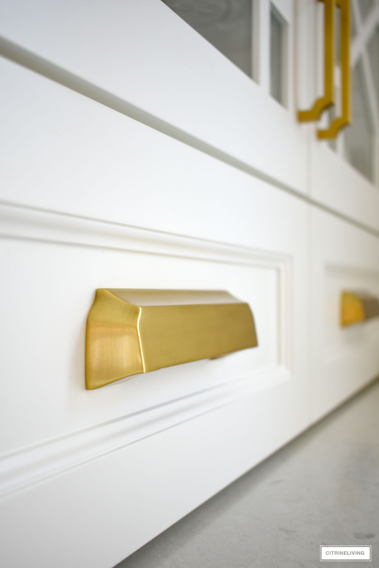
The small drawers are adorned with these beautiful and substantial Studio II cup pulls in 128mm and the top cabinet doors have these simple and chic Heron knobs in 1 1/4″.
All of our hardware is in the brushed golden brass finish – just gorgeous against every paint color in our kitchen.
We chose this mix of styles to bring some visual interest to our new kitchen and to create a truly special visual experience. We love it all so much!

GET 10% OFF AT HICKORY HARDWARE
Designed by the same designers at Belwith-Keeler at a more affordable price point.
Our kitchen used to be adorned with these beauties in chrome! I love the satin brass finish. They’re a very affordable option for any space! Click below to shop and use code CL10 to get 10% off!
OUR NEW BACKSPLASH, POT FILLER + BRASS RAIL
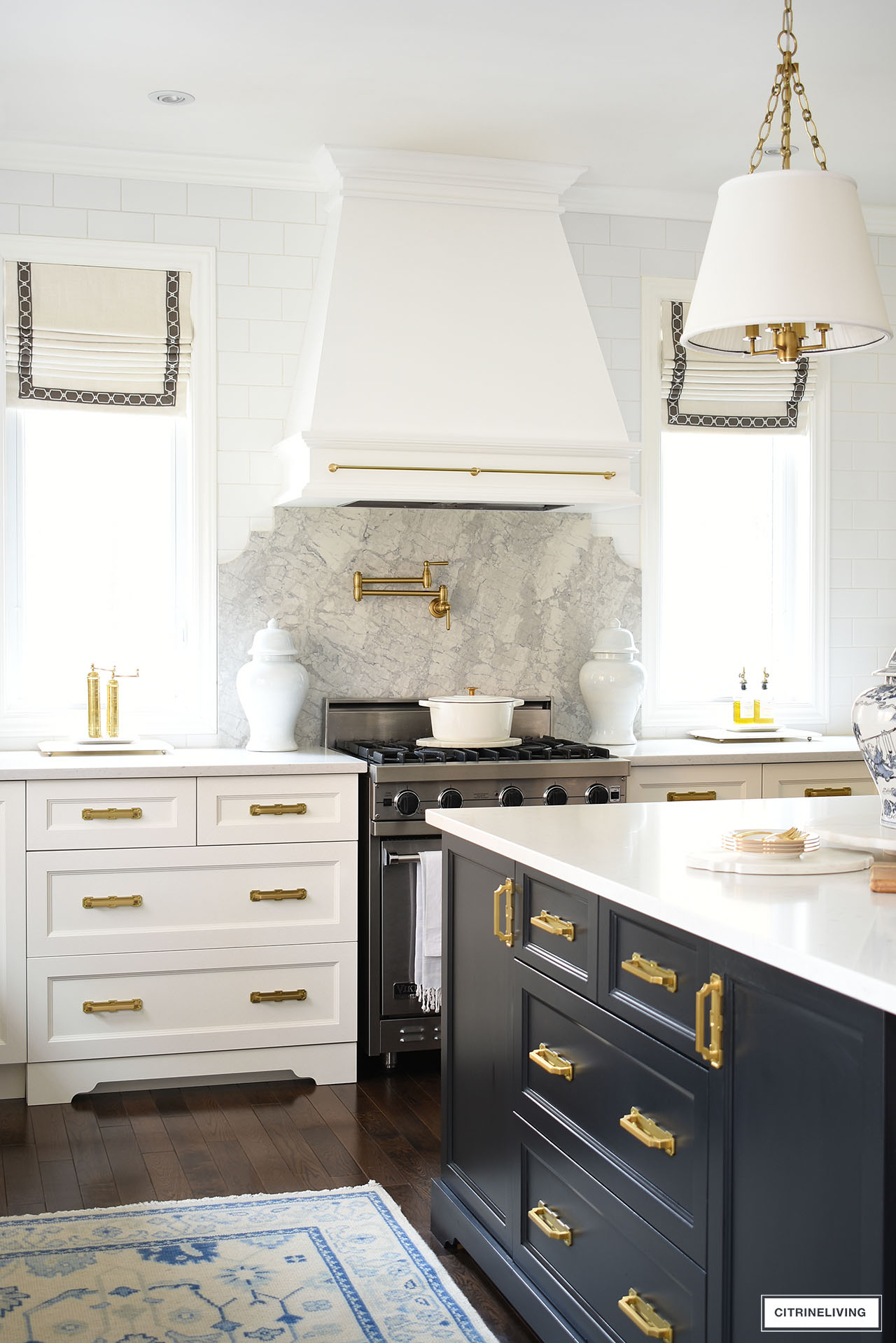
When we first decided to move forward with this kitchen update, it was only supposed to be our new upper cabinets.
Of course, with any home improvement project, it gets bigger as you move along!
We decided to increase our budget and add a custom designed quartz backsplash and brass pot filler.
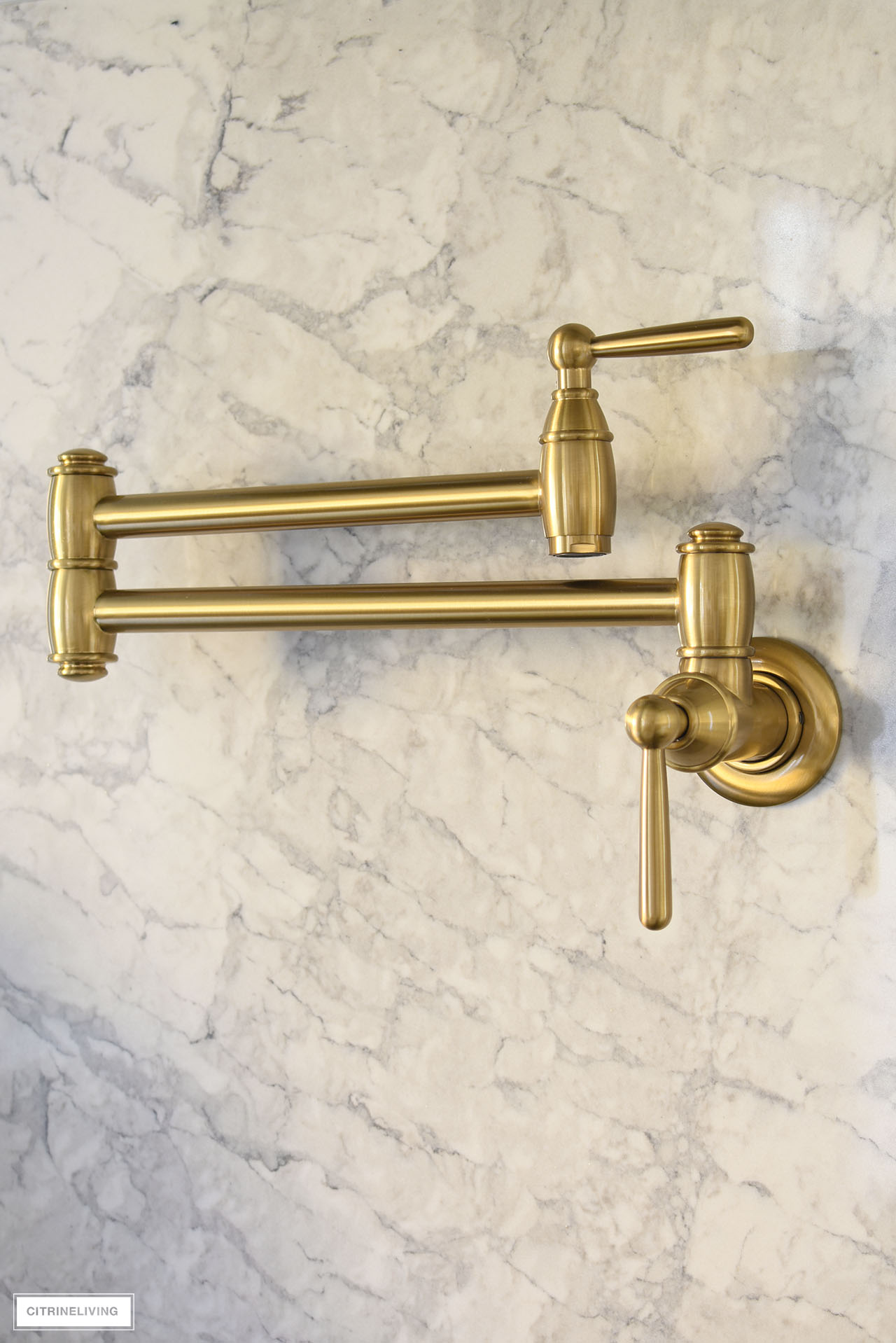
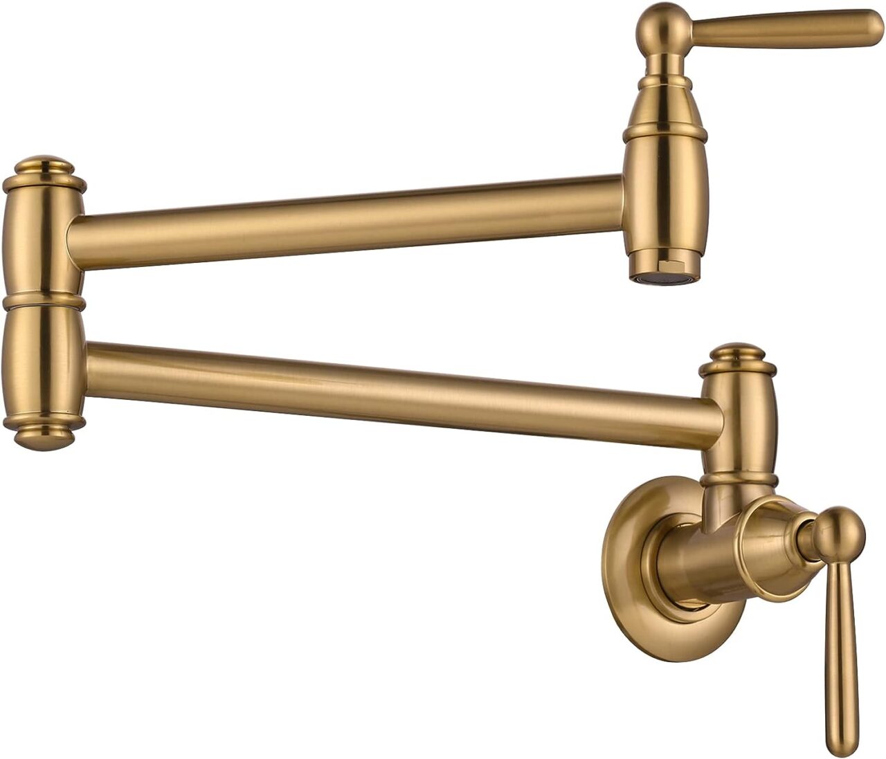
OUR BRASS POT FILLER
This simple, classic style is perfect for our kitchen – and super affordable!
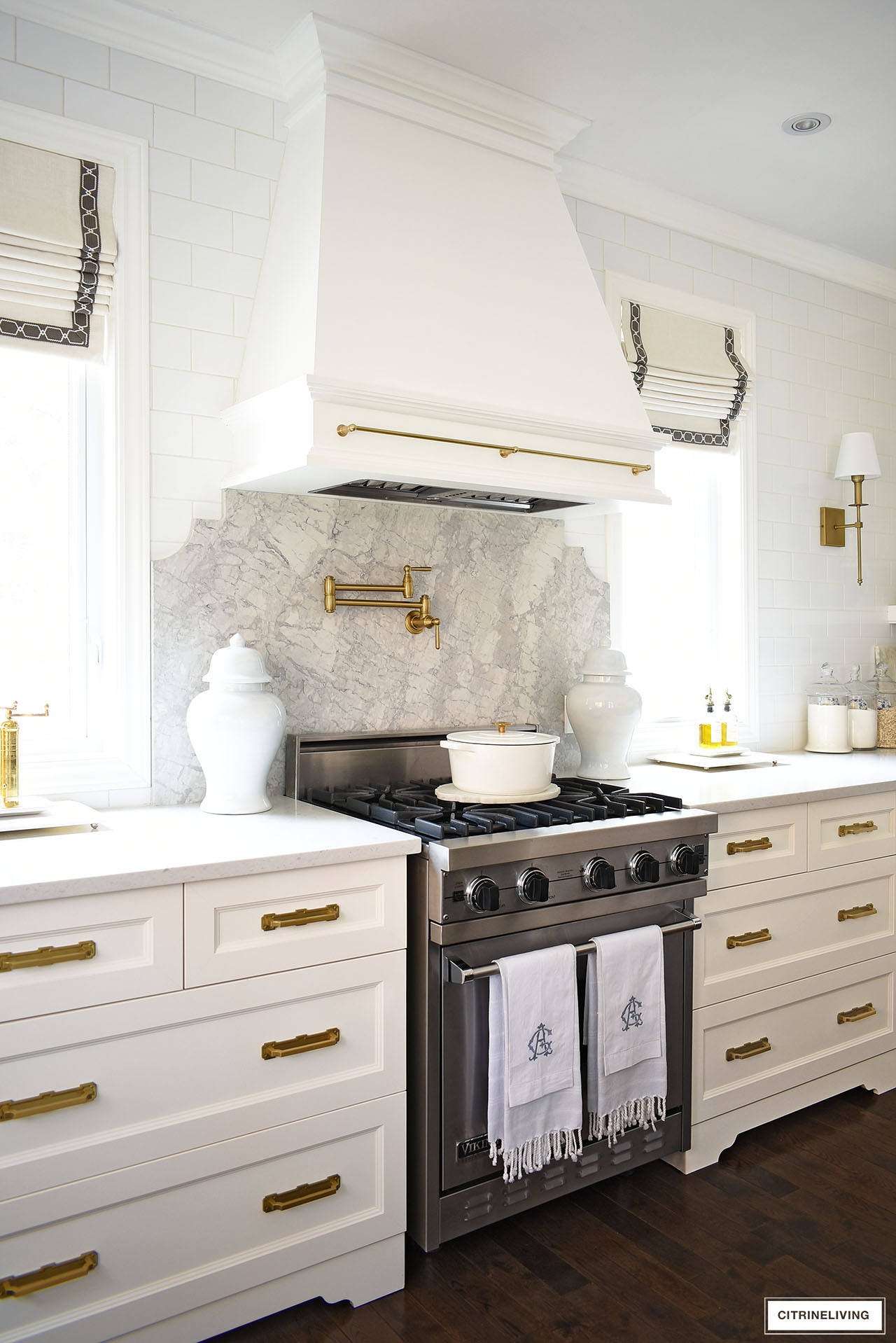
It’s amazing how much more elevated this view of our kitchen is now. I love the contrast of the Bahia quartz against our existing white subway tile wall and Misty Carrera quartz countertops.
The brass pot filler just pops against the grey quartz.
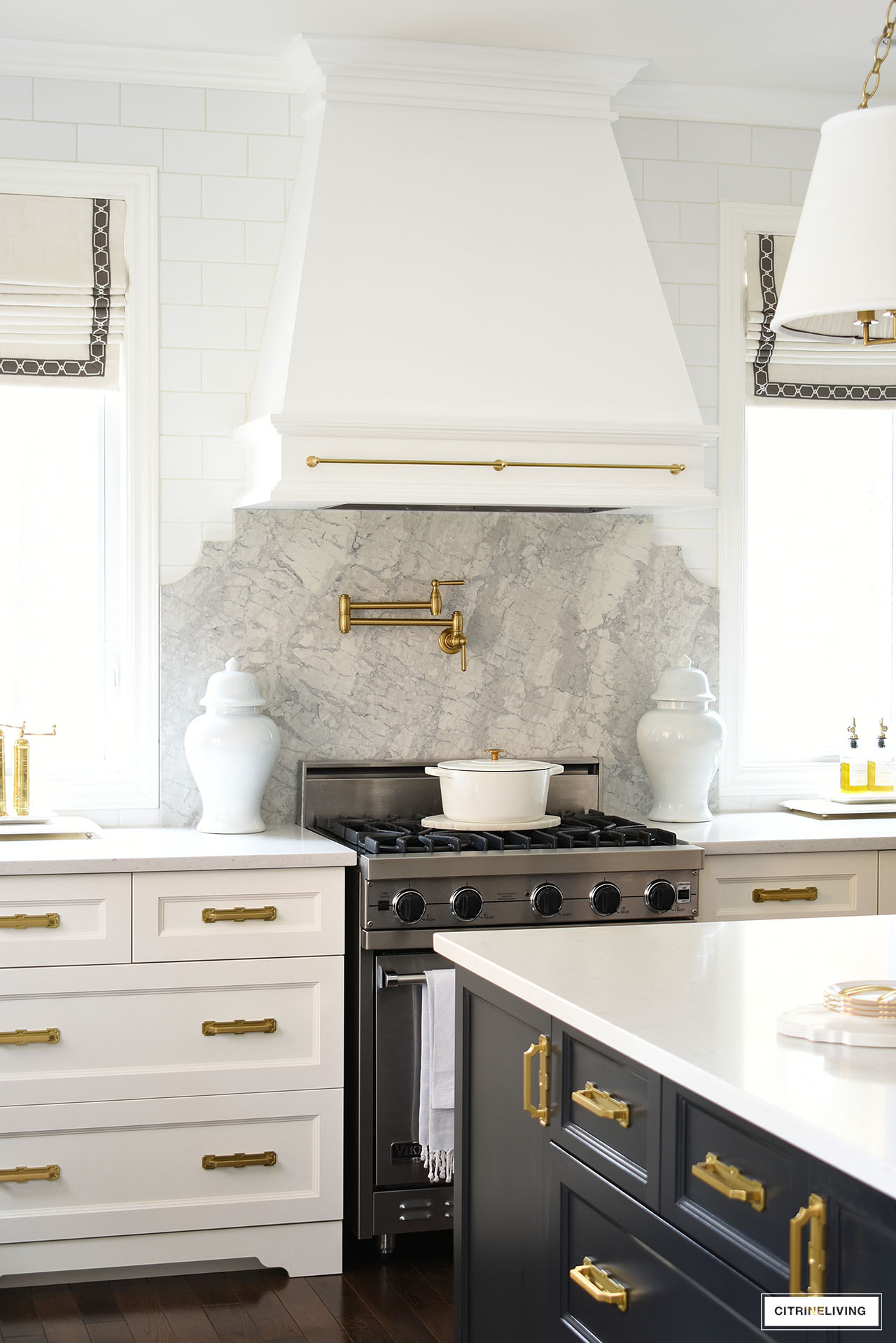
I mentioned above that we painted our hood that was ivory before (and always looked SO yellow), and we also installed this gorgeous brass rail detail for a vintage, old-world look that I love so much.

OUR BRASS RAIL
We’ve added this brass beauty to our range hood and also to dress up some shelves for some vintage charm.
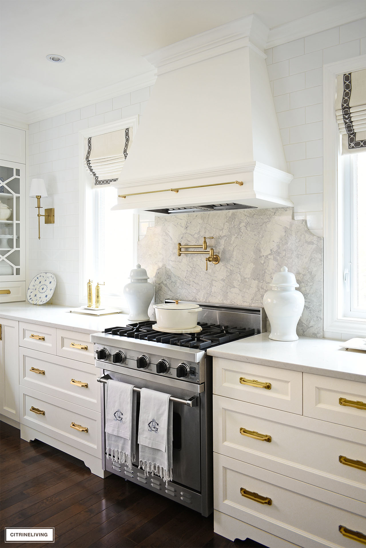
Our stove is a standard 30 inches – I dream of having an eight burner range one day – but to avoid major demolition and keep our cost down, we decided to keep what we have for now.
Our new backsplash helps to visually expand this space, so the range actually feels a little larger than it is. So, until we build our dream home, a 30 inch range it will have to be!
I’m absolutely thrilled with the results.
MORE KITCHEN UPDATES WITH BIG IMPACT
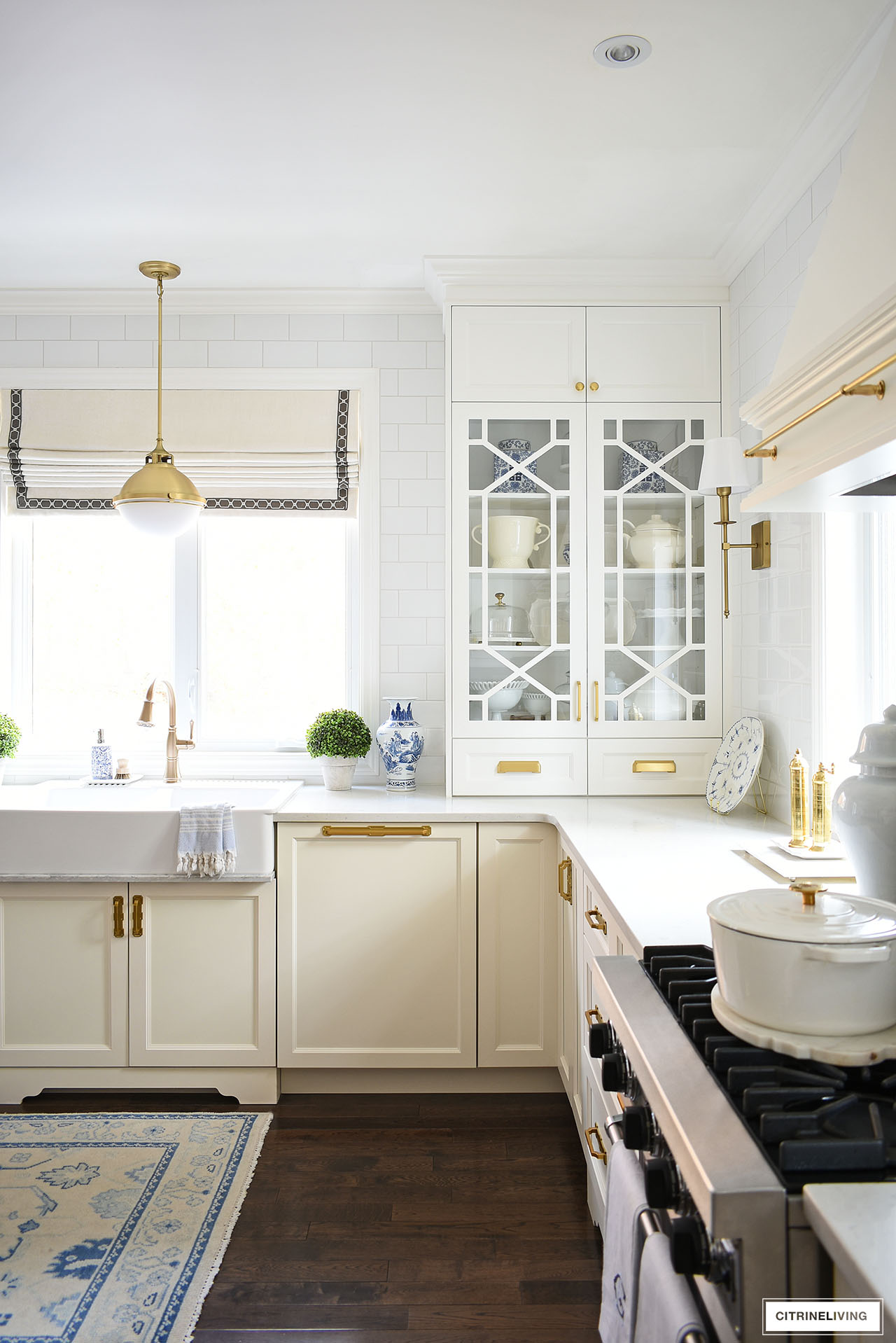
Even though we were on a budget, we decided we wanted to elevate the overall design of our kitchen with a paneled dishwasher.
We sold our old dishwasher, bought a new one with controls inside, at the top of the door, and had a panel made to match everything – the same color and finishing as the new drawer unit.
We followed this video tutorial to install it ourselves.
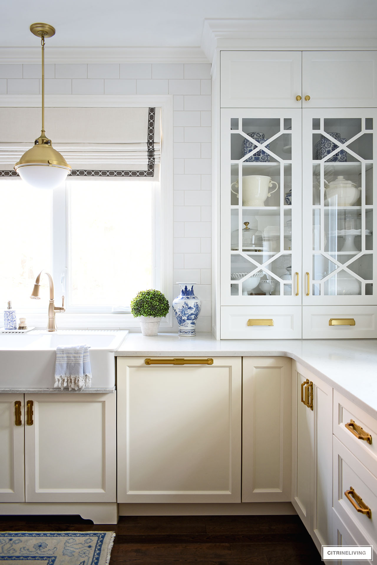
It was a last minute decision and we had to wait a long time to receive it – but it was so worth the wait!
It is so gorgeous and creates a totally seamless look that I felt was so important…so much brighter and cleaner.
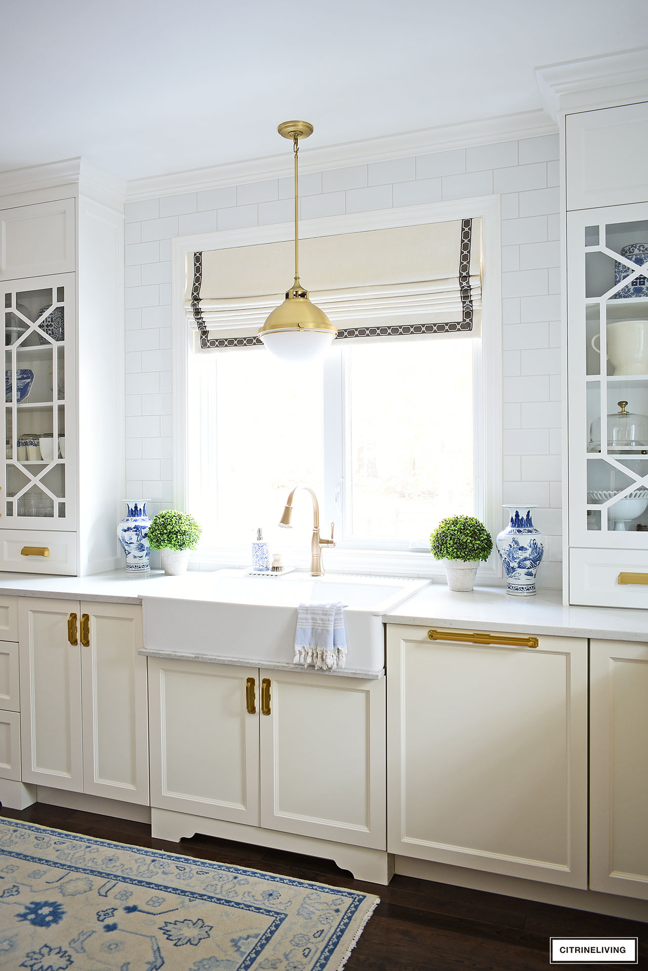
We tiled the wall around the window to match our existing tiled wall for continuous visual flow. We had just enough left over from when we built our home fourteen years ago!
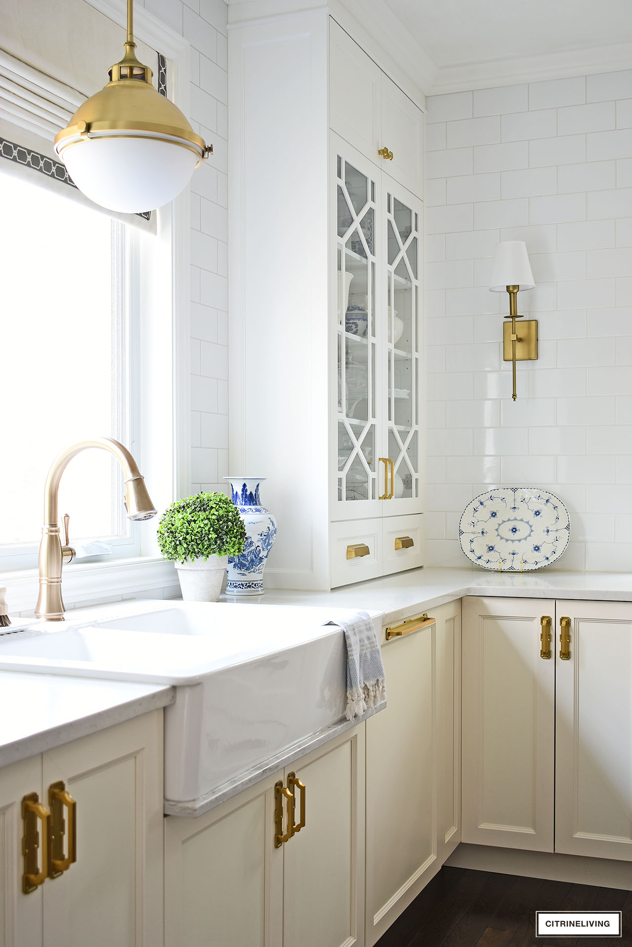
We also had a sink drip rail made to match the quartz backsplash, another small detail that elevates the entire look of our kitchen. There was just enough space under the sink, for a perfect fit.
Eventually, I would love to tile the entire kitchen – on the opposite side from what you see here. I’ve always loved those old, European kitchens that are fully tiled everywhere.

That wraps up our kitchen reveal! If you’re looking to make some kitchen updates, I hope you’ll find some ideas and inspiration here today.
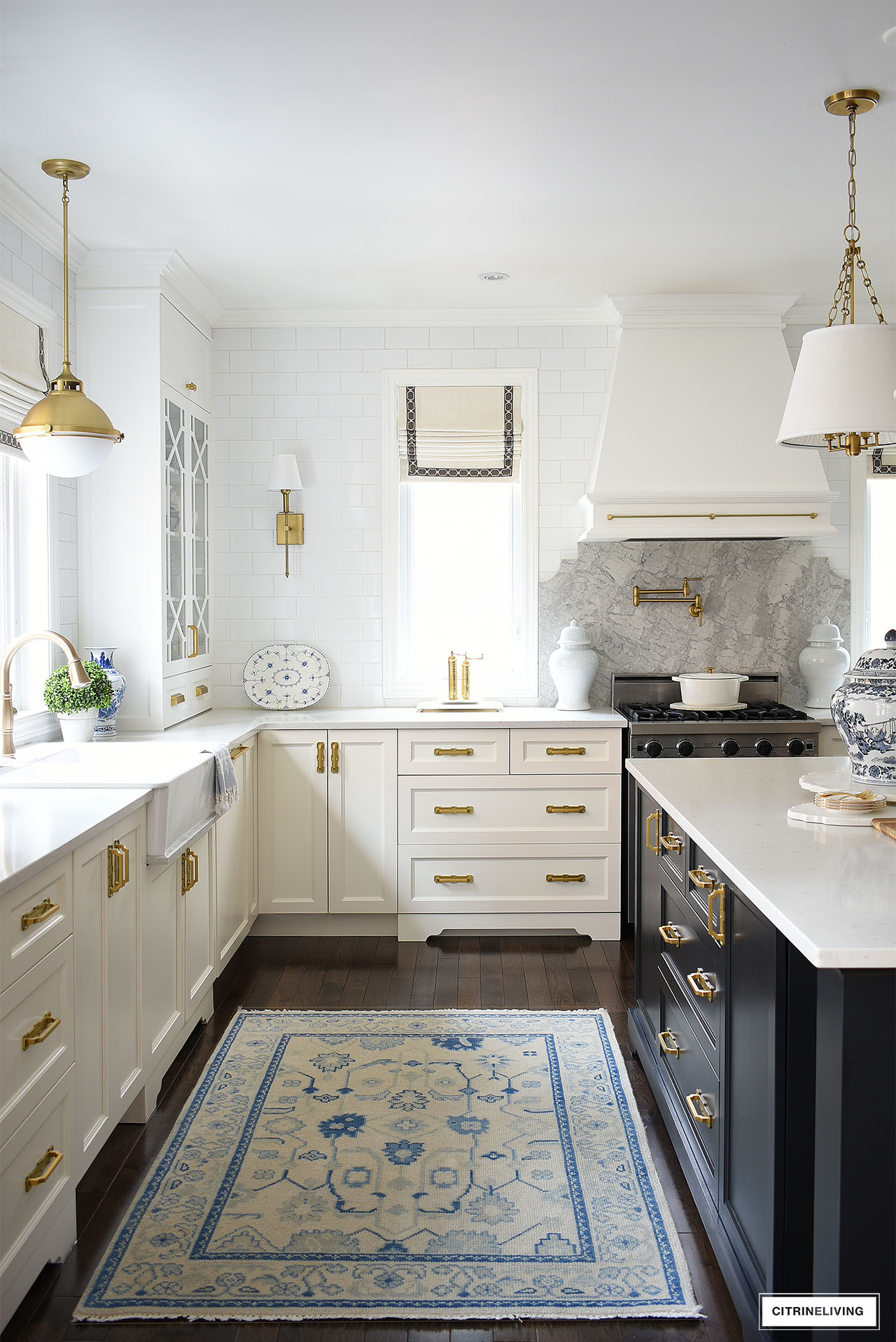
I’m so thrilled to have finally been able to share our kitchen reveal with you – I hope you love it as much as we do! We put so much thought and attention to detail into this space. It’s amazing what small details can do and how they add up to create something truly special, personal and stunning. Thank you so much for reading with me. xo

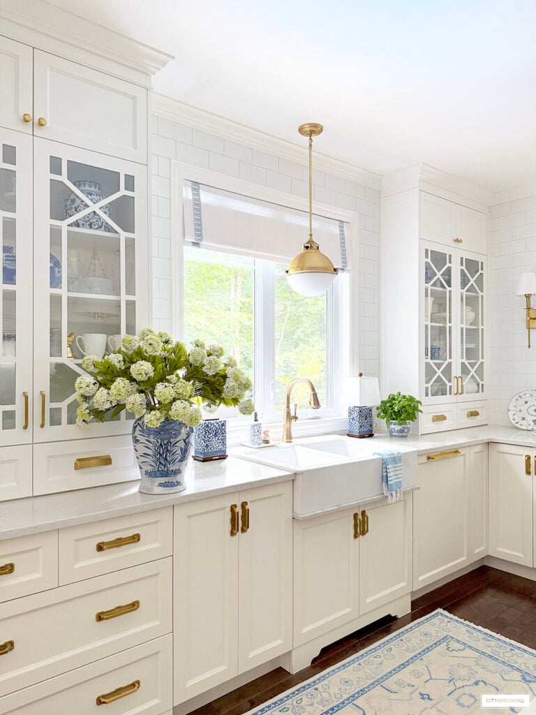
Thank you very much, I truly appreciate it! These shades are custom made by Martha and Ash! xo
Everything is so bright and beautiful!
Would you mind sharing where you purchased your Roman shades!
Thanks for sharing!
Thank you very much, I’m so happy you think so! Thanks for reading with me! xo
Your changes really did elevate the look. It is lovely.
Thank you very much! It’s 36″!
This is a gorgeous kitchen! Quick question. How wide is your pot drawer to the left of your range?
I’m space challenged!
Hi Amanda, thank you so much for reading with me – I am thrilled that you’re inspired! Ours is the small one, 13″. It really is a gorgeous light fixture! If you’re using it as the main light you might want to try the medium! Hope this helps! xo
Hi Tamara, your kitchen is stunning! Is the pendant light over your sink the 13” one or the 18”? I’m considering the same one now that I’ve seen it in your kitchen but I’m unsure of the size I would need. My kitchen is only 11×11. It would be my main light in the centre of the room so I would need to shorten the downrods. It’s beautiful in your kitchen and I love it even more now that I’ve seen it in your photos. Thanks in advance!
Thank you Deb! I’m so thrilled you like it! I am so grateful for your very kind words! Lots of planning went into every detail. We are so happy with the results!
Thank you so much Sally! We are so happy with everything, it feels like a completely different kitchen! Thank you for reading with me today! xo
Marty you are so kind my friend, thank you so much for the very kind words! xox
Wow, your kitchen is stunning. Every little detail is so well thought out. I love it all. What a fabulous kitchen.
What an amazing transformation! I love, love, love your upper cabinets, and the hardware, and the oh so useful lower drawers rather
not so useful desk- you can never have too much drawer/storage space in my opinion. The custom color on your island is beautiful, too. Gorgeous kitchen!
When I first read ivory lowers with white uppers, I thought “what?!”
It’s genius! Those new chinoiserie fronts are to die for! And the hardware…you truly have an educated eye for this! Thank you for sharing this beautiful room.