THE KITCHEN
I haven’t had time to work on a full post for you…we’re into the full swing of summer around here. We just had some vacation time, but we’re already into swimming and golf lessons everyday. I’ve also been working on my Instagram posts a lot lately and it really takes up the little time that I have to work on all of this..so, if you don’t follow me on IG (which you should, so please do!!), you haven’t seen these latest shots of the kitchen. I’ve been getting a little bit better at my photography skills and I think these look much better than any of the other shots I have featured here on the blog! I do promise I will get to a new post as soon as I can. For now, I hope you enjoy these pics!
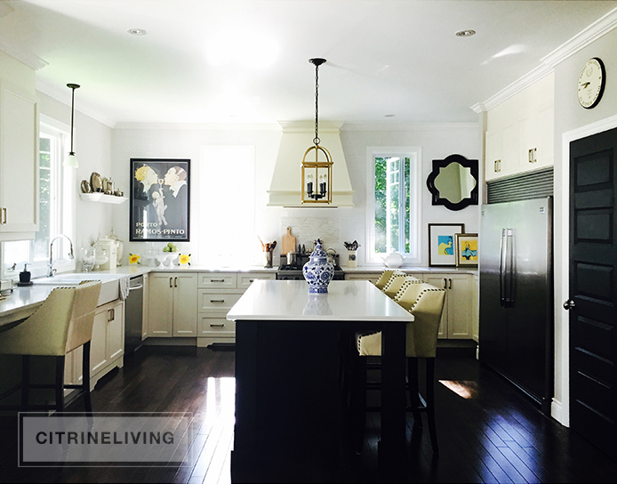
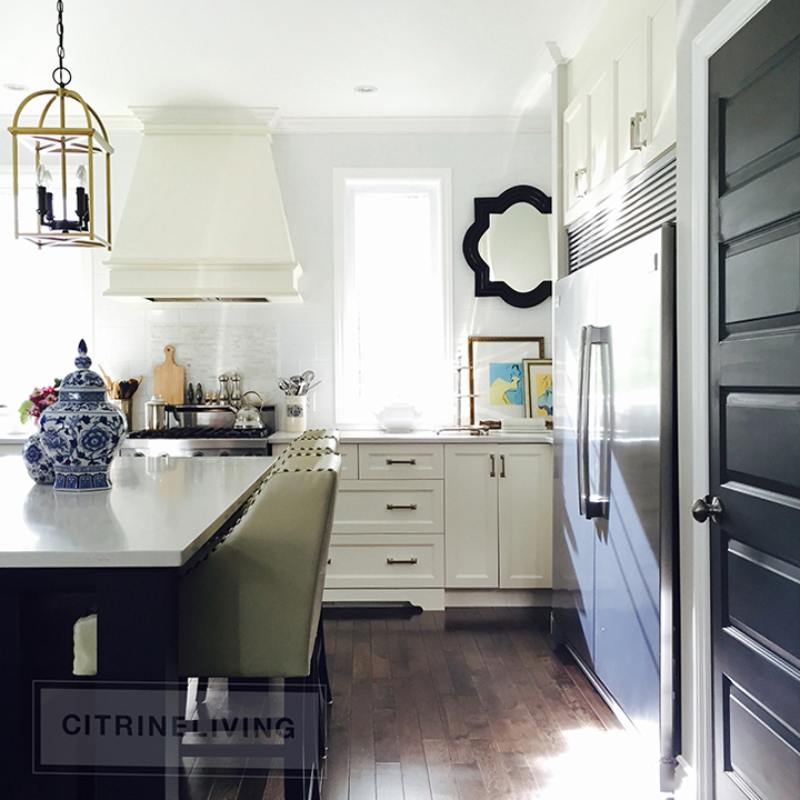
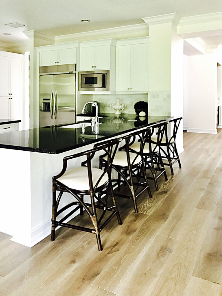
I wanted an ‘old-world-meets-today’ European feeling in our kitchen, so it was very important to me that it felt new with a nod to the past. This was the main reason for a focal wall with no cabinetry so the range hood would stand out. The stools were actually purchased before we even broke ground and they were the inspiration for this whole space…yes, my husband thought I was completely crazy! But I think I proved him wrong!
The fridge is a side by side all-freezer, all-refridgerator. It’s wonderful having so much space for food storage and it gives the kitchen an upscale designer feel. If you can afford the space, I strongly recommend it! Ours is made by Fridgidair.

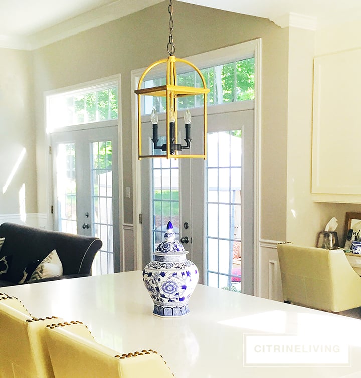
I love working at this island. I can see everything and everyone while I’m working here. When the kids are helping cook or bake there’s plenty of room for all of us to work together. We get great family time here!
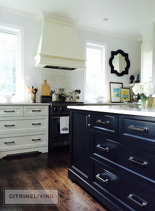
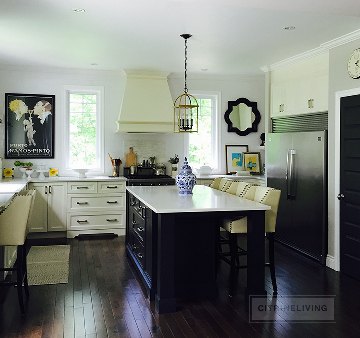
The island is a good size (7′ x 3.5′) and because it’s mostly drawers, it makes up for the lack upper cabinets. All of our dishes and silverware are in here. We chose hardware that was very affordable (it was within the budget from the builder) and used handles on all of the cabinet doors and draweers vs. knobs. I feel it creates a more sleek and sophisticated feeling in our kitchen.
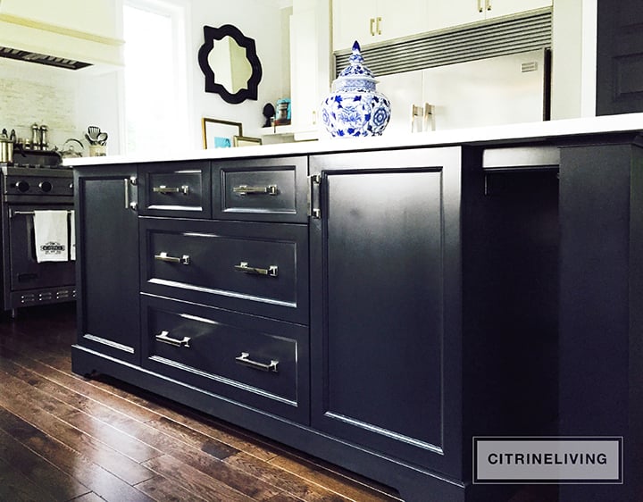
We don’t have a breakfast nook, so the island serves as our table at every meal… Meal time is very casual herel! We can fit up to 10 people when entertaining and it’s great for kids’ parties too. I can also prep food at one end during a party and use the other for buffet-style meals as well. No matter how many people come over, this is THE spot for gathering. It was a great design decision!
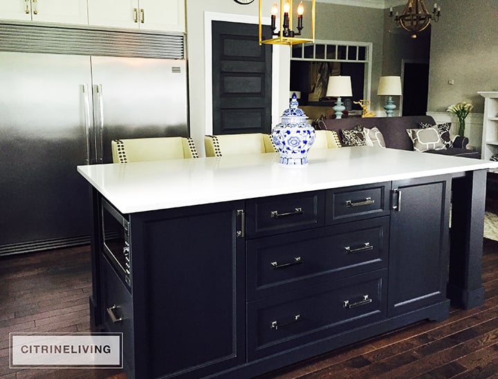
It is a true workhorse and is the best feature of the whole space!

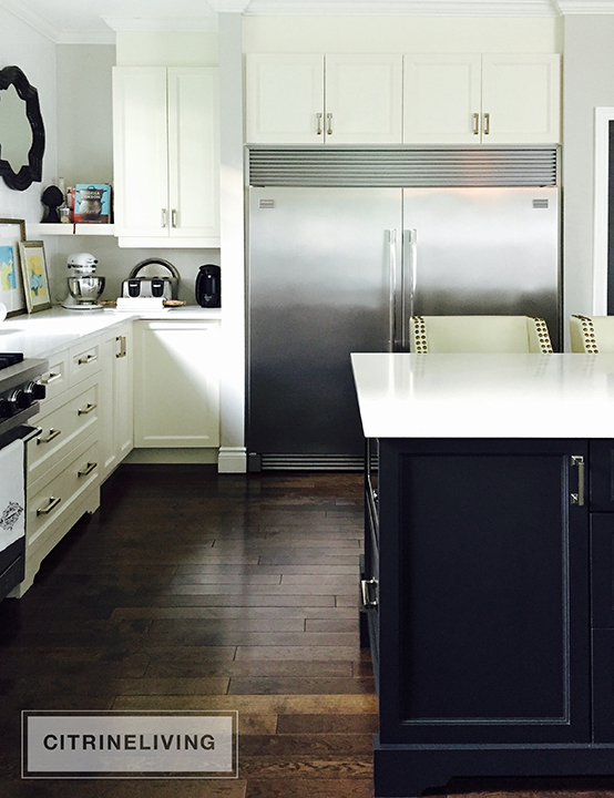
Here’s a look at the refrigerator wall. We keep our small appliances tucked in the corner and my cookbooks on the shelf above. My artwork and cookbooks add a nice touch of color over there.
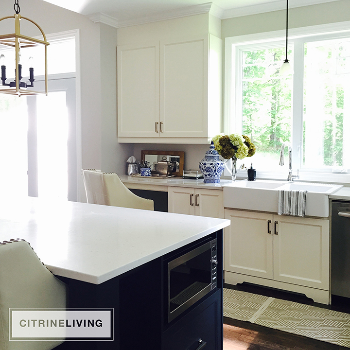
The sink is another one of my favorite things. Because it’s from Ikea, I was able to get the look I wanted without breaking the bank. It’s only about $400 which is a steal compared to the high-end options out there. It’s a great alternative!
The desk in the corner is not my favorite… Everyone needs a desk space, that’s for sure, but it seems to get cluttered very often and it stresses me out! I recently organized all of my paperwork in the cupboard below, which is a big plus, however, it’s still one of those spots that loves to catch all the clutter! I’ll need to deal with that somehow!
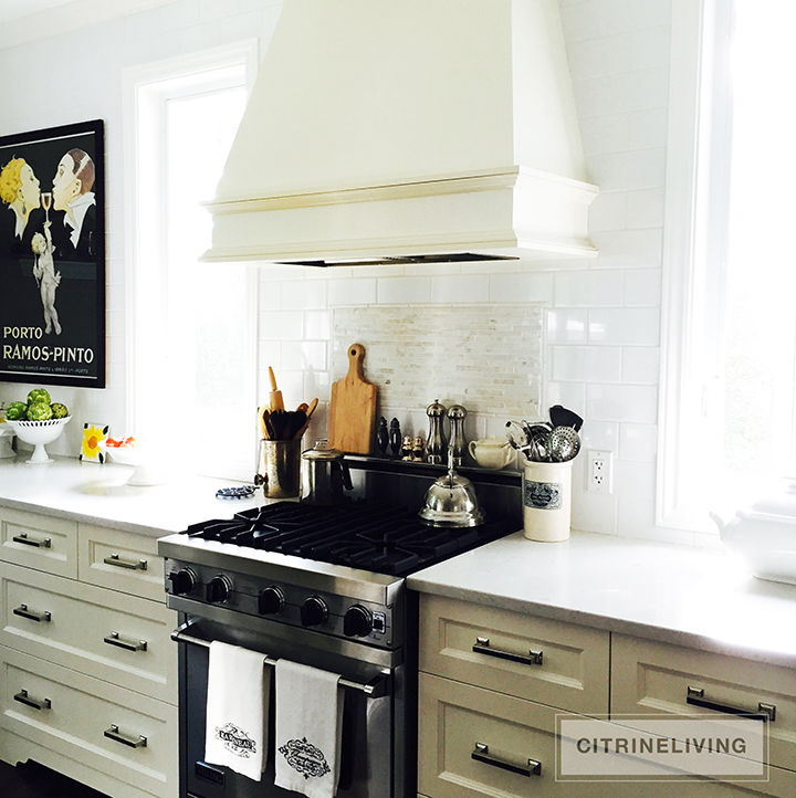
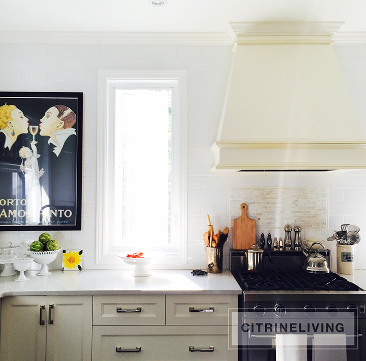
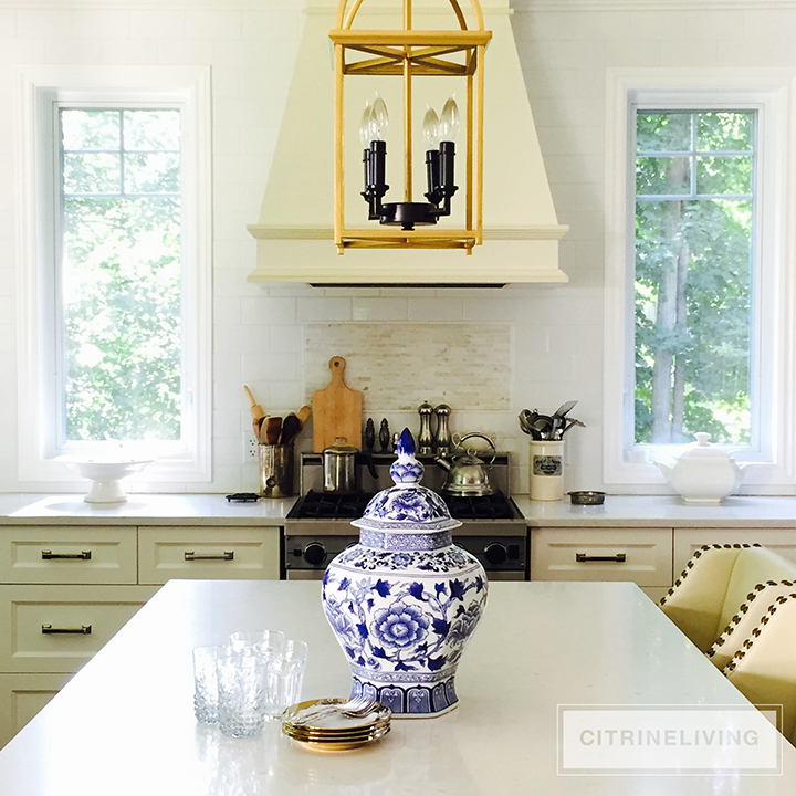
I knew I wanted the focal wall to have no upper cabinets. It makes the space feel larger and I love having the windows flanking the stove. We tiled the wall with inexpensive subway tile from HomeDepot. I had a marble backsplash inset done with tile from HomeDepot as well. For about $400, we created a high-end looking feature wall that makes a strong statement, yet still doesn’t overwhelm you. I love it!
Like the rest of the house, we were on a limited budget so we found ways to maxlmize the style factor without overspending. We splurged on appliances and counters (these are quartz) but saved in other areas, like the tile and the amount of cabinetry we used – our pantry is a closet rather than cupboards, which can be challenging when it comes to organizing at times…that’s another post for another time!

We chose to have as many drawers as possible in the space. I love the look, especially on each side of the stove – plus you get much more storage space than you do with cabinets.
That just about wraps up my kitchen tour! I hope you enjoyed it and found some interesting tips for yourself! I’d love to hear from you…leave a comment below or send me an email at inspiration@citrineliving.com. I hope you all have a great week and I hope you enjoyed this post too! I will try my best to be back very soon with something new! xo
PS – I’m still tweaking the look and feel of the blog so please excuse the different sized logos everhwnere on all of the photos!

What color did you paint your cabinets? They are gorgeous!
Hi Tara, Thank you so much for the compliment! Yes, I have Collingwood in all of the main areas of our home. Thanks so much for stopping by!
Hello,
Your home is beautiful! Did you also use Collingswood in the hallway and entryway?
Thank you.
Tara
Hi Laurie! Thank you for your feedback! They’re quartz and I love them because they’re indestructible! Have a great day :)
What is the material of your countertops? Very pretty kitchen…