OUR KIDS’ SMALL BATHROOM UPDATES: NEW HARDWARE, ART + MIRROR
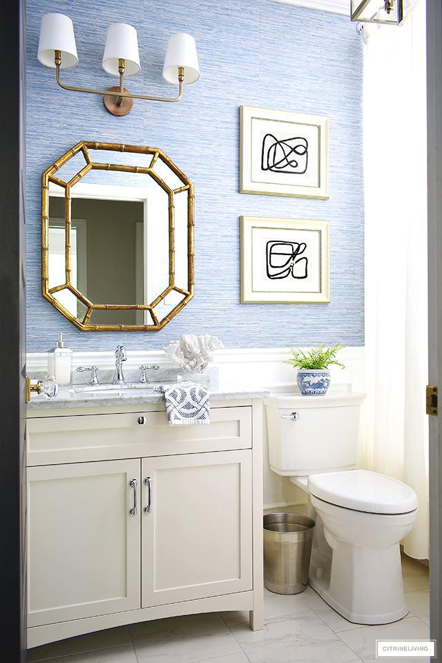
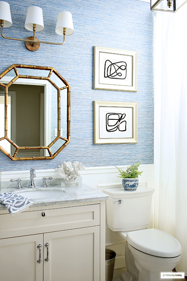
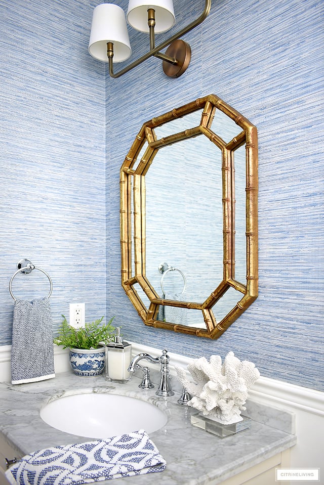
If you’ve been a longtime reader, then you may remember our small bathroom has gone through many changes. This is our kids’ bath, and also the main bathroom for guests. It serves more than one purpose, so I like to keep it functional and neat, and the look of this space is what I like to call ‘coastal-chic’, a sophisticated and casual look. I’m very excited to share some new, small bathroom updates we’ve recently made in here, that complete the look.
I loved it before, and every stage it’s been through! You can visit some of the previous versions of this small bathroom here and here. I wanted to take it up a notch and elevate the look with a few touches that make all the difference. Come in and see more!
I’d like to extend a HUGE thank you to Belwith-Keeler, for providing our new hardware and for sponsoring this post. All opinions are my own. Affiliate links are provided throughout this post – see my full disclosure policy here.
SMALL BATHROOM UPDATES: NEW HARDWARE
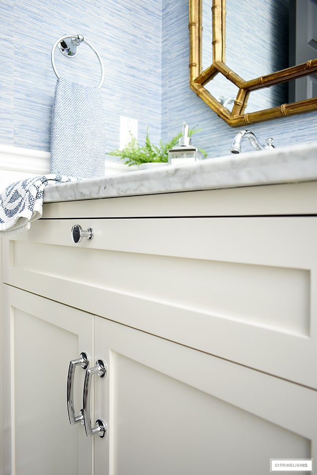
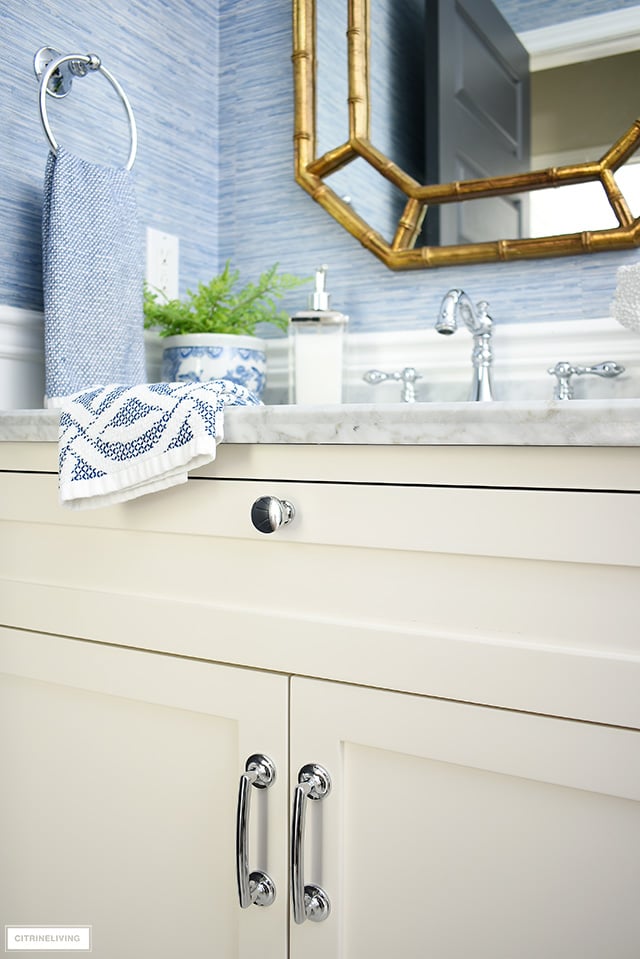
First, I want to share the update we made to our bathroom vanity. Previously, it sported very basic hardware (click here) with small, square knobs on the doors as well as the drawer.
They were nice and clean, but basic. I personally always prefer handles to knobs on cabinet doors and drawers when you can use them, they always add a more luxe and sophisticated look.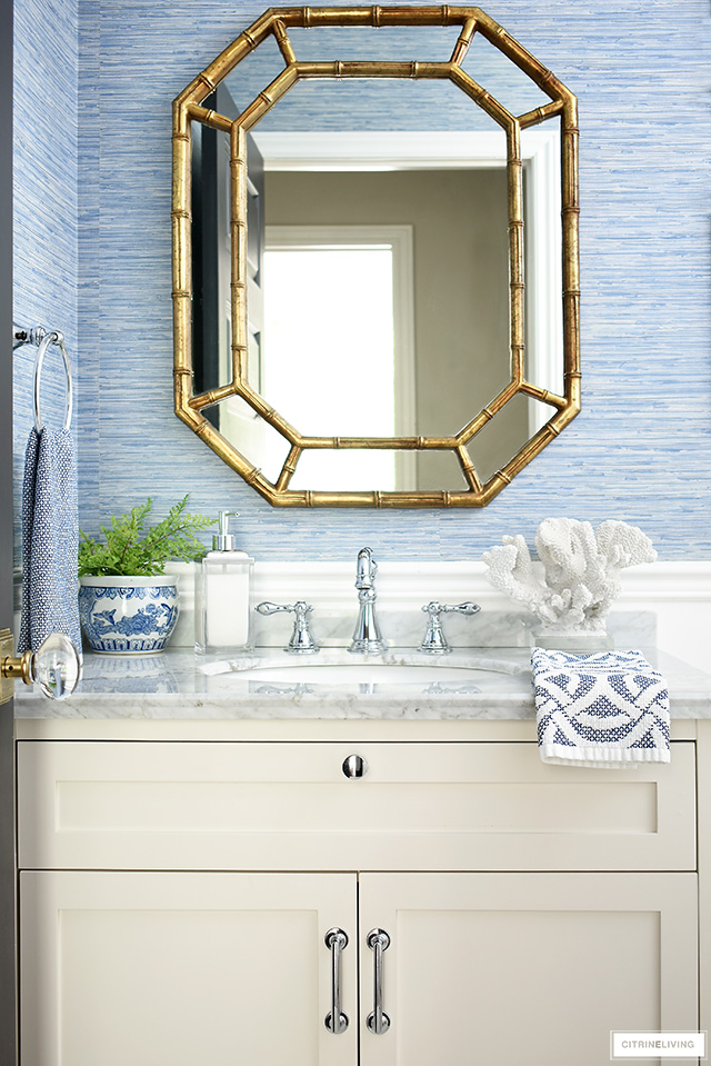
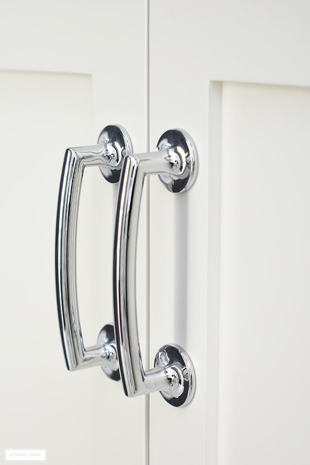
When we updated our kitchen hardware to brass two years ago (click here), we also chose our hardware from Belwith-Keeler. They have a fabulous selection available in many different styles and finishes, the quality and their attention to detail is what I truly love about their products.
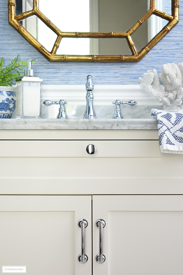
Simple and sophisticated, the Flare collection comes in different finishes. I chose polished silver to match as closely as I could to our faucet, as well as some of the other metal details in the space.
The knob has a solid and substantial feel when you open the drawer, and I love the simple, classic shape.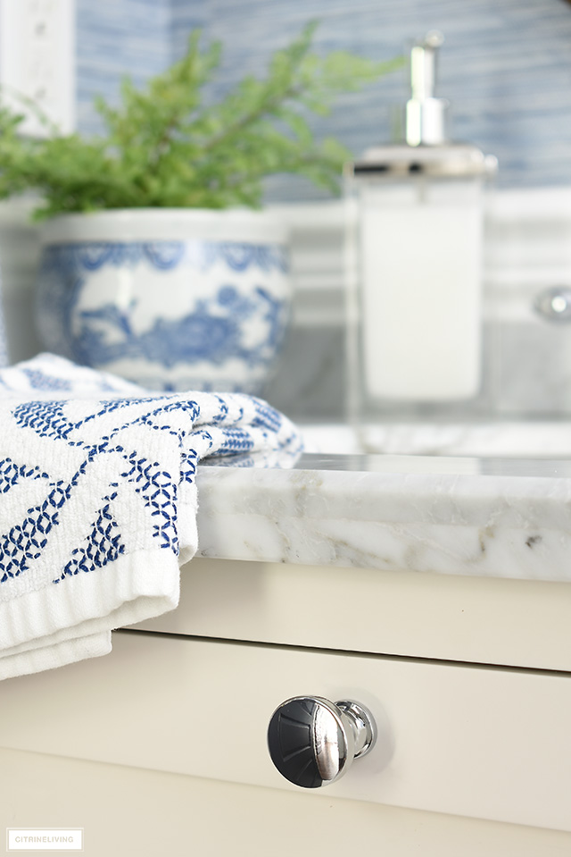
SMALL BATHROOM UPDATES: DIY ABSTRACT ARTWORK + MIRROR
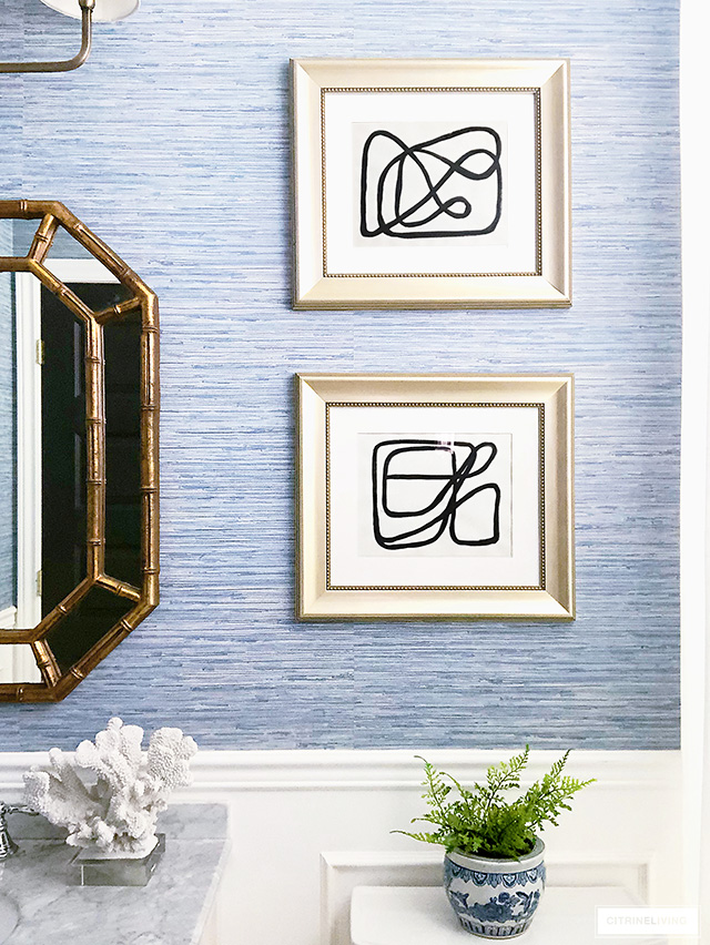
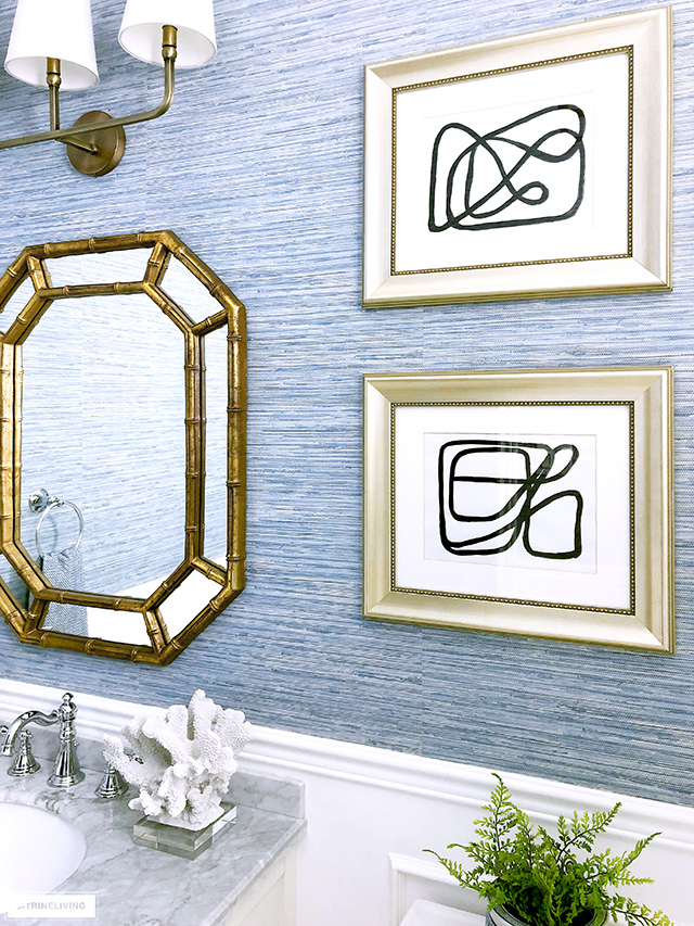
Art can truly transform any space and here, in our bathroom it does just that! To keep in line with our new, ‘elevated look’ I created some DIY abstract linear art. It was so simple to do – I found some inspiration on Pinterest (see some here) and with my brush and acrylic paint, I created these beauties…I’m very proud of them!
They lend a much more grown up feel than the simple typography prints we had here previously, which were perfect for the kids when they were younger. Now that they’re 14 and 16, I thought the art needed to grow up a little bit too ;)
What I love about creating my own artwork, is that it’s more personal and costs almost nothing. You might remember my abstract artwork that I created for our recent dining room gallery wall project – click here – another fun way to update the artwork in your home.
The last of our small bathroom updates is our Hollywood Regency-style gold mirror. We used it in here when we first built our home over ten years ago. Since then, it’s been all over, in many different spaces, recently in our entryway this past Spring (click here to see it). It’s one of my all-time favroites (and a roadside find!) and suits traditional as well as modern decor.
I love the gold tones against our blue walls (this is faux grasscloth paper by the way), and that it picks up the warm tones of the lighting and door hardware also. If my sixteen year old son tells me how much he loves it in here, then I know I’ve made the right choice haha! 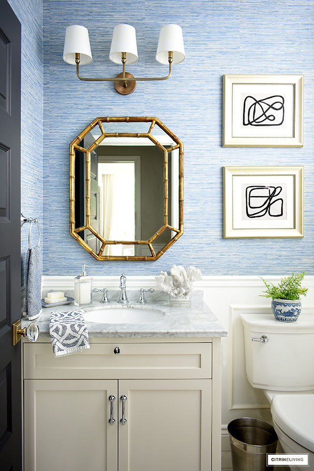



Thank you very much! It’s linked in the post but you can find it here as well: https://rstyle.me/+DriM_LqiUy8lcLksXUxNgg
I love the blue wall paper. Where can I purchase?
Hi! I have a few very similar ones linked at the bottom of this post! Just click the small thumbnail image to shop. Here is an affiliate link to a similar one I just used in our entryway: https://rstyle.me/+3wcMuoRaZ4jJSw49ryEDJA
I hope that helps, thank you for stopping by! xo
Where is the wallpaper from?!
Thank you so much Isabel!! You’re so kind! I appreciate it very much, and I’m so happy you like it all! Thanks for visiting! xox
Tamara, this bathroom update is fabulous! I love the chic coastal vibe. And the hardware you chose is stunning. Like always, everything you touch always turns out beautiful. Great work! Thanks for the inspiration. xo
Alexa I am so flattered – thank you SO MUCH! We really love how everything turned out! xo
Erica, I’m so happy you like it all, we certainly do…little updates go a long way! xo
Jenny thank you! We love the changes – simple but so good!! Thanks for stopping by! xo
Tamara! you did it again , another fabulous update. Love all the details in this space, so beautiful!
This little bathroom is so nice! Love all the details and the new hardware looks great!
Gorgeous! Tamara. The new hardware is stunning and makes the bathroom even more beautiful.