OUR NEW KITCHEN LIGHTING AND BARSTOOLS ARE ON THE WAY!
I’m really excited to be talking to you about our new kitchen updates that are happening – some changes that we’ll be making to this space that are going to have really big impact – I’m all about making big impact! Our home has been an ongoing evolution since we built it, almost 9 years ago! I can’t believe it’s been that long! Never, did we ever think we’d stay here for so many years…our plan was to build, flip, and build again and again. That plan changed quickly when we realized that we were just not cut out for that kind of work, and we loved our private, wooded lot so much, we wanted to stay for a while. So, here we are, this many years later, and we’re still here. We do plan to build again one day, when we can truly afford our dream home. In the mean time, we’ve been tweaking and improving along the way while we’re still here, bringing our home a little closer to where we’d like it to be. That said, I love projects, I love to create, redecorate and bringing newness into our home. It’s in my DNA after all, my mother was always redecorating something! I guess the apple doesn’t fall far from the tree. Lucky for me, as blogger, I am able to pull these things off a little easier than others, and part of being relevant in this business, is creating newness. I’m bringing yet some more newness to this space with our new kitchen lighting and barstools that will really take our kitchen up to another level. I’ve been slowly updating our kitchen over the years – the lighting has changed already more than once, we added our gorgeous new brass hardware and faucet this summer, we’ve built shelves and added sconces. Many of you have seen this evolution already. For those of you who haven’t, the before and afters are a lot of fun! You can see some of them here and here. Keep on reading for the all the details, the lighting options I was torn between choosing, and the barstools I’ve been dreaming about for years…
*Affiliate links are provided throughout, or at the bottom of this post for your shopping convenience – see my full disclosure policy here.
Table of Contents
WHEN WE FIRST CHANGED OUR KITCHEN LIGHTING…
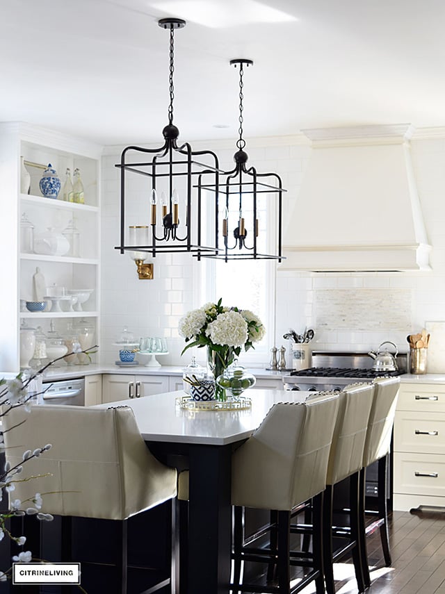
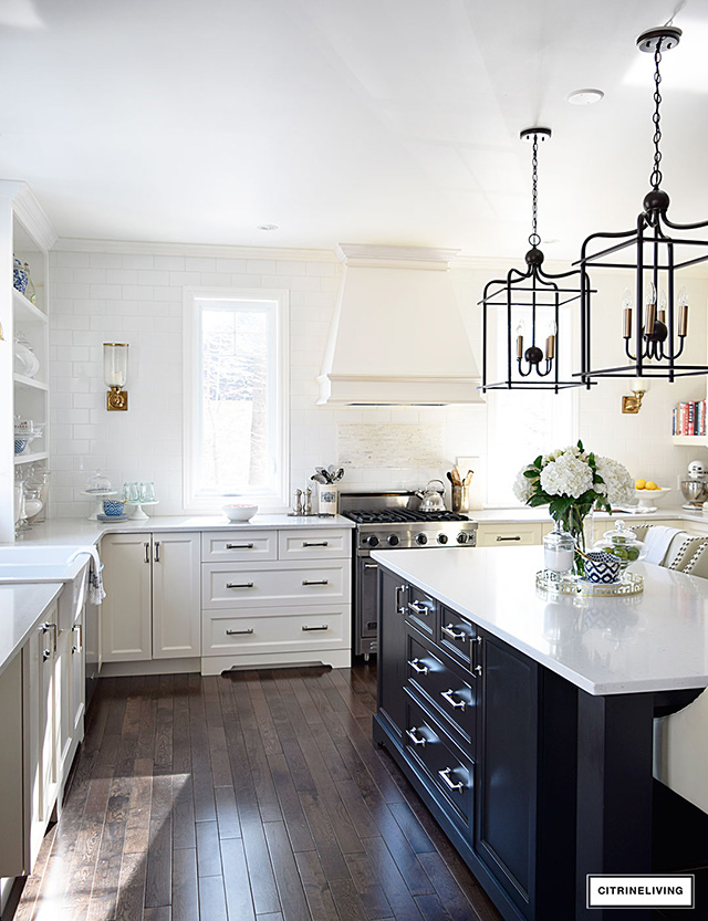
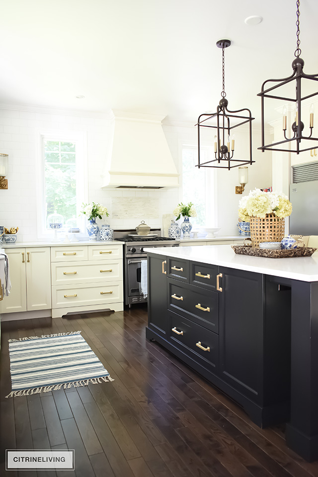
We first introduced our new pendant lights by Progress Lighting in the spring of 2017 (take the tour here), and we had just gone from a single pendant in the middle, to these, beautiful, two-toned double pendants, for amazing statement-making impact. It really made a huge difference in here, and we loved them!! I still love them very much – they’ve served our kitchen so well! The two tone finish was the perfect mix between our black island, and the brass elements we’ve slowly started to introduce into this space, like the coppery-toned wall sconces.
In my recent fall kitchen post (read it here), I talked about lightening up our kitchen somewhat, and that perhaps it was time to swap out our dark metal pendant lights for something a little brighter. Our black island needed something a little bit lighter hanging above it, to bring in some the change I’ve been looking for. These lights are gorgeous, and as I said, I truly love them so much…but that itch for change started happening not long after our new brass hardware and faucet got installed. The warmth they brought to our space really changed the look in here pretty drastically, and I felt the lighting needed to reflect that. I still have plans to eventually add some mirrored cabinets, a two-toned metal hood and maybe even marble tiles…many of you have heard it all before!
THEN WE ADDED OUR BRASS HARDWARE…
I’ve wanted brass hardware in our kitchen for as long as I can remember, and this past summer my dream finally became a reality with our stunning new brass hardware from Belwith-Keeler. It really could not be more perfect than this, it was exactly what I had envisioned in this space (read the reveal here), and our brass faucet also helped bring our kitchen one step closer to the look I’ve been envisioning.
OUR TOP THREE KITCHEN ISLAND LIGHTING PICKS!
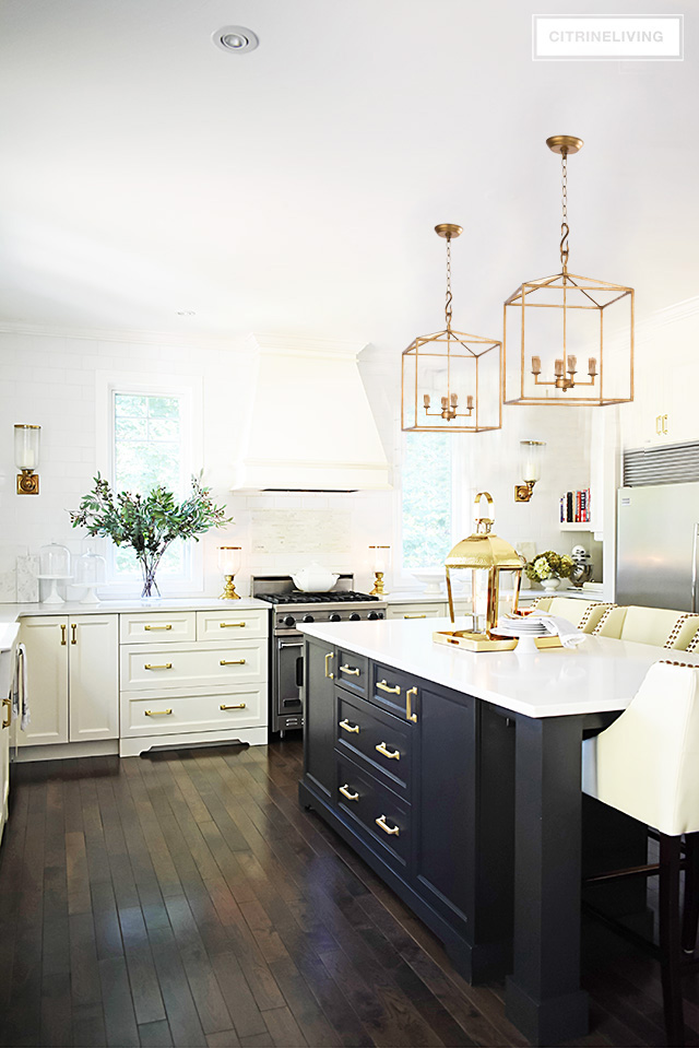
Before we begin – please don’t pay close attention to my photoshop skills in these pics, it’s pretty bad! As a designer, I like to use photoshop to envision what things will look like in our home before making a final decision. It’s not always feasible to do, but when the product image is clean with no background, at the right angle, it’s simple for me to simply drop it into my existing image. I did this a few months back, when I shared our new white sofas (see it here) that will be here soon – fingers crossed! Ok, back to our lighting…let’s look at my first choice – these gorgeous Regina Andrew brass pendants – I love the modern, sleek design, and the light and airy feel they bring to our kitchen. It’s a really dramatic change, don’t you think?
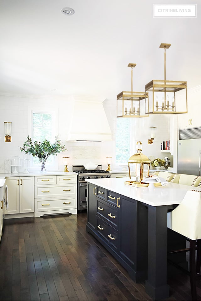
Next, I found these more classic, stunning pendants from Robert Abbey. They’re elegant, rich, and a lend a more traditional feel to our space, which I love. I’m always partial to something a little more classic in nature, and I really find these beauties a fabulous choice for our kitchen…I’ll tell you, as I’m writing this and I’m scrolling through my post looking at each mockup photo, I love all of these kitchen lighting options so much. It was a very tough choice to make. It’s not easy choosing lighting. You have to have a good idea in your head of the look you want. For me, it was definitely brass to play up all of the new brass elements going on in here, but I was torn between the exact style I wanted.
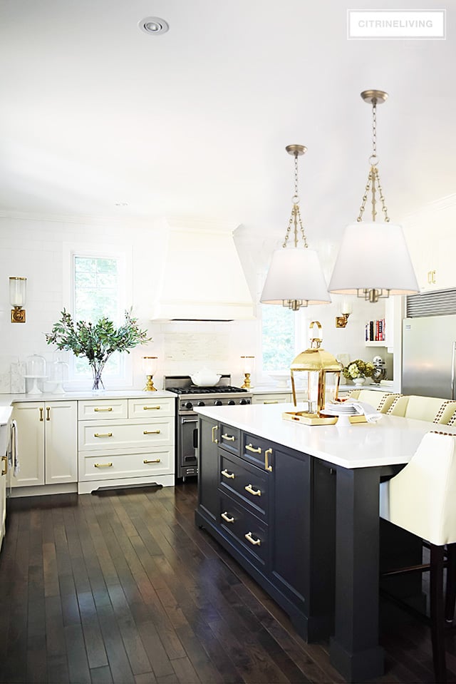
Then, during my search, I stumbled across these gorgeous, modern-meets-classic shade pendants by Hudson Valley Lighting that I completely fell head over heels with. At first, I was hesitant to bring in new kitchen lighting with shades into this space, since our adjacent living room has drum shade lighting as well. I wasn’t sure if it would be white shade overkill haha. After really thinking long and hard about it, I’ve decided they’ll be a beautiful compliment to our living room lighting, and add a more sophisticated, ‘upscale’ element I’ve been searching for. I love the tailored look these bring to our kitchen and the white shades are a gorgeous contrast, and breath of fresh air over our black island. These are the ones, my friends! I’m really excited for the change the kitchen lighting and barstools will bring in here…one step closer to that vision that has always been in my head.
LET’S TALK ABOUT THE SINK LIGHTING…
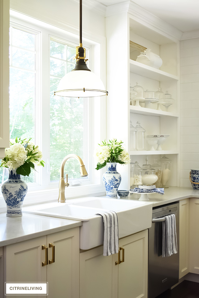
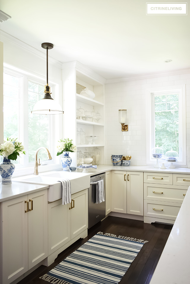
This space has undergone a few lighting changes also – if you haven’t seen the before (here), we originally had a tiny, non-existent mini pendant that did nothing to accent the window and sink. We updated that to a larger brass pendant, but after a while I was craving a more substantial piece, so we installed this beauty you see below. The two-tone finish was the perfect compliment to our island pendants, but now that those are changing, this light nees to as well. It has a vintage, industrial vibe, which isn’t quite the right compliment for our new, upscale, tailored lighting we’ve chosen. I love this light, trust me, but there has to be a cohesiveness between everything.
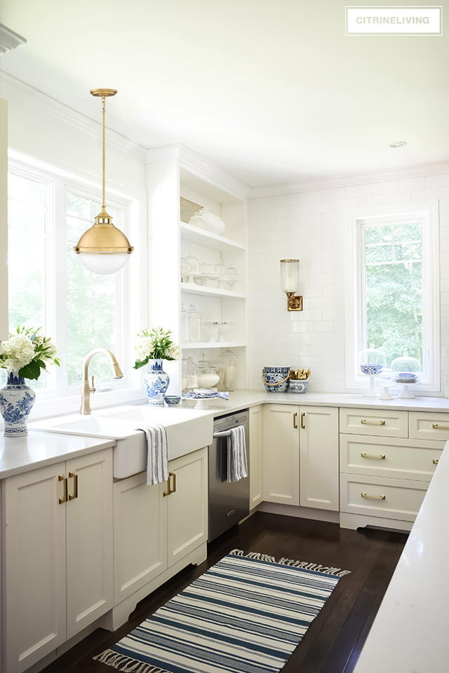
In my mockup below, you can see this pretty little brass globe pendant by Hinkley Lighting we have on the way. I love the shape and the detailing, which has a slight chinoiserie feel to it – perfect for our new Chinese Chippendale kitchen barstools that are coming. I love the contrast of the shape, and I think it’s a beautiful compliment to the pendants we chose.
HOW ABOUT OUR NEW KITCHEN BARSTOOLS!
I first fell in love with Chinese Chippendale when I was a little girl. My aunt had the most gorgeous white kitchen set by Thomasville. She actually still has the table in storage, and is saving it for me – I’ve been telling her for years I want it…I better find a way to get it off her hands soon! She lives a few hours away, and the logistics are tough, plus, I don’t have an eat-in kitchen in this house. It’s a fabulous piece with it’s faux bamboo detailing and it has always been a favorite of mine. Our new stools are the same look, with their faux bamboo details. For the longest time I’ve talked about getting a pair of Chinese Chippendale chairs in the dining room also – which I still plan to one day. I’m so thrilled the stools I’ve had my eye on now for a long time (I talked about them a couple months ago, here), are finally making their way to our home. I was on the fence between this white-washed wood finish, and ivory, but I finally settled on these ones. I think the warm wood tones will be the perfect compliment to all of the brass that’s happening in our kitchen. They can easily be painted if I ever want to change the look (don’t tell my hubby!), but I think this finish will be a gorgeous edition to our kitchen. 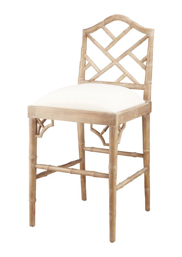



Hi Tara, thanks for visiting my blog and giving me your input! I’ve already chosen the shades and they really look fabulous! The metal is a gorgeous brushed brass and matches all the brass details in here perfectly – I’m really happy with my choice! I’ll be sharing the update this week, so stay tuned!
There are a lot of different types of light fixtures in one room maybe too many. It is hard to tell over the island with the brass lantern on the island but the first fixture looked more cooper colored and that wont work with all your new brass hardware and the other lighting that you already have. Maybe stick to what you have forget the shade and make sure they all blend together.
Can we talk about your stovetop lighting? Where are those lamps from and did you shorten the cords since they are plug-in? I love good mood lighting in a kitchen!
Reva, you’re so kind, thank you so much! I’ve been adding updates in our kitchen since we built our home almost 9 years ago! Our cabinets are ivory, I don’t have the name… It was the only ivory option available in that color palette other than white at the time! I hope you find what you’re looking for! Thanks for your sweet words and for stopping by to say hi! xo
I have always loooved your kitchen every time I see it posted on IG. Seeing all your updates makes me love it even more! Could you please tell me the color of you kitchen cabinets? We built our house 5 years ago and the kitchen was in the tail end of a French country popular look that I desperately already want to redo like yours! Thank you so much!
Oh no, I’m sorry you’re so sad to see them go, Linda!! I have wanted them for so many years!! So happy to have something new…I promise you’ll love the after pics too!! Thanks for letting me know!! xo
I so loved the before pics that I’m saddened to see them go even though Chinese chipendale has always been a fave of mine.