OUR FAVORITE 7 DESIGN CHOICES WE MADE BUILDING OUR HOME
When we built our home eight years ago, we never intended to be living in it this many years later. We were planning to build, finish the interior ourselves (which we did), and sell within a year or two, and do it over again a few more times. That plan changed within the first year of living here, and even though we built our home for someone else to love in the end, we fell in love with the location and privacy we have here. We knew some of the design decisions we were making had to be those that the majority of buyers would want in a home. At the same time, however, it was crucial for us to make choices that we would also love and that would be statement-making. Our home is 1700 square feet, on one level – so the footprint is on a bit of a smaller scale. Taking the size into account, coupled with the fact that we’d intended to sell our home right away, our decisions had to be frugal and defy the constraints that come with a smaller build. Today I’ll be walking you through our favorite design choices that we made when we built this home. Choices that helped us save money, help give the illusion of a larger space and choices that are still as relevant today as they were eight years ago. Let’s get started! *Affiliate links are provided in this post for your shopping convenience – see my full disclosure policy here.
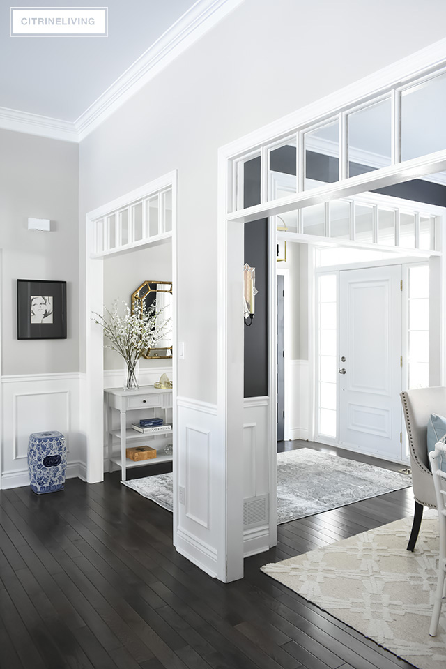
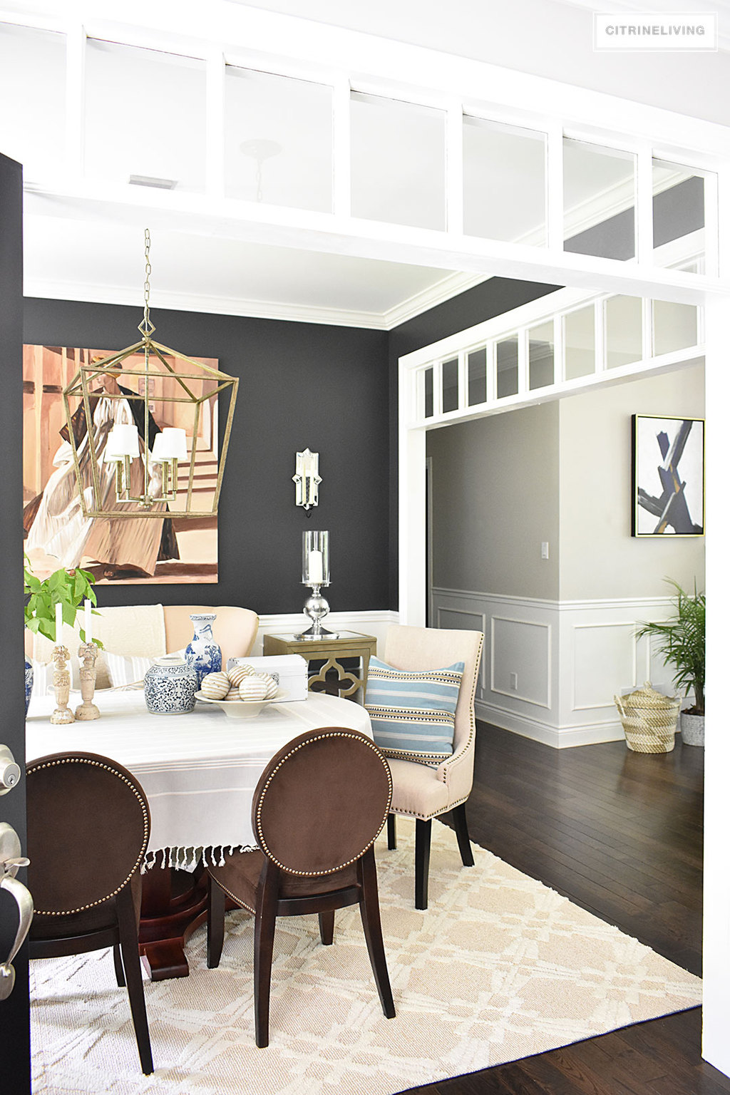

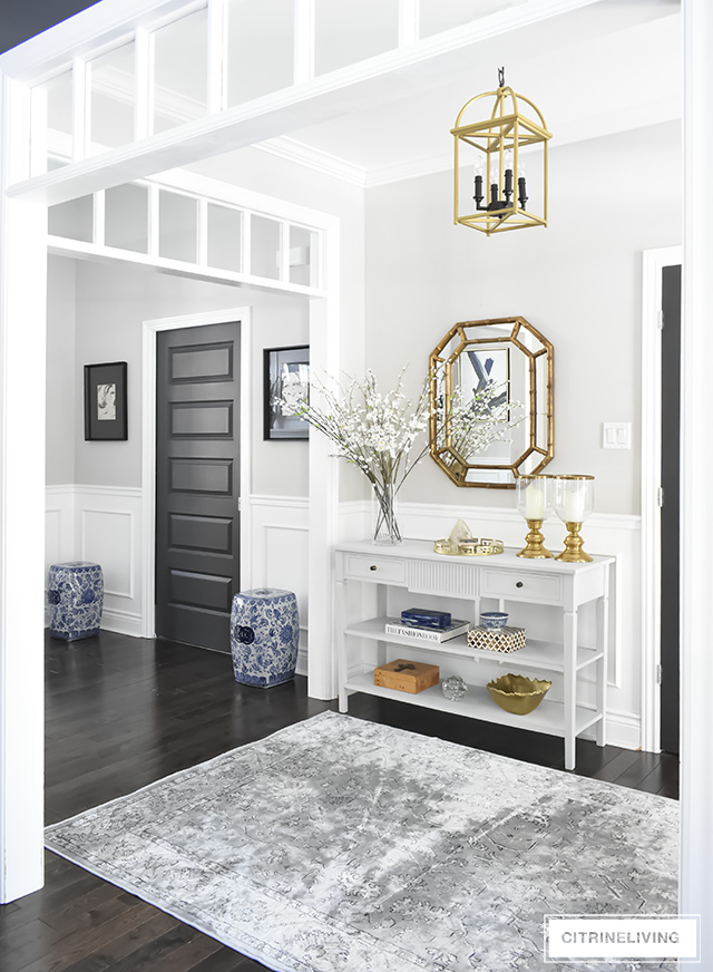
 One of the other key features we chose, was to have continuous hardwood throughout our home, including the entryway. We did choose tile for the bathrooms and mudroom, which are all separate spaces. The rest of our house, which has one room that flows into the next, has the same floors throughout, which again, helps to create the illusion of more space. I purposely did not want tile in the entryway (even though we live in a northern climate) or kitchen. With a smaller footprint, you want to maximize on those visual illusions you’re trying to create.
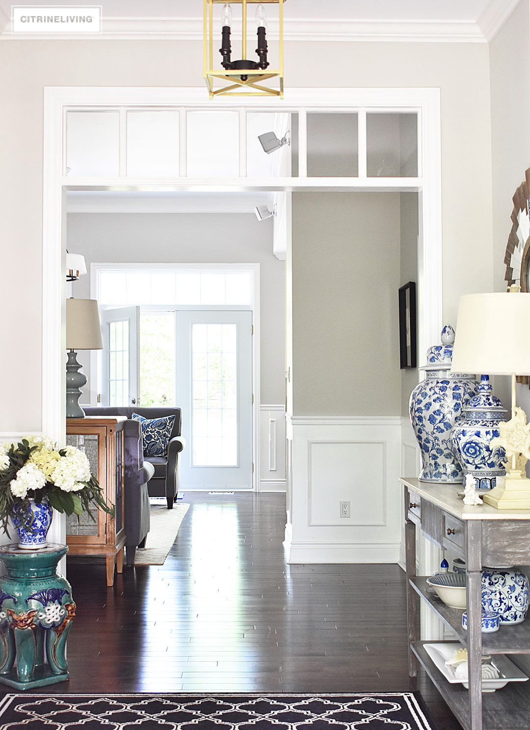 We debated back and forth between dark and light floors, and Neil really wanted to go with the darker tone – in the end I agreed as well. We do love them, they provide richness and an elegance, especially against the bright white trim.
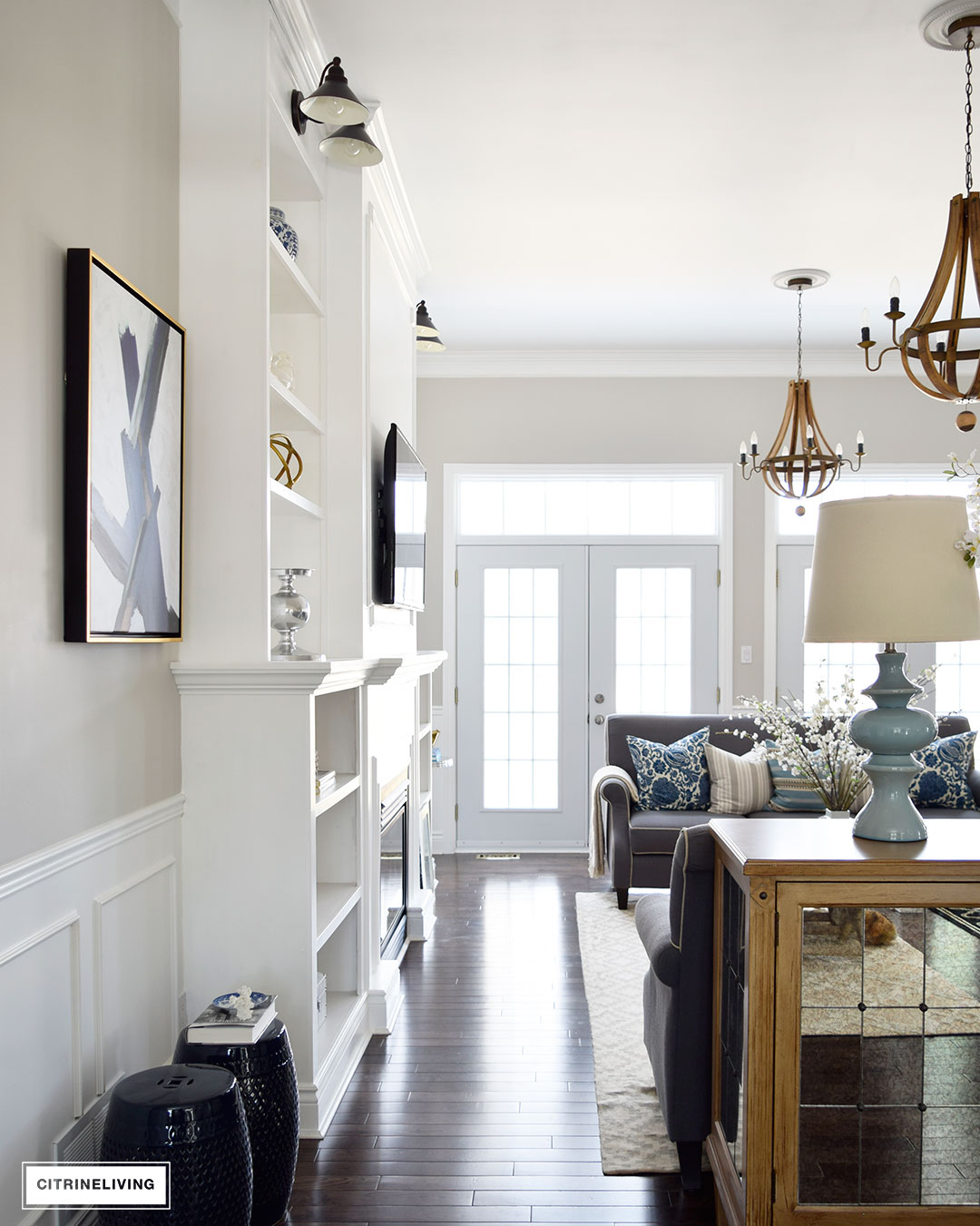 One of the cost saving decisions we made, was going with a mixed grade hardwood. We wanted a durable wood, so we decided on oak, however, oak can be pricey sometimes, so we needed to find something that was in our budget. We wanted to have variation in the grain as well, and it was important to us to get darks and lights throughout as well. Going with a mixed grade oak (A, B and C grades) allowed us to save money and get the look we were after. This is a walnut stain. Unfortunately I don’t have the brand or color name anymore! We did take our time shopping around, and we were so lucky to find a great deal on these floors.
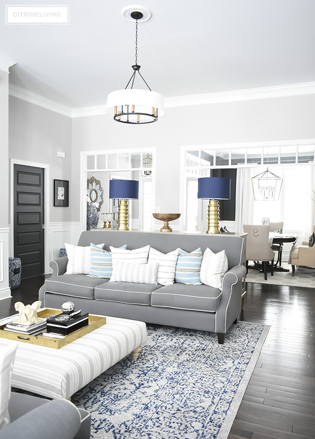 You’d be surprised what you can find yourself if you roll up your sleeves and do some of the dirty work. Which we definitely did – we installed all of the flooring, all of the trim (which is still not finished!) as well as painted every inch ourselves. This home has been a labor of love and we’re still laboring :)
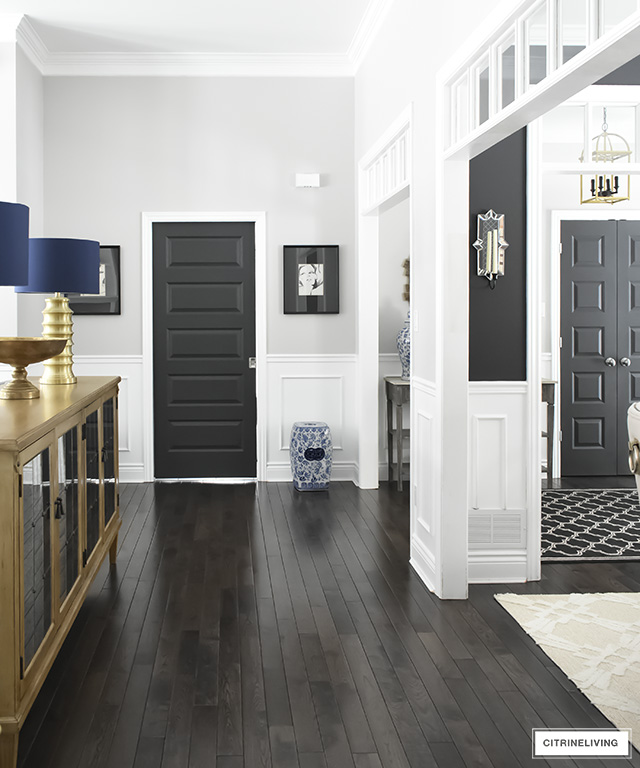 Take your time looking around, and talk to your builder – sometimes they’ll allow you to shop around and find your own materials which can save you money.
 Our master bathroom is one of our favorite spaces, especially now that we recently made it over (see the full reveal here). It’s our sanctuary and we love every detail in this space. One of the things we love most, that was an absolute must for both of us, was choosing to have a double vanity instead of a bathtub. We could have gone with a bathtub/shower combination, but a walk-in shower was also a must for the two of us.
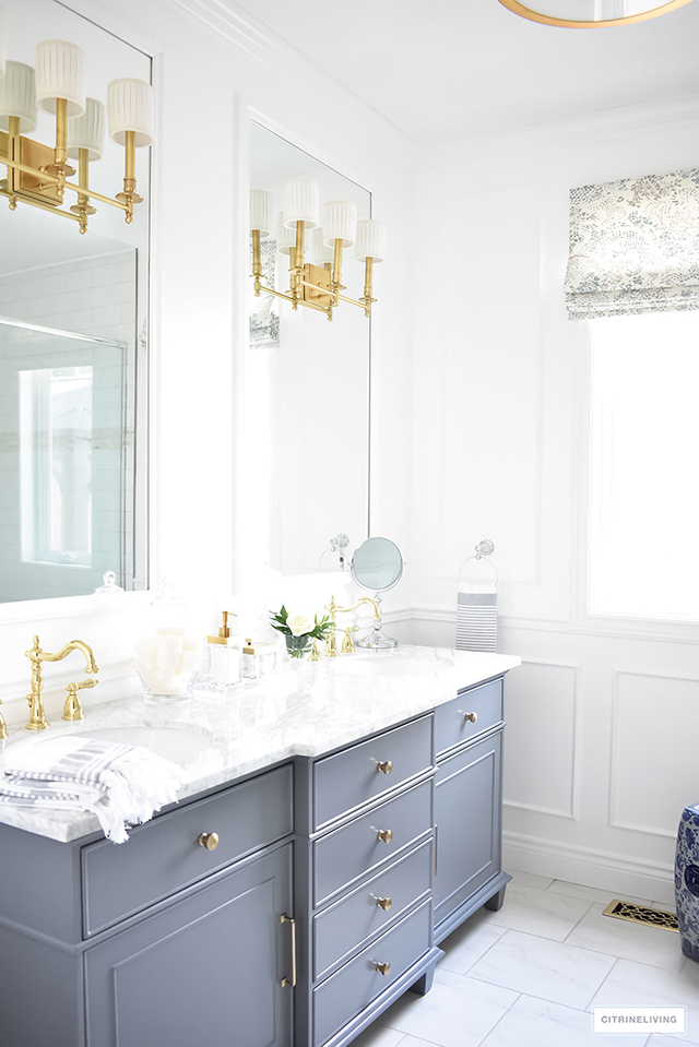 I am not much of a bath person, even when we had a bathroom with a big soaker tub in our first home, it wasn’t a ritual for me, nor for my hubby. So, with the limited number of baths we would take, we decided the walk-in shower and a vanity that was large enough for the two of us to be in here together at the same time was a no brainer.
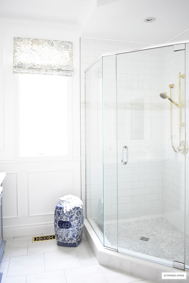 I need my space when I get ready and having ample counter space is huge when you’re two people sharing a bathroom. Trust me on this one – it was one of the best decisions we made. Everyone needs their personal space and I highly recommend going this route if you have to make the choice and cut back somewhere.
 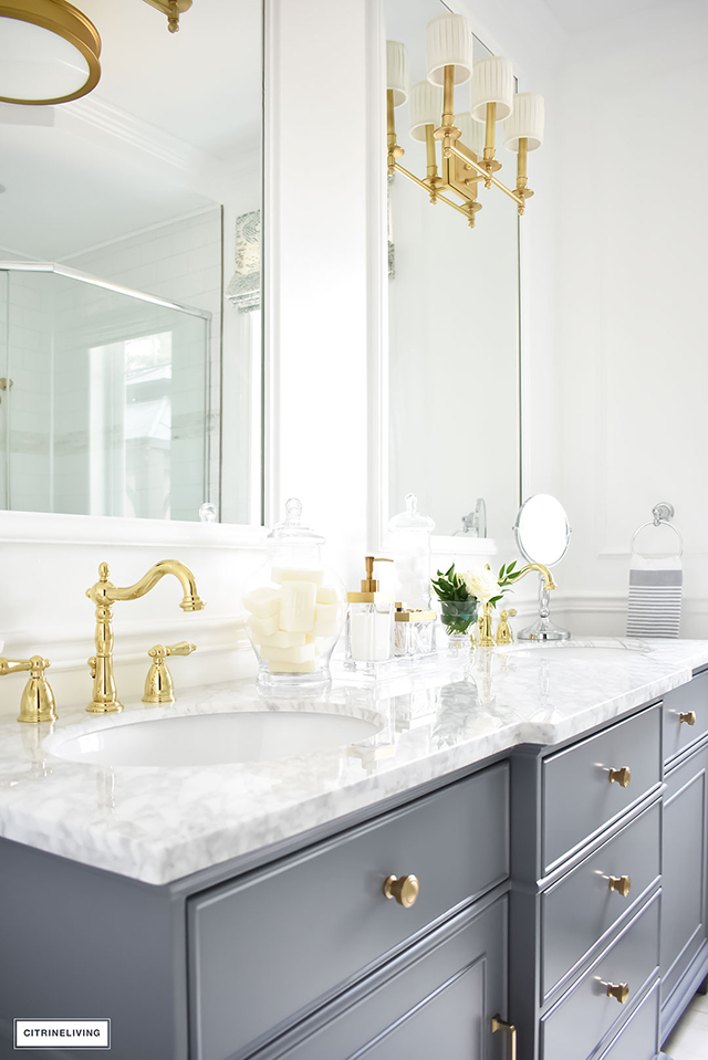 Again, having a smaller space to work with, you have to be able to comprise sometimes – this was a well worth it compromise for us!
 Our kitchen is one of my favorite spaces in our home. We’e made some updates along the way since we first moved in, which have brought it to a level that I love. I still have some plans for this space, such as counter to ceiling mirrored cupboards flanking the sink – I have a big vision in my head that I think would be gorgeous, and will hopefully come to fruition some day!
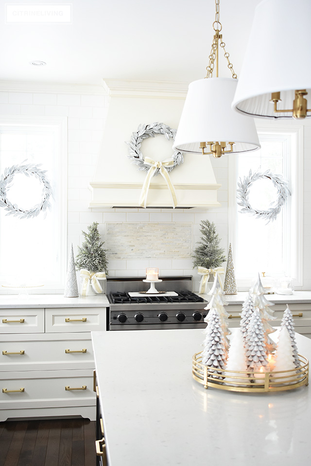
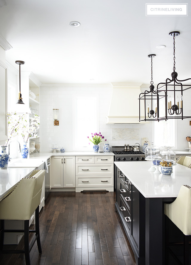 One of the most important design decisions in here was choosing to forego upper cabinets on the back wall and create a focal point with the custom range hood and flanking windows. We installed counter to ceiling white subway tile to create depth, add visual interest and texture, and again, make a statement.
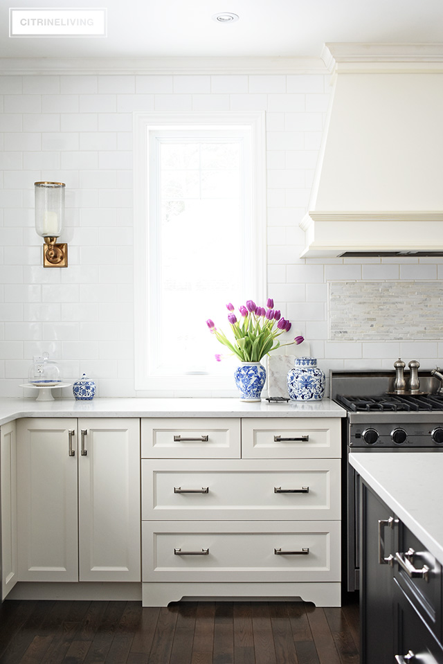 We built the open shelves next to the sink (where I want to add the mirrored cupboards) to bring in some added character to the space and I love having a space to display my collections. You can read about it here.
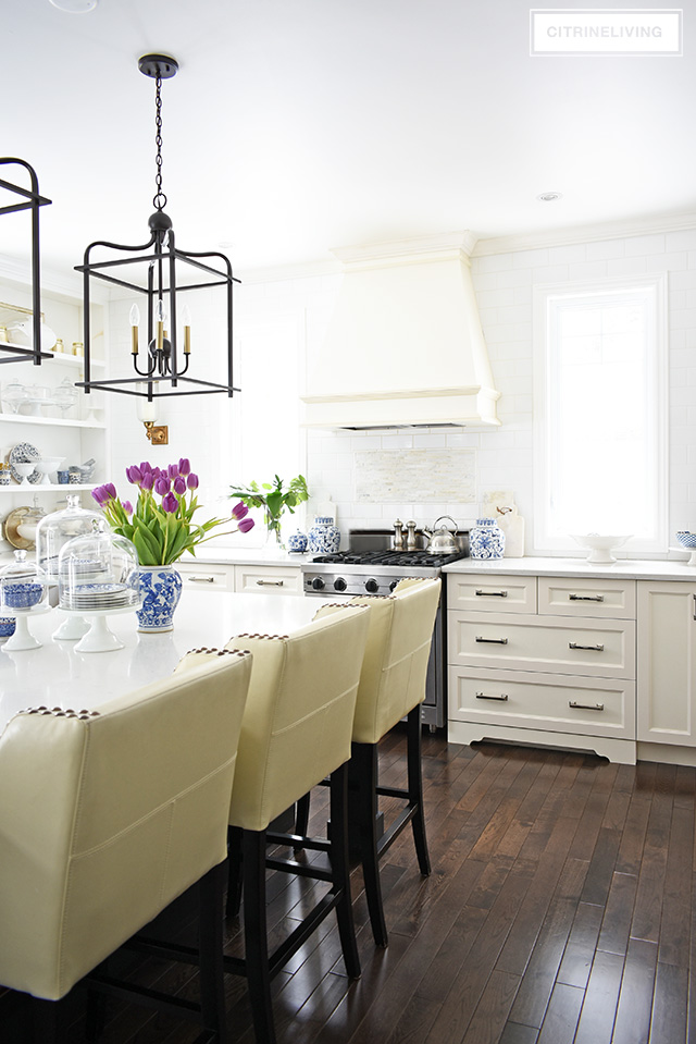 Having that back wall without cabinets was a design decision that is not for everyone, that’s for sure. However I wanted to create a traditional kitchen that was atypical, and transport you to another era. I had an old-world-meets-modern-day vision fort this kitchen! We have ample cupboard space and our island holds all of our dishes and flatware, as well as trash and recycling and the microwave. It is one hard working island!
 In our living room, or great room, which is central in our home, we wanted to make sure this space felt airy and bright since we spend most of our time here. The back of our home is north facing, and we don’t get much direct sunlight. We wanted to a make a big statement with as many windows as possible so we added the large transoms at the top as well to maximize on the height of the room.
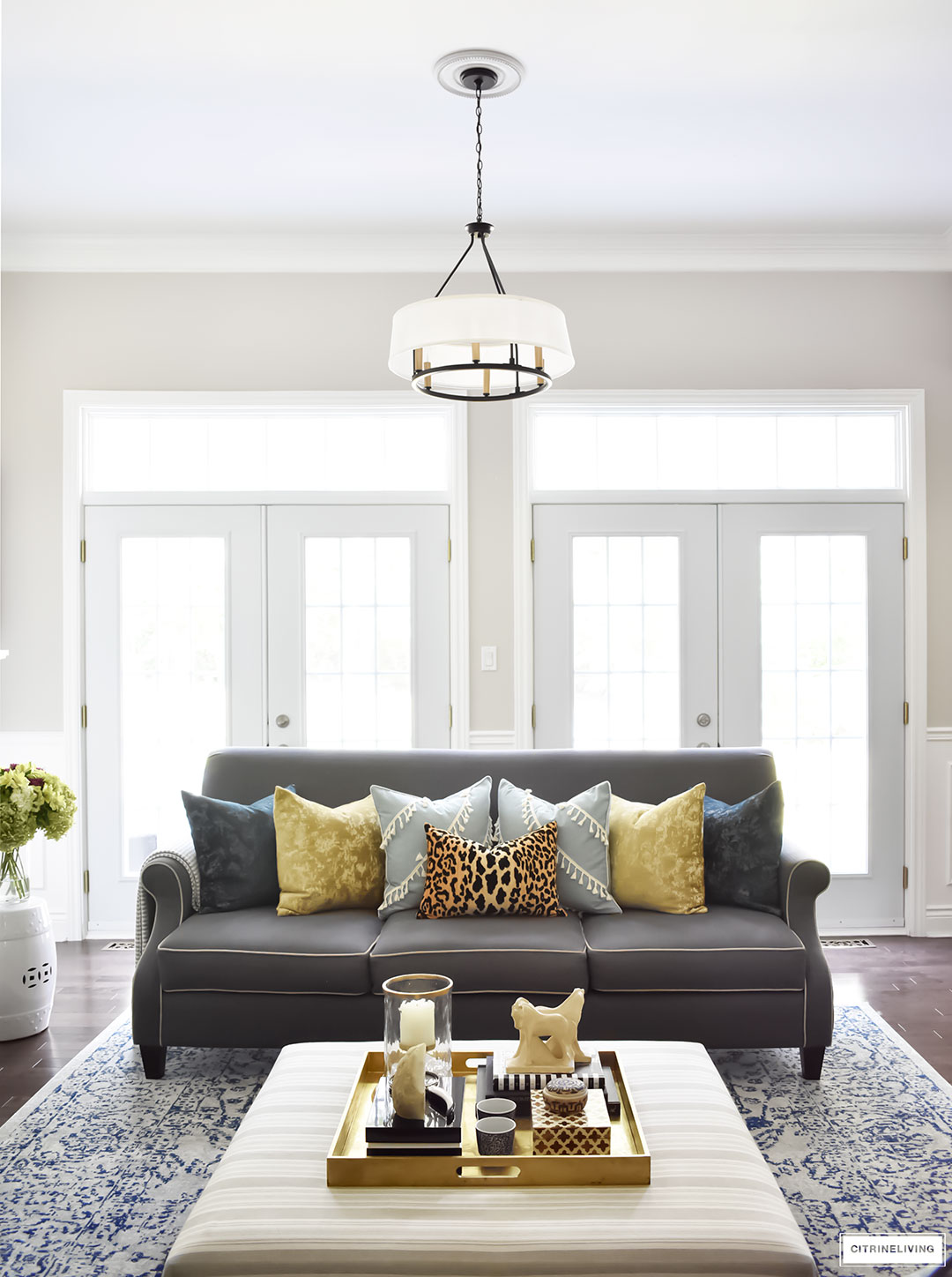 It was a small upgrade, but with a minimal investment, we have the statement we were looking for and this space gets great light year round, which is exactly what we wanted. By the way, I get a lot of questions about why we have no windows treatments. We have a very private yard, especially in the warmer months when the trees are filled in. I love having bare windows to maximize on the views of our foliage outside. We are in a very wooded area and we’re lucky to have so many trees to look at year round, it’s gorgeous!
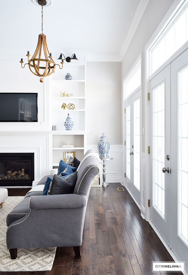
 Building on the idea of creating a living room that feels as big and as bright as possible, we chose to raise the ceilings in this space from nine to eleven feet. We have nine feet everywhere else, and we realized during the planning stage that it would be a worthwhile investment to raise this ceiling – and it allowed for the taller doors at the back as well.
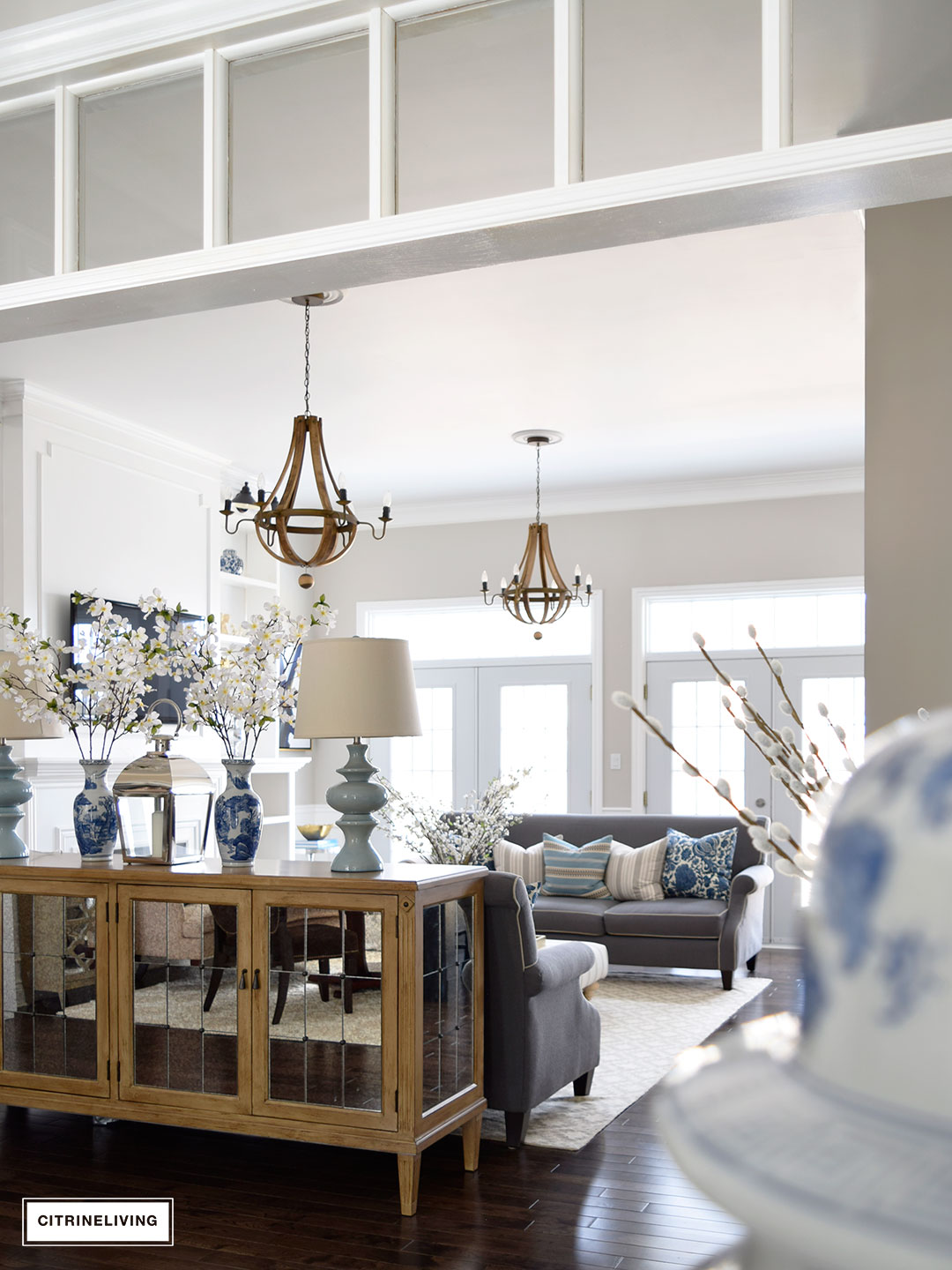 Having the height in here makes a huge difference in the feel of the room and it also allowed us to make a big statement with the bookshelves we built after we moved in as well. You can read all about these shelves here.
 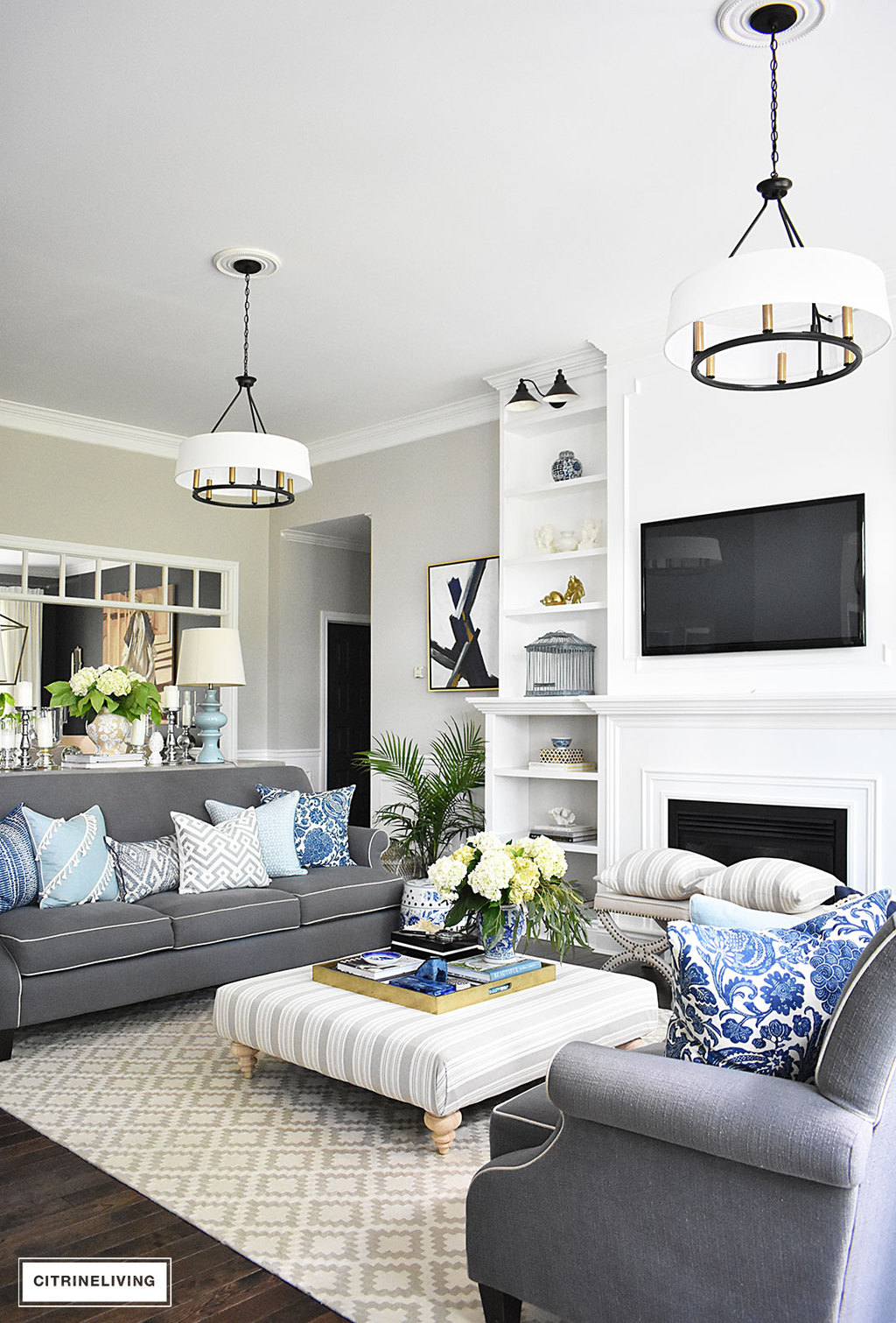 You won’t believe the difference in the room once we added them! Taking advantage of the height in here was a key factor, and makes the room feel even larger than before.
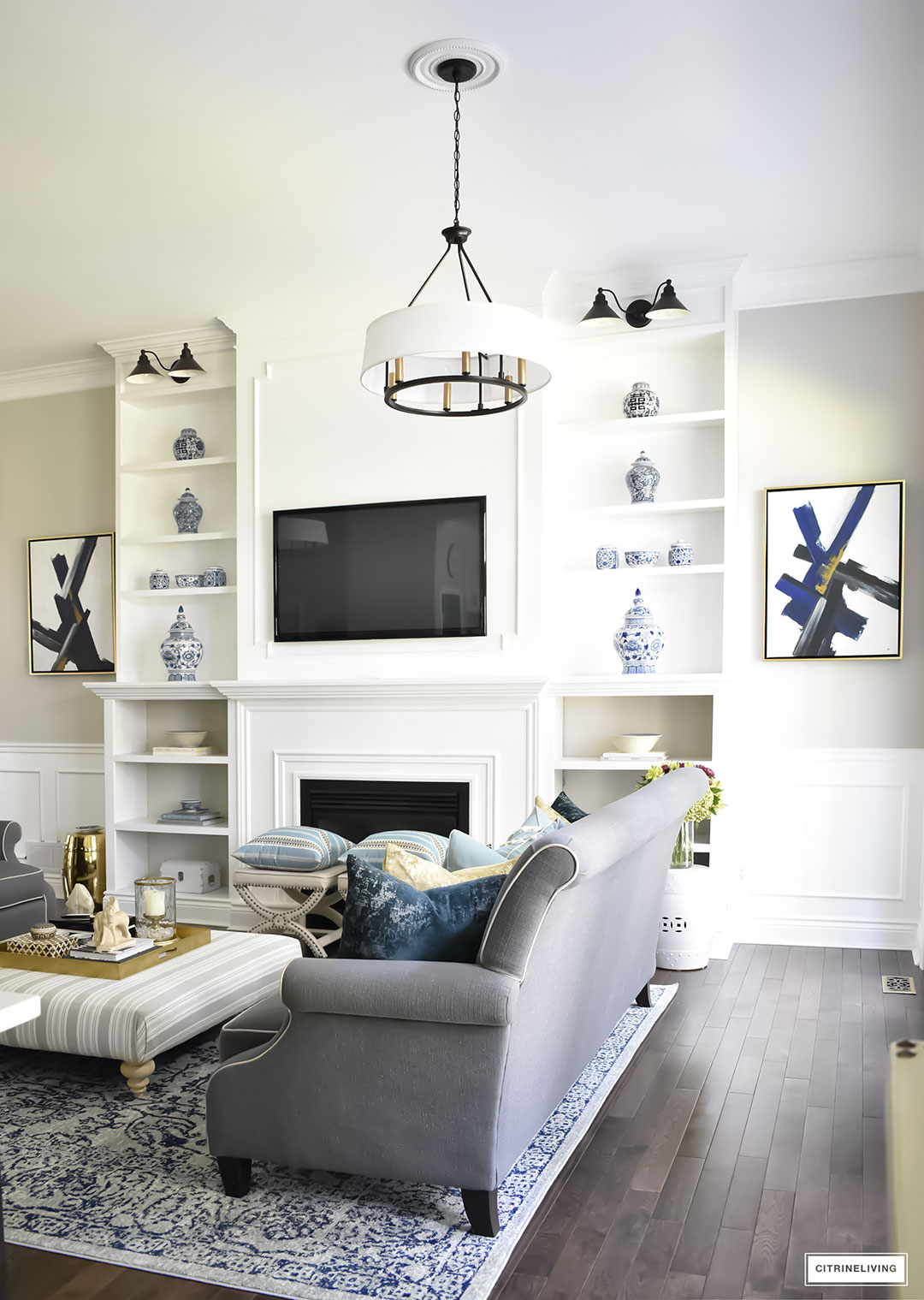
 I’m still talking about this room because it really is the central gathering space of our home (aside from the kitchen of course!) and the focal point of our home. We focused much of our energy in here to create a room with wow factor. Another detail we added was the double chandeliers. For a room this large – 15 x 23 feet, it needed the two lights for balance as well. I’m big on symmetry and that was another reason I wanted both lights. I love the way they frame our shelves as well.
 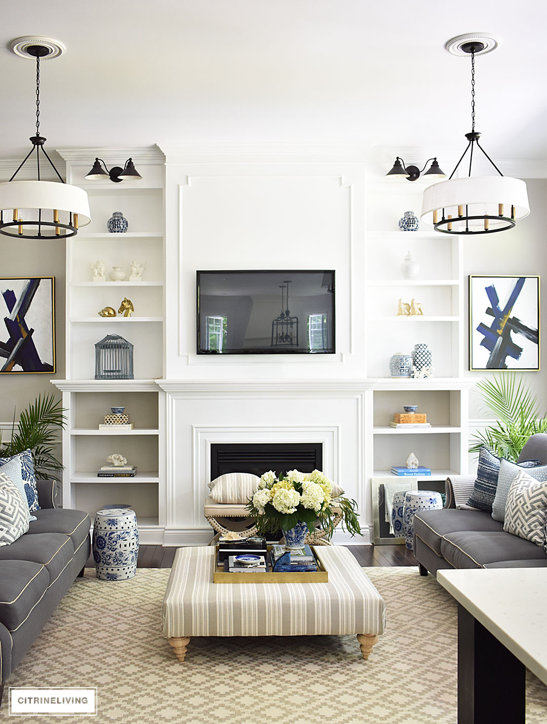 It was nothing to add a second light to the electrical plan, and again, the second fixture was a small investment…with big impact!
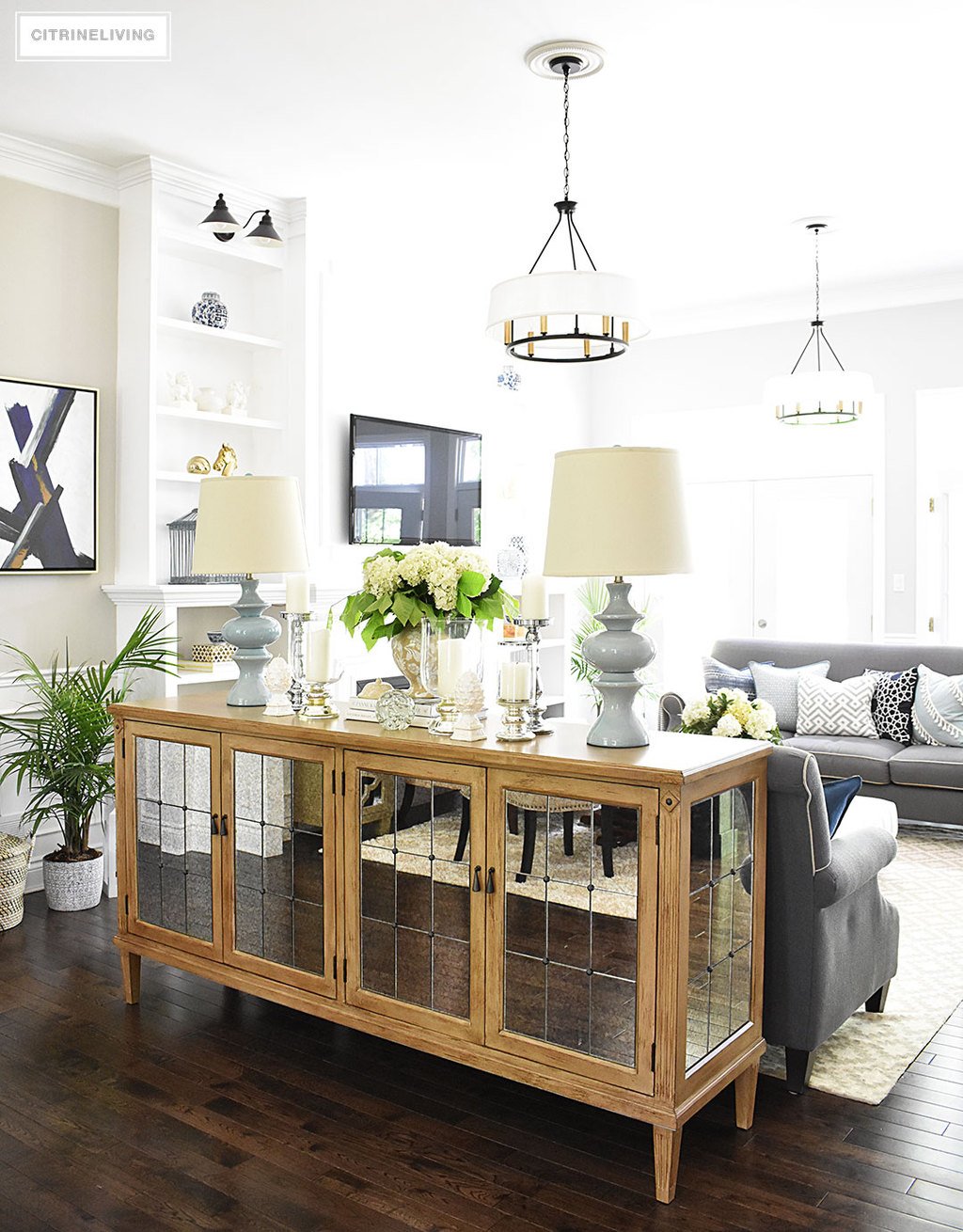 Our home is 1700 square feet, which is not small, but it’s not considered large either. It was integral when we were in the design phase to create as much vertical space as possible and again, to give the illusion of larger, more open rooms. Opening up doorways, adding transoms, raising ceilings, tiling walls, double chandeliers, it all makes a huge difference and helps to sell a home as well, which was our original intent. We wanted to create a home that would capture your attention from the first moment you stepped through the door. With the small investments that we made, the rewards are that much bigger in the end, and the added resale value will be that much better too. I hope you enjoyed this post and if you’re building or remodelling, I know some of these design choices can help you too! Thanks for reading with me, I always appreciate your time! xo



Hello. I love the brick on the exterior of the home. I’ve been searching online for weeks. Can you provide any information on where it was purchased? Thank you.
Hi! We ordered them through our builder and the company who supplied all of the trim and wood for finishing our home. These are just a double door option for a standard door (I think it’s a 30″ opening), maybe check with home depot or a big box store, anywhere you’d order interior doors. You may have to order them custom though, I’m not sure! I wish I could be of more help!
Hi- I have a question about your double black doors in the entry? Did you have them custom made or where did you find them? I am redoing our home and looking for similar doors but cannot find.
Any advice is welcomed and appreciated! Thank you!
Hi Joanna! Thank you very much for your kind words! I bet you love having a less space to clean! Sometimes I can’t wait to build a larger home, but then the thought of all the cleaning makes me think twice! I’m so happy to hear you love your new home, that is so amazing. Thank you very much for taking the time to stop in and say hi, it means a lot to me! xo
Teri, I feel you, trust me!! It can feel small at times that’s for sure, and were so conscious of finding ways to increase the size of our home, visually! It’s amazing what you can do – like changing the paint! There are a lot of ways to create that space! I’m so happy you like to read along with me, it truly means so much and even more that you found this post useful! I love to inspire my readers!! So happy to have you here! xo
Hi Krista! Thank you so much for stopping by, I’m so happy to have you here and that you like this post! And the bookshelves too! We’re constantly finding ways to improve our home! Our plan is custom through our builder but I would maybe try to make the master little bigger (we actually decreased it to gain space in the living room), and also a little more space between the kitchen and living room. I’d also love an entrance to the kitchen from the mudroom (which is usually not pictured) as well…there are always things I’d change! We built one other house before this one, but it was tiny. I dream of building our dream home one day soon! If I do, I most certainly will be sharing all the details here! Thank you again for visiting!! xo
New to your blog today through dimplesandtangles. Love this post! Could you share house plan name and if you would change anything to it now that you have lived in it? Loving so much about your house :). Have you built and sold houses before? Any blog post about that? Just read through your bookshelf addition- love!
Wow! I would have guessed your house was twice the size with the airy-ness and light that is captured in the photos. It’s absolutely beautiful. I’ve been reading your blog for about a year now and love your style.
We built our house in 2008 but its just shy of 1500sf. I’m always looking for ways to look bigger, because with two small kids and a husband, I sometimes feel like the walls are closing in! I recently painted the main areas of the home white which made a huge difference! I’ve learned to really edit my decor and be super choosy as to what gets to stay.
I really enjoyed this post 🤗
We build a great room house for our retirement. Love it! The big homes we had are a thing of the past now the kids are gone. I don’t miss all the cleaning. We also added lots of windows to bring in the light. I’m loving your transoms. They add a touch of elegance to your space.
When we beefed up the trim in our house, I was tempted to leave the drapes down, too. Unfortunately, we need them for privacy.
Your home is absolutely lovely. It feels welcoming.