MY FAVORITE ROOM MAKEOVERS: PART 1

| |

In the eight years that we’ve lived in our home, I think we’ve updated almost every space. I’m always looking for a new project, and I love to find creative ways to bring my vision to life. From our kitchen (which I’m starting with today, since it’s the most recent update in our home), to our daughter’s bedroom, I’m sharing some simple updates that have brought big change to these room makeovers. Some are as simple as painting the walls, while others feature diy builtins that have yielded dramatic results. I’ve decided to do this in a two-part series, so stay tuned for a second instalment next week!

*Affiliate links are provided throughout, or at the bottom of this post for your shopping convenience – see my full disclosure policy here

Amazing before and after room makeovers that pack a huge punch! From simple updates with dramatic results to paint colors that completely change the look!

FAVORITE MAKEOVER NUMBER ONE : OUR KITCHEN

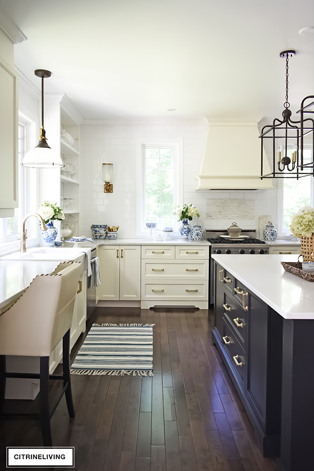
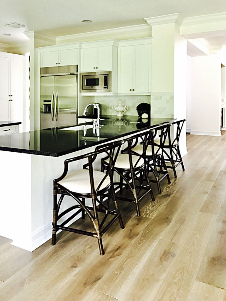
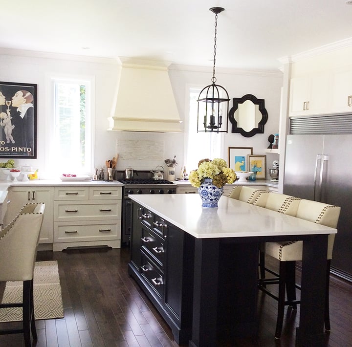
You’ve already seen our recent kitchen updates a couple of weeks ago, and although it’s been slowly transformed over the course of eight years, I think the results are pretty dramatic. From slowly updating and adding extra lighting, building diy open shelves, to swapping out all of the hardware to lustrous brass handles, the look of our kitchen has gone from casually elegant, to a little more elegantly refined.
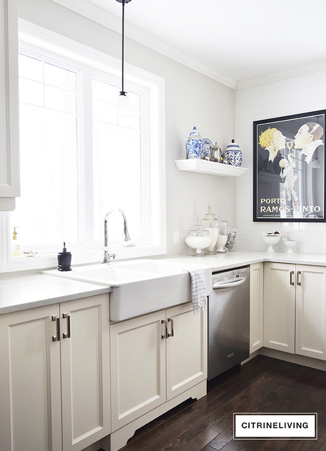
Traditional kitchen with no upper cabinets and black island.I can’t share the exact same angles in these pictures, but you definitely get the idea. This room has undergone some pretty significant changes! I still have a vision of a big stainless and brass custom hood, mirrored, or glass front cabinets flanking the sink, possibly some all brass lighting and Chippendale style barstools to truly complete the look in here. Even marble subway tiles on the back wall to replace the white ones to add even more old-world charm in here…a girl can dream, right?! The wheels never stop ;)White kitchen with apron front farm sink.

I’m thrilled with the changes we’ve incorporated in here up to now, and I have to say, each element we’ve added over the years has created a significant difference, helping to almost complete the look of our kitchen.
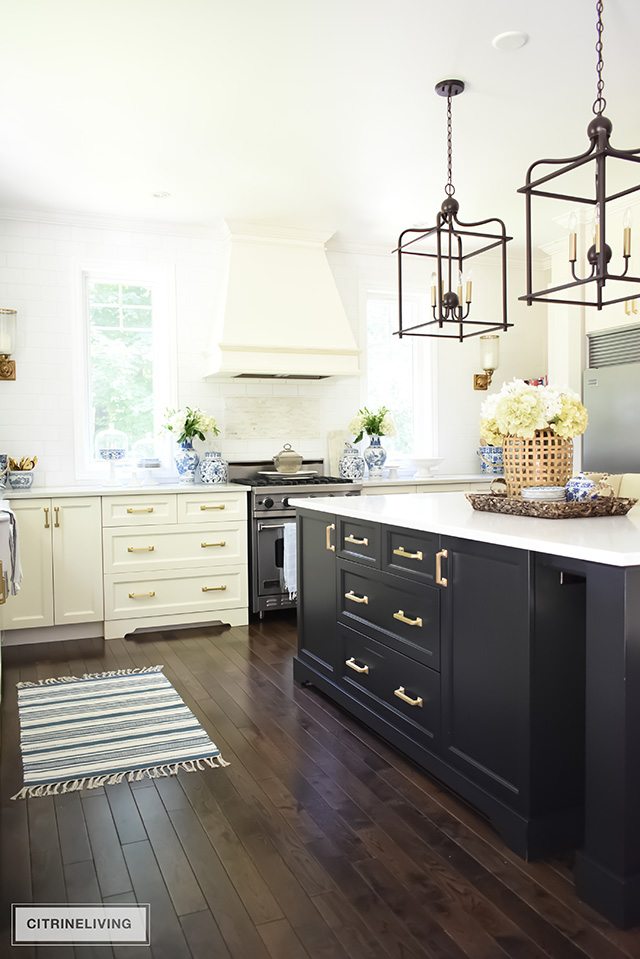
Ivory kitchen with contrasting black island and brass hardware. Large scale pendant lighting over the island.

If you haven’t seen my latest kitchen makeover blog post with all of the details, you can read all about it right here.Traditional kitchen with ivory perimeter cabinets, black island with brass hardware, and counter to ceiling subway tile wall.

FAVORITE MAKEOVER NUMBER TWO : OUR LIVING ROOM

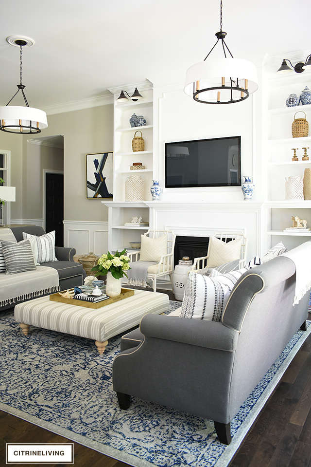
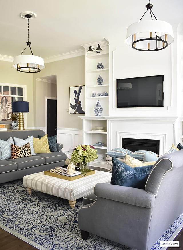
In this room, there have been some significant changes that have helped to create a more sophisticated look over the years, and there are more on the way! What started out as an eclectic beginning, our living room has slowly become more refined, but still has a ‘collected’ look. We added on to our original bookshelves that we started with, and took them all the way up to the ceiling for some serious wow factor –  you can read that reveal post here.
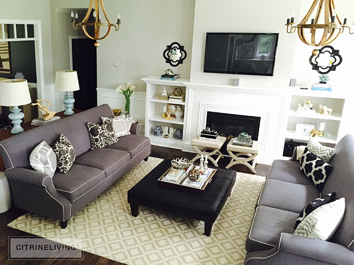
Living room before with dark grey couches and wine barrel chandeliersWe updated the chandeliers, brought our original rug to our bedroom and replaced it with this vintage-inspired navy blue one. I recovered our ottoman (several times, I might add!) and changed the feet, and soon we’ll have new white sofas which I cannot wait for. I think they’ll be fabulous against the blue in the carpet…I’m so excited to see our space with such a different look from where we first started!Living room with large builtin bookshelves, grey sofas, double chandeliers, blue vintage rug.Above is our living room decorated for summer, with a laid-back, casual vibe – you can see more of my summer decor here. Below is from my Fall home tour last year, with a slightly more streamlined look – read all about it here.Living room with large builtin bookshelves, grey sofas, double chandeliers, blue vintage rug.

FAVORITE MAKEOVER NUMBER THREE : OUR DINING ROOM

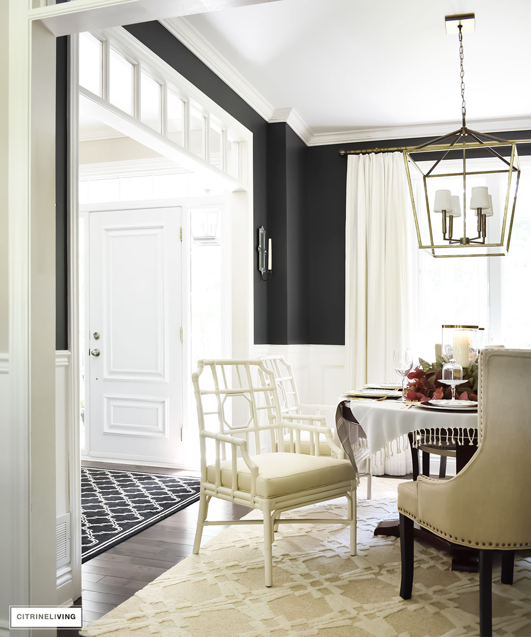
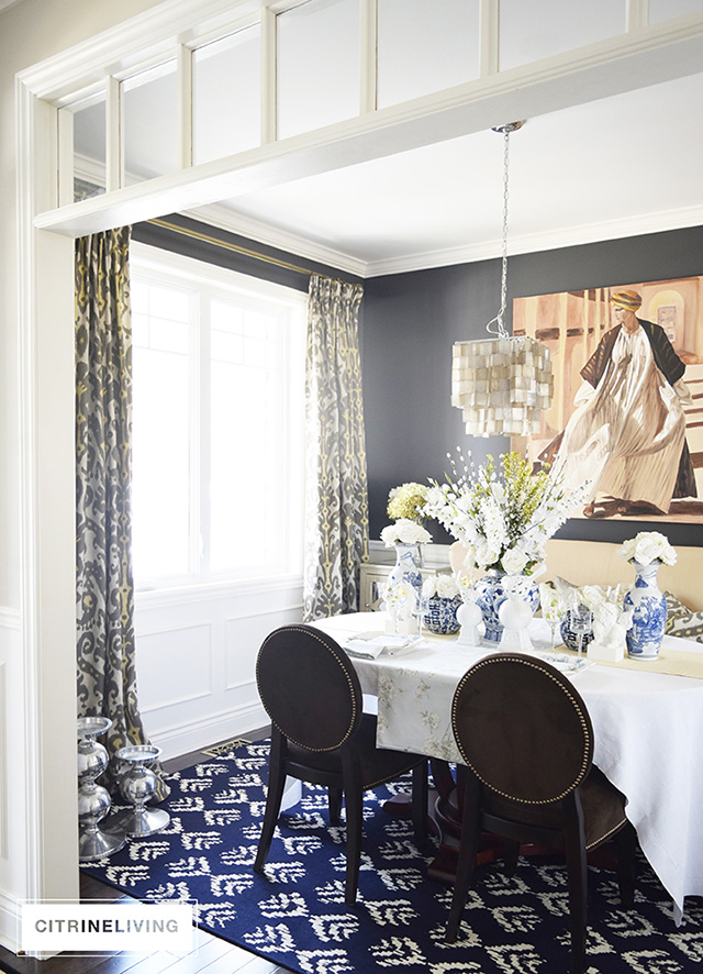
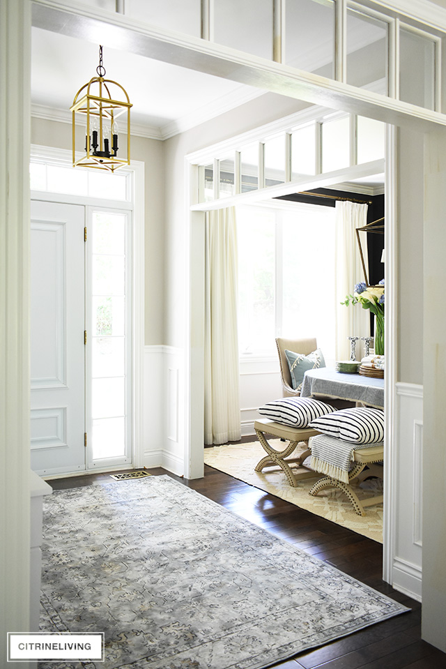
I think I’ve already mentioned that I’m always looking for a new project and our dining room is next on the list. It’s already seen a few simple updates in the eight years we’ve lived here – custom drapes, a new chandelier, a new rug, and a some different dining chairs, have all helped me bring my original vision of this room to life. Dining room with black walls and white wainscotting.This room started out a little empty and unfinished with clean, white Ikea drapes, and a too-small zebra print rug, and went to an eclectic, statement-making, pattern on pattern room makeover for a few years. I eventually went back to a pared-down neutral look for something a little more classic feeling. Sometimes I still miss all that crazy pattern!Dining room with pattern on pattern textiles, black walls.
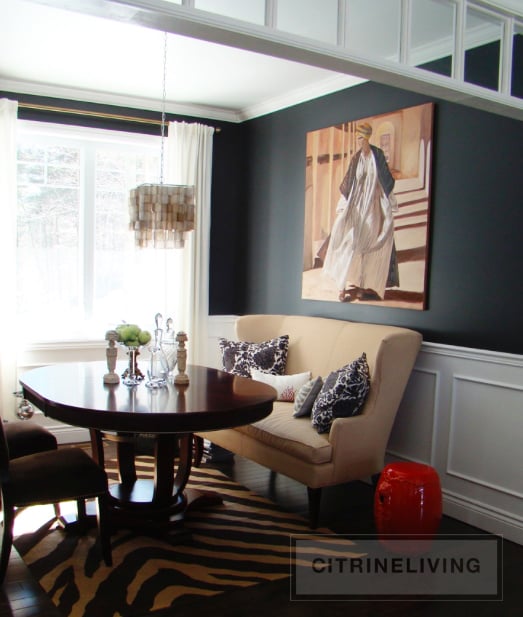
Next up was changing the chandelier – from our dinky, way-too-small capiz shell light, to a dramatic, modern, over scale lantern-style chandelier that packs a ton of punch. I am a lighting fanatic and I always love to make a statement with it. I especially love well-priced lighting, and this one is always priced at such a steal for a designer look. We swapped out all the bold color and pattern for a more calm and neutral space, which brings this room to where it is today.
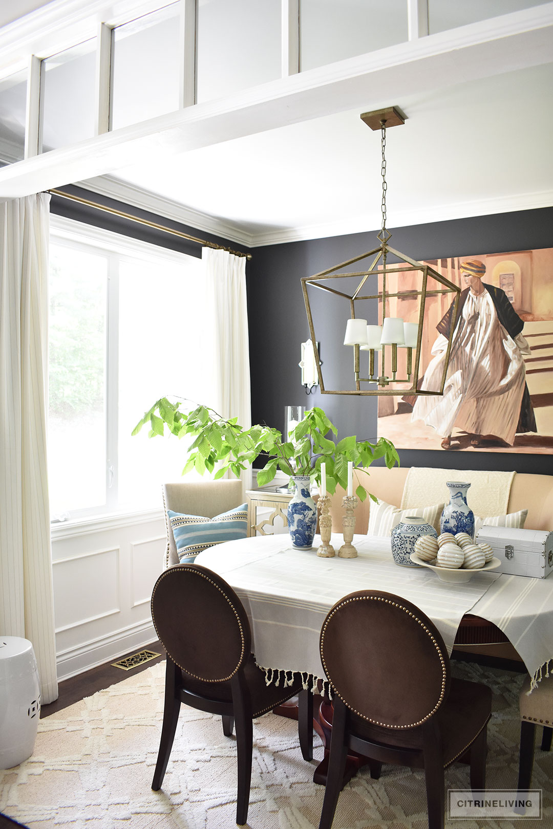
Dining room with black walls, white drapes, transoms.You can see more of our dining room from last summer right here and from this past spring here.

Dining room with black walls, white drapes, transoms.You’ll notice, I have the table covered in a few of these shots, mostly because I really want something lighter, and I’m so tired of the cherry/mahogany stain of our table. The wall color is one of my favorite features in this room, it definitely makes a bold statement which I love, but I’ve finally decided after some long deliberations, that we’re painting it a light-medium grey. Keep your eyes peeled for the changes that are on the way in the next few months!


FAVORITE MAKEOVER NUMBER FOUR : OUR DAUGHTER’S BEDROOM 

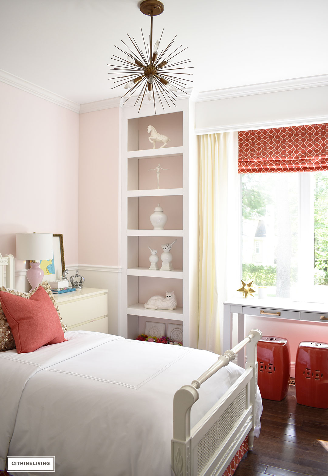
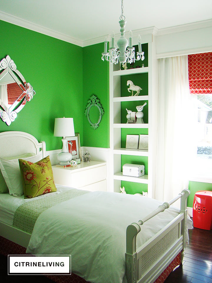
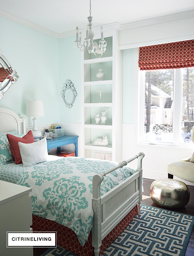
When we first built out home, our daughter’s bedroom was a real statement-making design that had bold, kelly green walls, contrasting white furniture and trim work with punchy coral textiles and accents. The inspiration was a bright and bold Palm Beach look that I still love as much today as I did when I designed it.

When we decided to update the walls, it was hard for me to let go of this gorgeous wall color, I loved it so much, but if you remember what I said – I’m always looking for a new project – hence three different paint schemes in eight years…call me crazy?Girl's bedroom with kelly green walls, white millwork and coral accents.

Paint truly is the easiest way to transform any space and I would definitely have to say the three different colors that have adorned these walls have brought about some significant change. We went from bold green, to pale teal, to blush pink – three completely different directions, all of which we really loved.Girl's bedroom with benjamin moor refreshing teal walls and white trim. The eclectic mix of geometric pattern and medallion print bedding, paired together with the coral trellis print bedskirt and roman blind was a fun and youthful design that we loved, for about a year haha. You may not believe this, but there was even a ‘transition’ design, between these two looks as we were searching for new ideas to bring a new look to this space. Read all about the different stages this room underwent and full the teal bedroom reveal here.Girl's bedroom with blush pink walls, white trim, brass and coral accents.Lastly, we went with an on-trend fashion forward design, something more grown up, with blush pink walls, brass accents and our coral staples that we love so much. You can see this full blush pink room makeover here.
FAVORITE MAKEOVER NUMBER FIVE : OUR BACKYARD PATIO

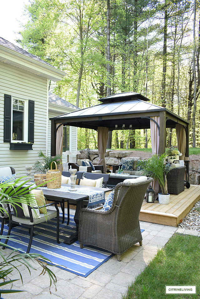
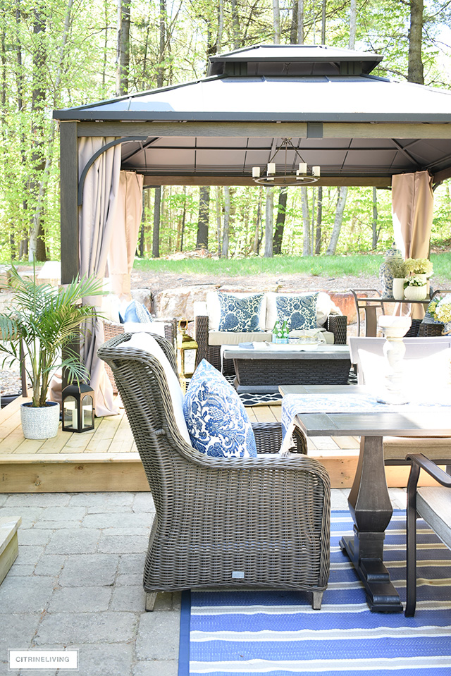
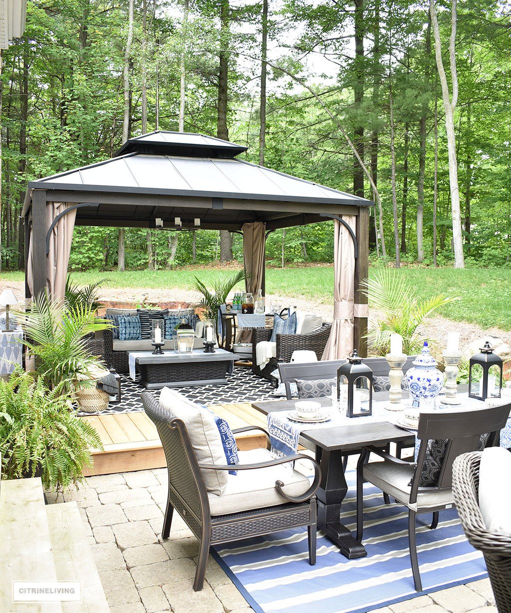
Last summer we were fortunate enough to make over our patio and let me tell you, it went from simple and a little on the small side, to incredible with expansive space for lounging, dining and conversation. The idea was to create multiple zones for various uses and we certainly achieved our goals with this outdoor room makeover.Outdoor patio with gazebo.We started by extending the space with a raised deck, off to one side of the patio. This was such a game changer out here, I can’t even tell you. It feels as though it has doubled our outdoor space and serves as the perfect  base for our lounge area inside our gazebo. You can read all about the full patio makeover here.Outdoor patio makeover with large gazebo, dining area and lounge zone.
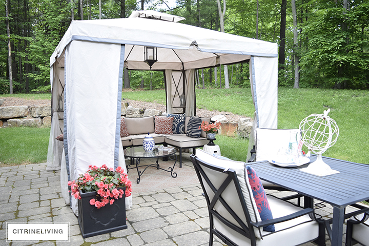
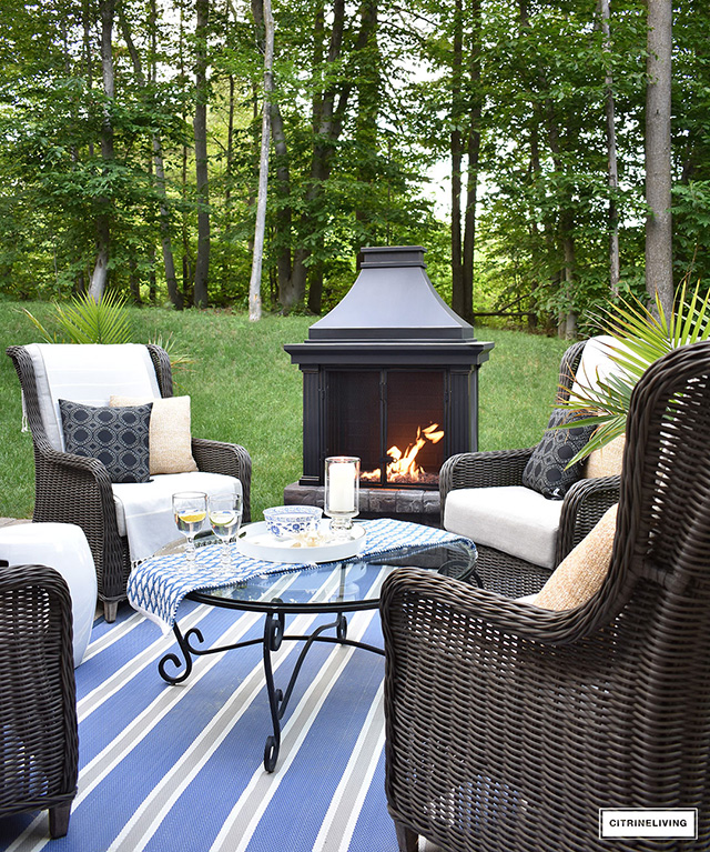
Outdoor patio makeover with large gazebo, dining area and lounge zone.What I love most about our makeover, is that it’s a true extension of our home and literally doubles the our living space. The flow from indoors to out is seamless and we love entertaining and relaxing out here all summer long. Especially having three different zones to enjoy – each designated space serves it’s purpose and functions effortlessly.Outdoor patio conversation zone with fireplace and wingback chairs. Our conversation zone is cozy and inviting, and we’re often out here in the evenings stargazing and talking for hours. This entire outdoor space is definitely a family favorite and our friends love it too. I can’t ask for more than that.

Outdoor patio with gazebo, dining table and wingback chairs.I published a recent post on how to make your outdoor space warm and welcoming with the addition of baskets and woven items, bringing indoor items out and other tips as well. You can read the full post here.

That wraps up Part 1 of my room makeover series, I hope you love all of the changes we’ve incorporated throughout the years in our home – we love them and I can assure you, I look forward to more changes down the road ;) Thanks so much for reading with me, as always! Tell me what you think down below! If you’re new to CitrineLiving and would like to hear from me, you can sign up for my newsletter at the bottom of this post! xo

SaveSave

SaveSave

SaveSave

SaveSave

SaveSave

SaveSave

SaveSave

SaveSave

SaveSave

SaveSave

SaveSave

SaveSave

SaveSave

SaveSave

SaveSave

SaveSave

SaveSave

SaveSave

SaveSave

SaveSave

SaveSave

SaveSave

SaveSave

SaveSave

SaveSave

SaveSave

SaveSave

SaveSave

Similar Posts

10 Comments

  1. tamaraanka says:

    Hi, thanks for the kind note! The greige is Collingwood by BM and the trim is Ultra Pure White by Behr :)

  2. Andrea Morris says:

    I really love your kitchen wall colors. What color did you use?

  3. tamaraanka says:

    Thank you! It’s Collingwood by Benjamin Moore!

  4. Jenny Wevers says:

    I love your Living Room paint color! Can you please tell me what it is?

  5. tamaraanka says:

    Maggie, thank you! I truly am so happy you like everything, and so happy you stopped by today! That painting is by my mother – she painted it for us as an engagement gift! Thank you again for your kind words! xox

  6. Sigh! I know it’s not good to covet but it’s hard not to with your home. The outdoor space alone gets me excited and motivated. And that gorgeous painting in your dining room – yummy! Lovely, lovely home. Kudos.

  7. tamaraanka says:

    Isabel thank you so much!! It’s fun to look back and see the progress! I’m really happy you like it! xox

  8. Isabel Gauvin says:

    Wow Tam! It’s amazing what you have accomplished over the years! love it all .xoxo
    izab

  9. tamaraanka says:

    Marty, thank you very much! I’m thrilled you lie it all! xo

  10. Marty Oravetz says:

    Such a lovely home and each change has been stunning.

Leave a Reply

Your email address will not be published. Required fields are marked *