FRESH SPRING KITCHEN DECORATING: BLUE + WHITE IS BACK!
It’s so hard to believe it’s April and how fast the months are passing! Even with the current situation we’re all in right now and spending all of our time at home, the days go just as fast for me. I keep very busy with work every day – it’s important to me to keep inspiring you! So with that, come and take a look at our spring kitchen!
I grew up surrounded my blue and white in our home, my mother is a collector and her love for this timeless decorating element has most definitely left an imprint on my design style, as well as my sisters. We all love it. I personally find so much comfort in using my blue and white pieces, and every time I bring them out, I’m reminded of that…the nostalgia it creates for me.
Using my favorite blue and whites in our spring kitchen this season just feels so good to me right now. I forgot how much vibrancy it brings to this space! I went with neutrals over the winter (click for Christmas and January), which I also love, but it feels like such a breath of fresh air bringing the blues back in here for spring. It also feels like home…keep scrolling to tour our spring kitchen!
Affiliate links are provided throughout this post – see my full disclosure policy here.
SPRING KITCHEN DECORATING
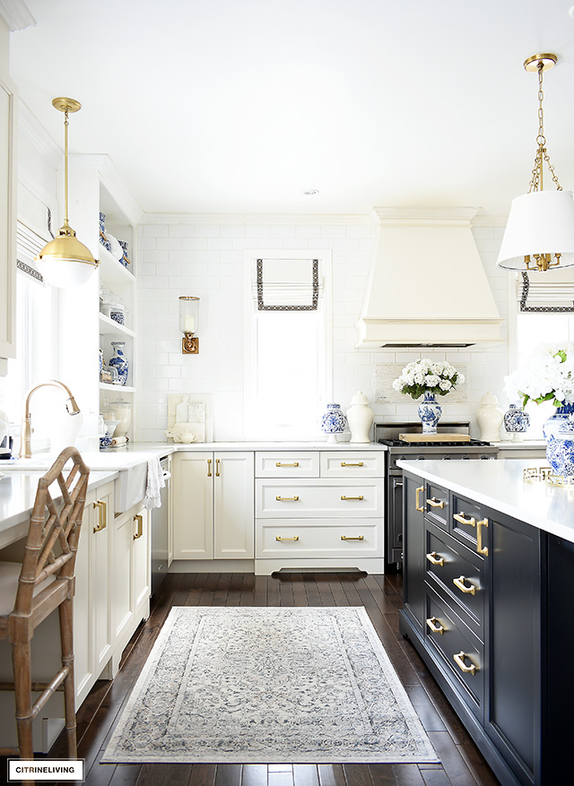
Welcome to our spring kitchen! It feels so nice to finally wake up in the mornings and it’s light out! I crave this time of year and when the sun is shining, we get such beautiful direct sunlight in our kitchen until about noon. There’s just something about a sun-filled kitchen in the mornings!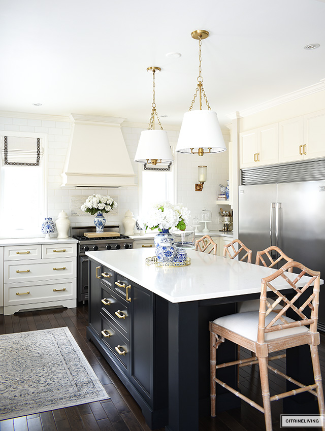

STYLING SPRING SHELVES WITH BLUE + WHITE
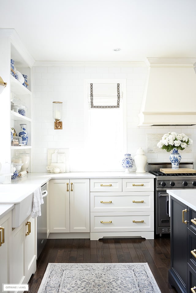
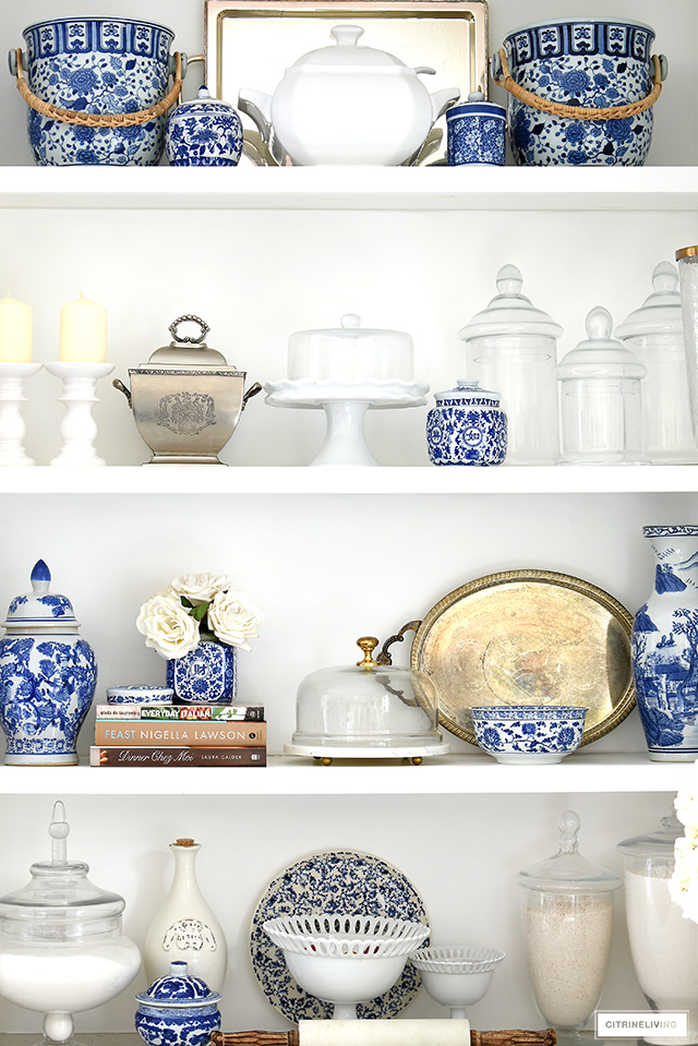
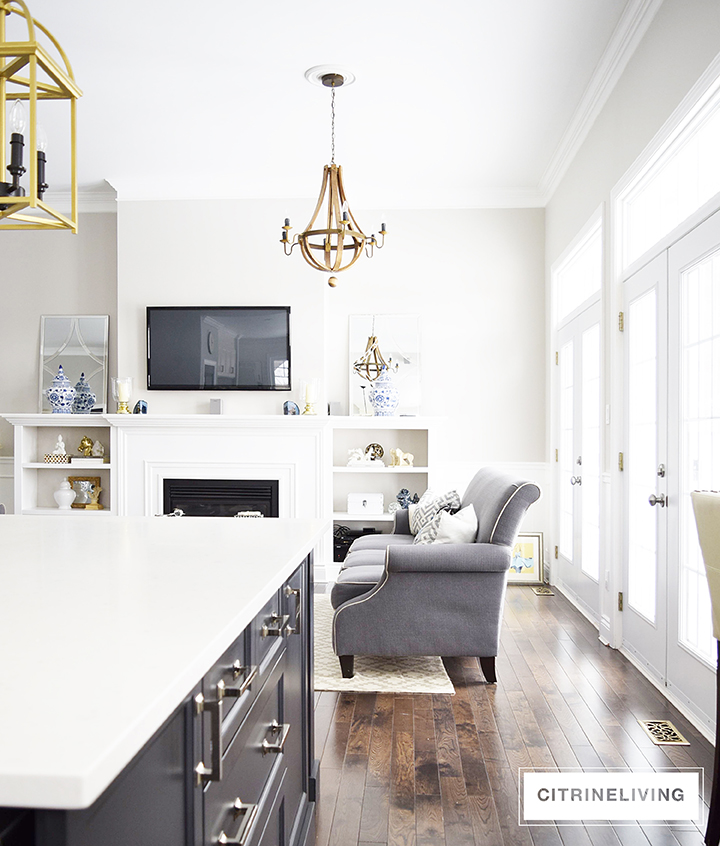
I don’t always restyle these shelves, and I do often like to keep them mostly neutral with white, silver and glass pieces. It’s a lot of shelf space to cover and I’m always leery of this corner looking too junky or overwhelming visually.
I do however, also love a layered maximalist look, so when I saw the most gorgeous dining room image from Serena & Lily (below) I knew what look I wanted to bring to our shelves this spring.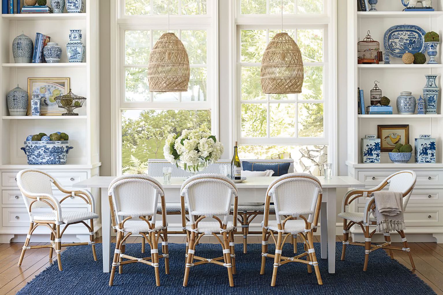
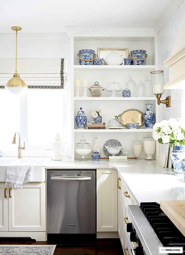
I’ve been collecting blue and white pieces for a long time. Some are from my mother, others I’ve found in various local stores, vintage stores and Chinatown. Most of my glass jars and cake stands are from my local HomeSense.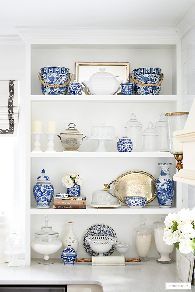

CREATING A FOCAL POINT IN YOUR KITCHEN
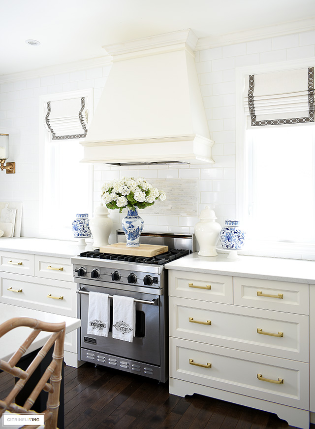
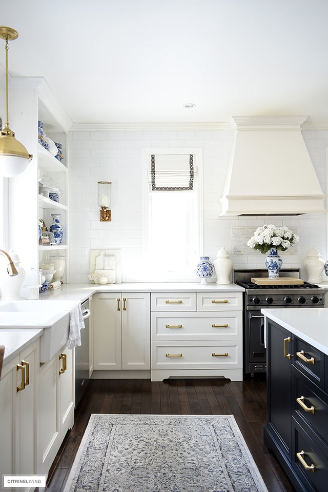
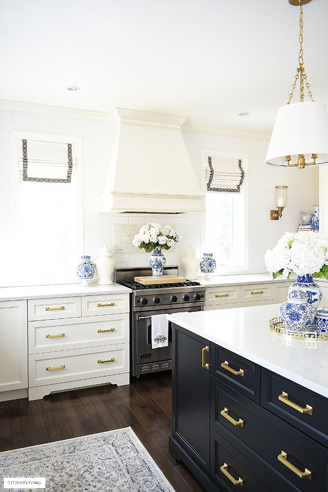
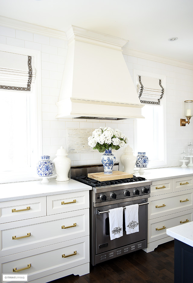
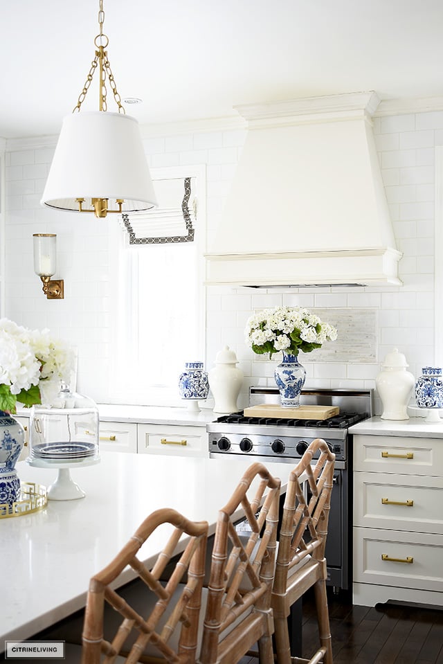
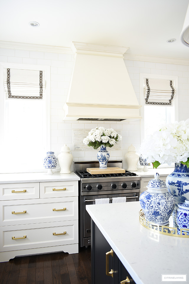
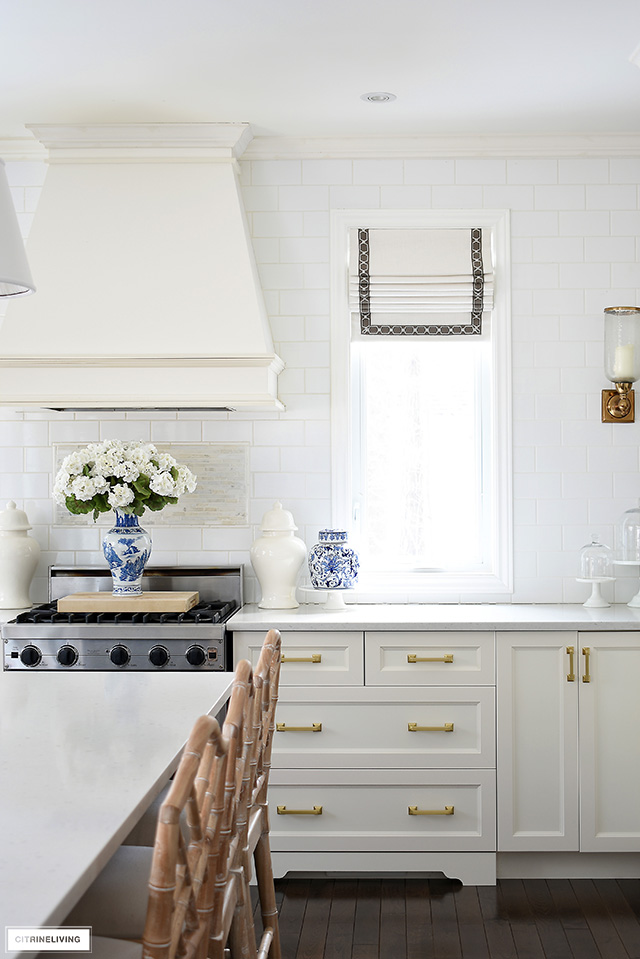
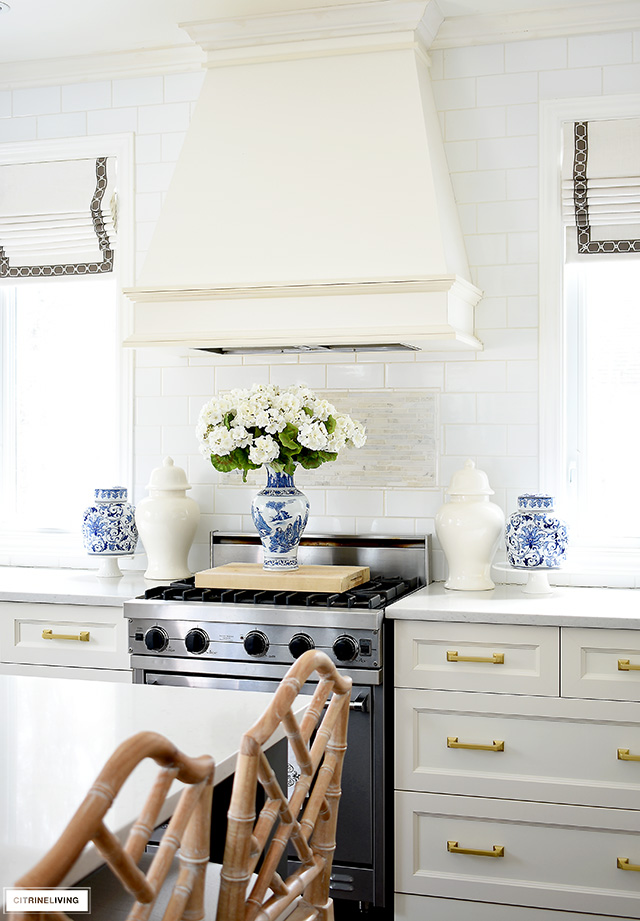
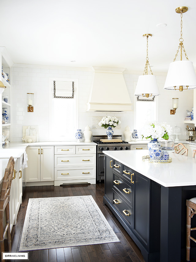
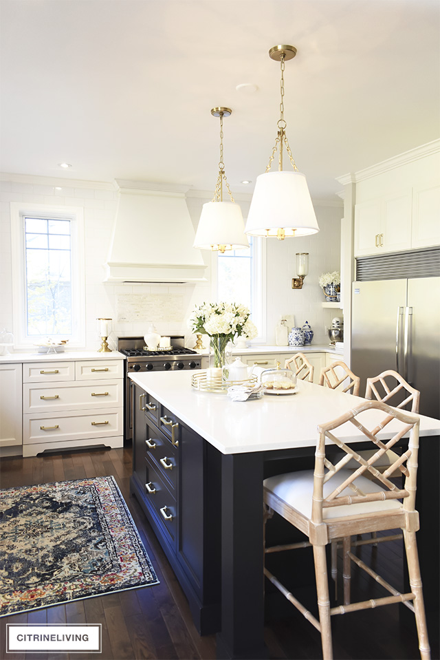
Our back wall is expansive and it serves as the focal point in our kitchen with subway tile wall, range hood and the symmetrical windows. I like to style around our stove using symmetry to play up the focal point even more.
We keep our tea kettle and coffee pot here every day, but for photography’s sake I like to add a decorative element – I borrowed this arrangement from my spring living room tour (click here to see it). It’s s always a beautiful touch to add something here when you’re entertaining and not using the range.
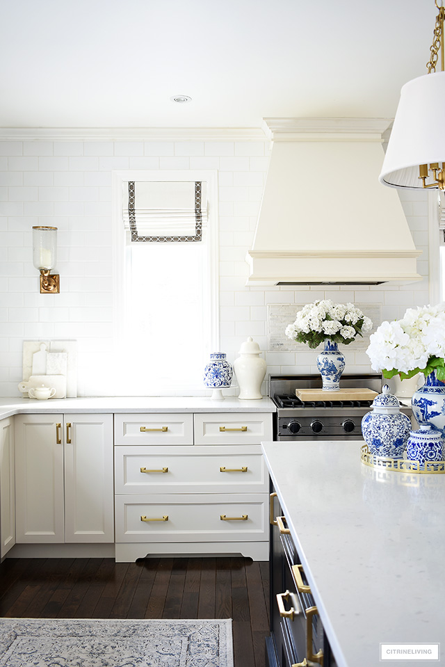
I flanked the stove with the same white ginger jars you’ve seen here for the last few months, these are from Lauren Haskell Design, one of my favorite online shops. The white jars are the perfect decorative touch to style with.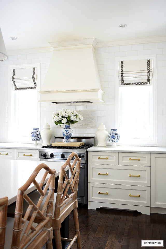
They’re so beautiful with the blue and white pieces I used – two cake stands with a ginger jar atop of each, and of course my borrowed arrangement, of what I think might be faux geraniums – one of my readers left me a comment on my living room post, because I wasn’t sure what they are – thank you for the insight!

CREATING A BALANCED LOOK
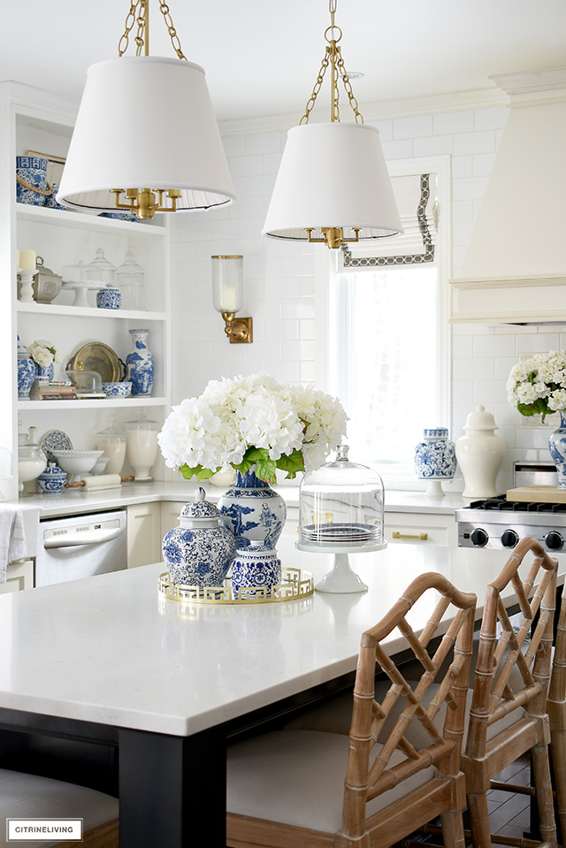
I may have more blue and white pieces than a lot of you may have, but that doesn’t mean you still can’t create the same feeling with a few key pieces of your own. A beautiful vignette on your kitchen table or island, and a couple of other touches around your kitchen is all you need to get the look.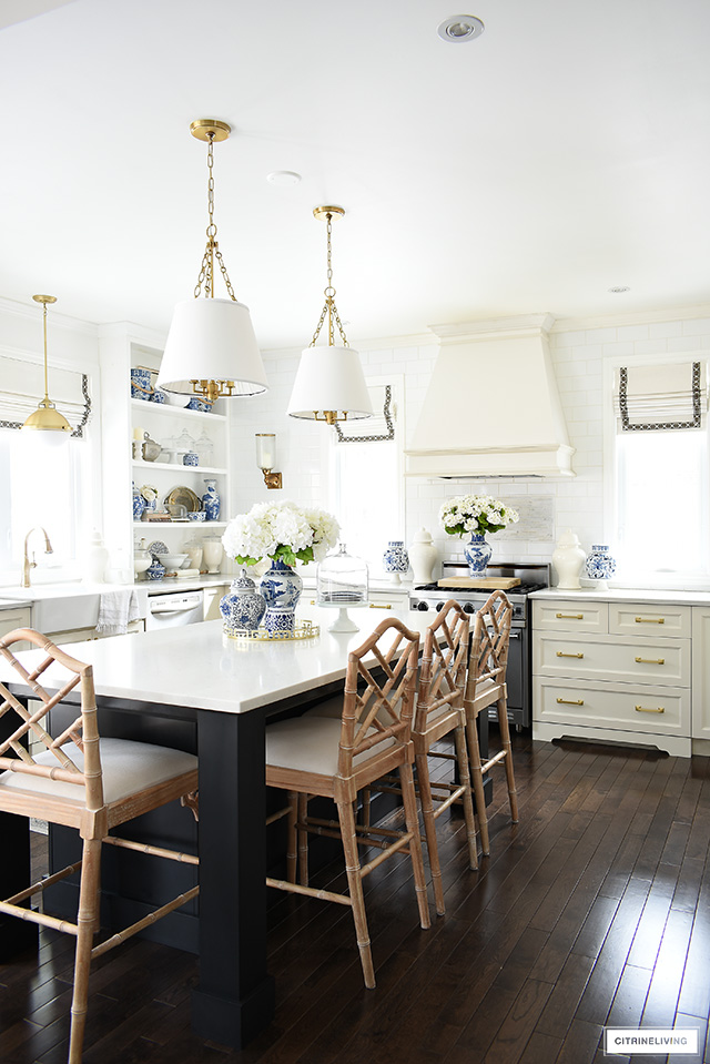






Hi! They’re quartz made by Caesarstone, the name is Misty Carrera!
Hi! What is the material and color of your island and counters?
Hi! Unfortunately I don’t have color names for either one…they were the only ivory (yes, off white!) and black choices available through our builder 10 years ago! I wish I could help! Thank you for stopping by! xo
What color is the paint for your island? It is so pretty with your white (off white?) cabinets. Also, what is your perimeter cabinet color?
Jessica that is so kind, thank you very much! Happy Spring :)
Thank you so much Jill! I am thrilled that you’ve found inspiration for your spring kitchen, that makes me so happy! Even better you found some pieces on sale! I have not seen the dispenser but you can be sure I am going to check it out! Thanks for the tip! And you’re so very welcome, I always appreciate you visiting and reading, thank you! Happy Spring decorating! xox
Thank you so much Sandi! That can happen sometimes if you click in the wrong spot, I’m not quite why. I’m so sorry! Try clicking toward the bottom of the image of the product – if you’re on a mobile phone or tablet, make sure to press hard enough, sometimes tapping too lightly results in nothing happening. If you’re on a desktop, make sure you click directly on the product or toward the bottom as well. If that doesn’t work, you can send me an email of what you’f like to see, and I’d be happy to send you direct links if you’d like, at inspiration@citrineliving.com. Again, I apologize for the inconvenience! Thank you so much for reading with me! xo
In love with many of the beautiful items! The blog says to scroll and tap on the photos to shop, but when I tap on the photos nothing happens. If I tap twice it just directs to Pinterest. How can I shop?
Tamara, once again so inspiring. I am in love with your kitchen, so stunning!
Gorgeous as usual! I was looking for a way to freshen up the kitchen yesterday and now you’ve given me great ideas. I browsed through the WS site and found some beautiful things on sale. Have you seen the ginger jar beverage dispenser? So cool and also on sale! Thanks for starting my day on a positive note :)